|
Kilo Volt by Science [web]
[nfo]
|
||||||||||||||
|---|---|---|---|---|---|---|---|---|---|---|---|---|---|---|

|
|
|||||||||||||
|
popularity : 54% |
|||||||||||||
alltime top: #21060 |
|
|||||||||||||
|
||||||||||||||
| added on the 2019-08-20 21:29:40 by arm1n |
||||||||||||||
popularity helper
comments
Good vibes but really generic scenes. Left Me a bit cold. But a new science demo is always a good news.
rulez added on the 2019-08-20 23:28:16 by nytrik 
Come on Spike your demos used to look way better than this :(
I liked this
Nice rendering
i'm very happy to see a new science demo. you guys were a firm part of my german demoscene socialisation. and i can understand you, jar, that you are pissed off at the results - it definitely deserved a higher ranking. but then again, to be honest, while it was technically impressive and a smooth package, it lacked a certain extra. not sure how to express it - but probably it was not very memorable, when people thought back at the democompo in order to vote. in any case, please don't get discouraged and stay with us! <3
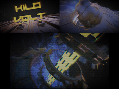
Thought this would rank way higher, besides shadows this doesn't have to hide vs. what you can do with Unity. Love the particle swarm, the SSS sphere, how there's always particles around the models and how you stick to the energy theme - and the music supports it. Actually like it so much, you have to take this (hopefully constructive) criticism ^^
The excessive noise makes it rather hard (even confusing) to see the particles and the scanline overlay look doesn't help with that either. (other overlays are fine)
The music is rather monotonous. The timing when you cut to the next scene is flawless, but without seeing visuals and just listening to the track you cannot tell whether it's the 2nd or 5th scene running. (seems to be a general issue with danceable music, not particularly this song)
There is something weird about the lighting, I don't think it's just the abscence of shadows - you picked clever designs that don't make their abscence too obvious. There are also some bright yellow glowing elements in the models that don't light up anything around them (really obvious in the greets scene), but I think that's not it either. I cannot put my finger on it, maybe environment/cubemap lighting that is coming from somewhere not visible in the scenes? (this is something I really appreciate about Unity: being able to pause playback, toggle things on and off and debug issues that way.)
Good effort, but I think you need to find someone who enjoys doing graphics as much as you enjoy programming. (or borrow models from libraries like other AAA groups)
so 2010 :D
good try but everything about this style expired ca. 2005, especially the FFT sync...
also pretty sure you can afford more taps in your radial blur and chromabs in 2019
also pretty sure you can afford more taps in your radial blur and chromabs in 2019
I'm sure it would be much better with flat shading on 3d meshs :)
ok
"utter annoying crap."
not bad. but not great either since it lacks a bit of content imho, it feels kinda bland. but the style is great! i also like the music so weak thumbs up.
submit changes
if this prod is a fake, some info is false or the download link is broken,
do not post about it in the comments, it will get lost.
instead, click here !
