|
android by fresh!mindworkz [web]
[nfo]
|
||||||||||||||
|---|---|---|---|---|---|---|---|---|---|---|---|---|---|---|

|
|
|||||||||||||
|
popularity : 64% |
|||||||||||||
alltime top: #4335 |
|
|||||||||||||
| added on the 2005-04-10 10:41:52 by pasy |
||||||||||||||
popularity helper
comments
i liked that
rox0r
Good sync, cool techy wireframes and random numbers, somewhat kicking music. The colour scheme could use more work, but I like this nevertheless.
Good flow, and the models are also nice for a 64k but it's still an "objects rotating in the middle of the screen" intro...
Jok a modellek :)
Nice one, except that wireframes could be antialiased :) Oh and some parts (e.g spaceship) were very slow on geforce2
have to agree zoom on this - but still its just cool :)
Quite nice.
nice design but can't say it rules if precalculation seems to take more time than the intro itself(1.3GHz, gf4mx) :)
good sync.
and cool some scene.
and cool some scene.
No bad, but nothing sceners haven't seen 100000000000 times before.
rocks
That's a decent technicall demo, but still looks rather pointless. Dark color scheme and dominating wires (BTW Don't think there was a need to break the magic during smooth head rotations) were fresh some years ago. I'm sincerely interested to know what made its precalc time so IMMANSE.
Please, get acquainted with that prod: http://www.pouet.net/prod.php?which=11702
All in all the face I usually see in a mirror.
Please, get acquainted with that prod: http://www.pouet.net/prod.php?which=11702
All in all the face I usually see in a mirror.
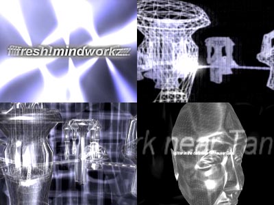
prett standard. the "effect" in the upper right of the screenshot was the coolest in the prod.
I especially enjoyed that one part, where all those structures are being built for the viewer to see. Apart from the technical robot/machine theme it lacks a bit of coherence. Perhaps it's just me but the Bladerunner citing, tough timeless for its own right, isn't really fitting here..
But all in all, I liked this prod pretty much.
But all in all, I liked this prod pretty much.
there is 1 nice scene...
rulz
The precalc/intro quality ratio isn't the highest possible in this production, and the framerate was questionable at parts, but still I liked the visual side very much :)
not bad... i'm drunkk
good enough
I also liked that object building scene, but overall it could have been better. Music was a bit too simple for me, too.
The usual linux quality
there are some interesting points here, but the overall feeling is somewhat average. the blade runner quotes didn't fit much.
mediocre code, lousy visuals and creepy music.
A bit long precalc, nice visuals (Yes,. I still like envmapped specular shinny objects ;)
whee, rox \o/
nagyon kellemes intro :)
nagyon kellemes intro :)
a nice intro with very good effects.
my fave effect is those vertically and horizontally extruded polys on the spaceship
my fave effect is those vertically and horizontally extruded polys on the spaceship
hehe. typical :)
(no bad tone, just hope u got what i mean :)
(no bad tone, just hope u got what i mean :)
I will give this a weak rulez.
It is very well executed, I think the code is great, and I like the visuals and the flow. The music isn't my deal, so I cannot judge that. But as others said, I think this is rather pointless. Rotating 3D objects... Nice ones, ok, but, hey... I'm bored.
It is very well executed, I think the code is great, and I like the visuals and the flow. The music isn't my deal, so I cannot judge that. But as others said, I think this is rather pointless. Rotating 3D objects... Nice ones, ok, but, hey... I'm bored.
too long precalc for nothing.
ugly visuals, bad music.
ugly visuals, bad music.
ugly
Citing Blade Runner is a bit lame, but you guessed the resonant frequency of my loudspeakers: a very immersive experience (all things over my table were vibrating).
Waauw! Congratz!
This style kicks ass.
I love the Klingon Raptor. :)
Great visuals, and neat Blade Runner lyrics. ;)
Keep it up.
I love the Klingon Raptor. :)
Great visuals, and neat Blade Runner lyrics. ;)
Keep it up.
Nice! Music is cool
This is WAY better than the screenshots....I really liked it. Good 64k!
\o/
Nice music
ok
A proper demo.
Nice
submit changes
if this prod is a fake, some info is false or the download link is broken,
do not post about it in the comments, it will get lost.
instead, click here !

worths waiting for the long precalc
great job guys!