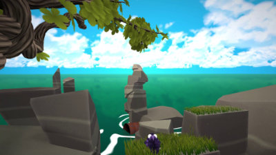
|
Equiratis rodentus by With Love
[nfo]
|
||||||||||||||
|---|---|---|---|---|---|---|---|---|---|---|---|---|---|---|

|
|
|||||||||||||
|
popularity : 56% |
|||||||||||||
alltime top: #9297 |
|
|||||||||||||
|
||||||||||||||
| added on the 2024-08-19 16:32:25 by Doctor Gekil |
||||||||||||||
popularity helper
comments
very cute and informative!
rulez added on the 2024-08-19 17:00:42 by post malone 
cute, nice butterfly effect, then sad.
scroller is way too long. :)
scroller is way too long. :)
The fuzzy cuteness makes up for a lot of the shortcomings here. Keep it up and looking forward to seeing your next release!
What uncle-x said
Lovely production, nice mood and attention to details (grass deforming with the rodent, etc.). Great first prod, looking forward to more:)
Everything is cool, except for the creepy ending with the boulder falling on the animal.
And yes, the grass is shitty. It would be better without it.
And yes, the grass is shitty. It would be better without it.
Yeah damn, the fuck was that ending, jeez :D
The assets are impressive, the animation is great, the expressions are well delivered, the pacing is well done, but there's a lot to be desired about the camera work (linear?!) and the general cohesion where it feels like the music was made for a completely different intro and just bolted on as an afterthought, and doesn't convey a lot of the emotion that was implied to be in the story, which is why the ending - even though it is foreshadowed - doesn't really sit well, because there isn't really a tone to attach it to?
Still, a respectable effort.
Really like the look of it. Don't like the sad ending though. :(
Looking forward to more
Poor squirrel! That ending was terrible. Good stuff though.
would you please just make the ADSR envelopes exponential instead of linear, like on the hihats especially… i can't do this anymore
The pacing and camera work have their shortcomings, but the animation work is way way above what is usually seen in the demoscene.
As a first prod and as a 64k, this is some incredible quality and content.
As a first prod and as a 64k, this is some incredible quality and content.
This gave me very much the PS2 platform game vibes, graphically. The music, too; was surprised to see it was 64k, really. Better character animation and emotion than 99% of full-size demos out there.
There are some crazy glitches in scene changes, though. Suddenly the character's fur becomes like 1000 units long or something, or maybe 0, it's as if some character animation system hasn't understood that the camera is moving :-) It's super-jarring, and a shame, because apart from that, this is the best 64k of the year as far as I'm concerned.
There are some crazy glitches in scene changes, though. Suddenly the character's fur becomes like 1000 units long or something, or maybe 0, it's as if some character animation system hasn't understood that the camera is moving :-) It's super-jarring, and a shame, because apart from that, this is the best 64k of the year as far as I'm concerned.
Found an old reminiscence with the Cocoon’s demo called «Glon 243», but more cute and technically far more advanced.
That level and amount of animation, featured in a 64k, is amazing.
The workflow could deserve a seminar next year, imho 😂
That level and amount of animation, featured in a 64k, is amazing.
The workflow could deserve a seminar next year, imho 😂
the sad end makes it a piggy
i really liked most of the camerawork and i love the animations! That fur rendering has some nice ideas. I'm not too fond of the rendering style and why do i have the feeling those squirrels are on E or something? I'll try to rewatch it in .75x speed probably :)
a lovely prod ! what a pity you had to cut the happy end for size limits ;)
(yes the squirrel is still alive... and will be back?)
(yes the squirrel is still alive... and will be back?)
Impressive work!
Making a 64k intro is always a lot of work, and it's even more difficult when it's a first prod. This was ambitious, as animated stories are hard to do and require a massive amount of work. But you did a good job, so well done!
Textures: they work very well. You kept them relatively simple, and that was a good decision. They give a consistent look across the demo.
Modeling and rendering also look good. But the grass looks poor on close-up shots when we see the grey background. Maybe it would help to put a grass texture on the ground?
Camera: this is a weak point. A lot of camera movements are not needed and don't serve the story. The camera movements should be more intentional. Keep the camera static (or slow) unless there's a reason for it. Camera editing and pacing would need more work to better help the story-telling.
Music: it sounds relatively cheap. It sounds like the music data is too small (it sounds more like a 4kB intro than a 64kB intro). We usually count around 16kB for the music, and I suspect your music is much much smaller. But the main problem is that the music doesn't help the story-telling. It doesn't feel in sync with the image. It's very obvious when the rock falls: the music doesn't care and continue the main theme. Throughout the demo, it sounds like the music and the graphics were done independently. This kind of demo requires a lot of iterations to make sure the music matches well.
I'd love to see more demos from you! I think your plan was overly ambitious: you obviously executed a lot of things very well, but this kind of animation with story-telling requires even more polish work to put it to the next level.
Amazing first, especially fitting a whole 3D story into 64K. I'm looking forward more prods from you Cédric.
Super cute
Your prod brought me joy and heartfelt laughter. Emotions that are not easy to convey. You did amazing with this first prod! GG! more more more!
really fun and nice fur effect.
I loved it! It does not look as a firstie. It's a really a tough and daring move to go that far for a firstie. You've been really brave, Cédric!
Animation is out of this world for a 64k, and overall it looks really nice, cohesive and fun (except for the disposed squirrel part). Grass render could be a bit better but for the rest of it, it's a blast.
It has been a pleasure to meet you at the partyplace Cédric, and compete with you in the compo! Looking forward to competing with you again!
Lovely firstie. Just not sure if the stone was needed :)
A very respectable first 64k. Great rendering style, animation, and wtf story. :D
really sick firsty, others have mentioned nits, but very commendable effort! Keep going!
a 64k with character animation this good is super super cool and i loved it during the compo, but whyyyyy do all the cute little animals always get hurt :c
Very nice 64k, I'm impressed by the animation.
Butterfly^Wsquirrel effect.
Great effort! But story telling is tough, camera and music didn't do their part here, maybe next time? Give us more please
Ambitious, I like it. When it comes to material on visual storytelling, Framed Ink by Marcos Mateu-Mestre and the Disney's Mulan Style Guide were helpful to me.
:)
Quote:
I'm looking forward more prods from you Cédric.
💯
more plz
submit changes
if this prod is a fake, some info is false or the download link is broken,
do not post about it in the comments, it will get lost.
instead, click here !
