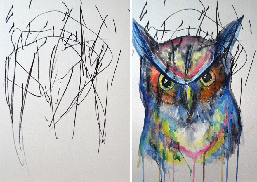
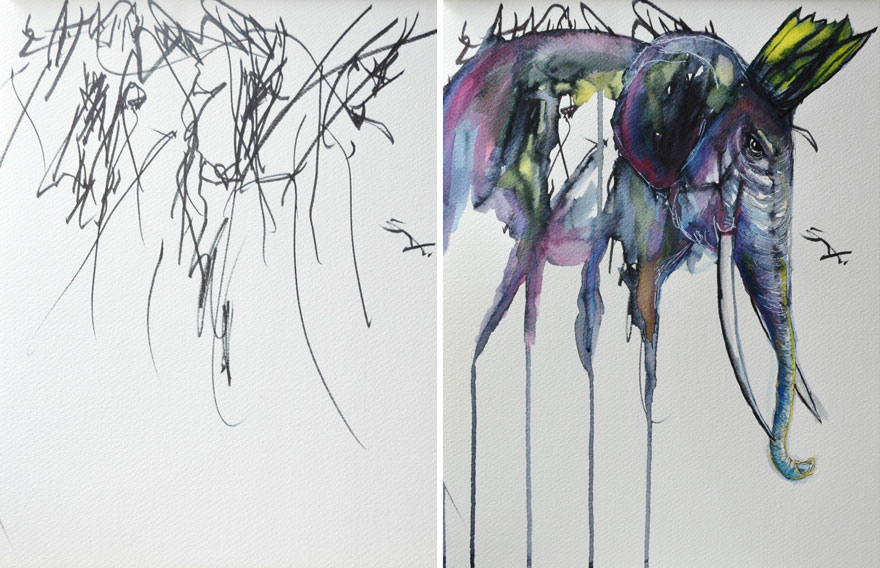
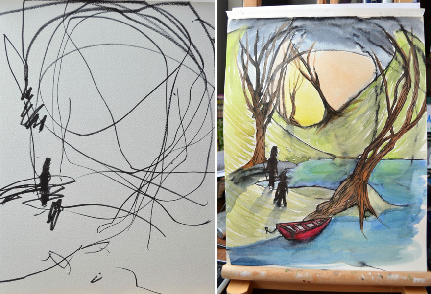
Paintovers
category: gfx [glöplog]

Am I doing this right?
ahahaha !


Quote:
Awesome and thanks! Here you go :)
Quote:
@trc_wm: For me it's opening a screenshot in photoshop and running rampart to visualize anything from crazy brainstorming ideas or subtle touches of color-grading.
@preacher: proabbly not what you had in mind... This bauhaus-stuff is tricky...
Quote:
Quote:
Got carried away. Probably completely useless. Let's try again.
Quote:
I guess this what you call a one trick pony.
Quote:
Preacher: Here you go. And old concept I made pick up again:
Quote:
this was a blast! :) need alot more practice though, more screenshots please! :)
Quote:
here's a dutch version:
Quote:
me too, me too.
Quote:
Quote:
Quote:
org:
searching for colors...
Quote:
Quote:
Quote:
Still messing with colors. I watched Pacific Rim recently. A horrible movie with nice colors...
I kinda like this one...
Quote:
Needed some distraction from GUI-Design
Quote:
Better, but still lacks some depth. Tricky lighting indeed.
Quote:
Finally some worthy footage :-)
Quote:
Quote:
can you guys please reupload these. it's all broken and i wanna see it too bad.
also sorry for necropost :(
(plz upload it to postimg or imgur)

Because gargaj wanted me to.


maali: yup, i was inspired. :)
The thing with Maali is you don't even need to see his name to know a picture is from him.
Quote:
that looks good!
Not sure if this belongs in here, but if I understood it correctly this thread is about taking something into a different direction to explore possibilities.
This is an attempt to cut the scenes from Fairlight's Unprogress into a story. Besides text nothing was added or cut away. The first and last scenes were chosen to be impactful ones.

Not sure about the end though, mentioning the group's name at the point where soldiers fight civilians seems very wrong :P
This is an attempt to cut the scenes from Fairlight's Unprogress into a story. Besides text nothing was added or cut away. The first and last scenes were chosen to be impactful ones.

Not sure about the end though, mentioning the group's name at the point where soldiers fight civilians seems very wrong :P
This is in spirit from Solskogen 2017: https://www.youtube.com/watch?v=fs4WDh93JEk :D :D (stiaje's audio paintover)

I've tried to make it better digestible for those who aren't interested in effects, but no clue whether there is any room performance-wise to add the new elements or whether it breaks the soundtrack. Probably both :>
Some explanation why and how:
Scene 1: (god scale) Credits
Scene 2: (god scale) Tulou Logo
Scene 3: (god scale) Trump dreaming about money. This may not make too much sense when viewing it the first time, basically just replacing the meaningless cubes with bundles of money.
Scene 4: (god scale) Trump chasing the rocket. It's probably best not to show all text at once, so the joke does not get annoying.
Scene 5: (planetary to city scale) Zoomer. Needs a simple crosshair to give the sense of looking through the missile's camera.
Scene 6: (human scale) City cubemap - the cam needs to be redone looking into a street, look into another street, look up in the sky see a relatively small flare, look back at 1-2 streets, look back into the sky at a larger flare. The scene should give a sense of confusion and panic. A rocket is incoming and you can neither run nor hide.
Scene 7: (atomic scale) Added background and some faked bokeh (so Pixtur can sleep tonight) and flares orbiting the voxels as electrons. Animation is good as is. Bonus points if the flare's locations suggests they'd be lighting the voxels.
Scene 8: (imaginary space) Greets, because friendship and respect goes a long way.
Scene 9: (imaginary space) Trump dancing, unfortunately "get off your ass and vote or trump happens" did not fit :I
Scene 10: (imaginary space) End logo
Thanks for the input r1g8 , I better release a final...


