Random "work in progress" shots
category: general [glöplog]
what, shmoov uloohz? :)
>OOEI₪ ₪IOOJD
I did a score board for my PICO-8 game ☺
[img]
https://media.giphy.com/media/l3q2GVs5vGHOJSZig/source.gif[/img]
[img]
https://media.giphy.com/media/l3q2GVs5vGHOJSZig/source.gif[/img]
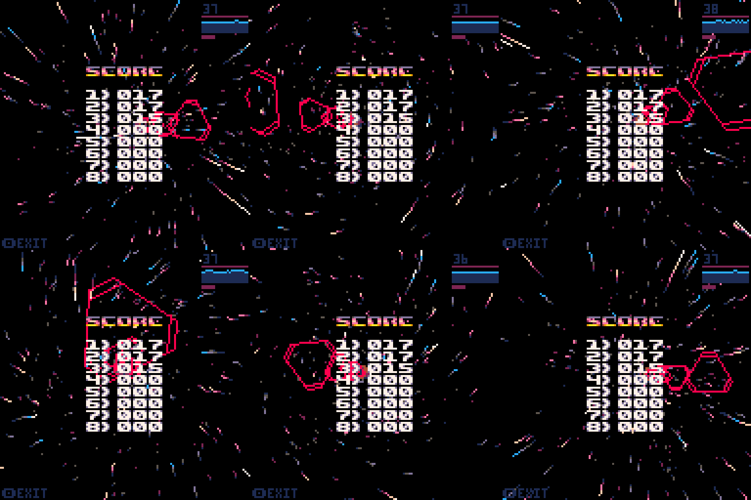
Is that for the "voxel" shooter ? I LOVE the style of both things but they look like they are for two different games.
po1: yes it's for the voxel game, I wanted an hiscore/menu like the one in latest Gradius arcade game.
the good point is it doesn't take much space since I'm already reaching max size of code tokens in PICO 8 :)
the good point is it doesn't take much space since I'm already reaching max size of code tokens in PICO 8 :)
rez: niiiiice!
rez: woow! :)
holy cow rez, you keep pushing it up!
Those are some pretty smooth particles, rez! Pure demoscene spirit, showing how beautiful the platform can be!
Yeah, that looks cool as hell rez :D
ok, now that my game is released, back to normal business:


ɧคɾɗվ: uuuh, valentins day is comming up :D
needs labels. 


going to test things on Raspberry Pi


and now with a lot of optimizations I can add tons of LASERS :D
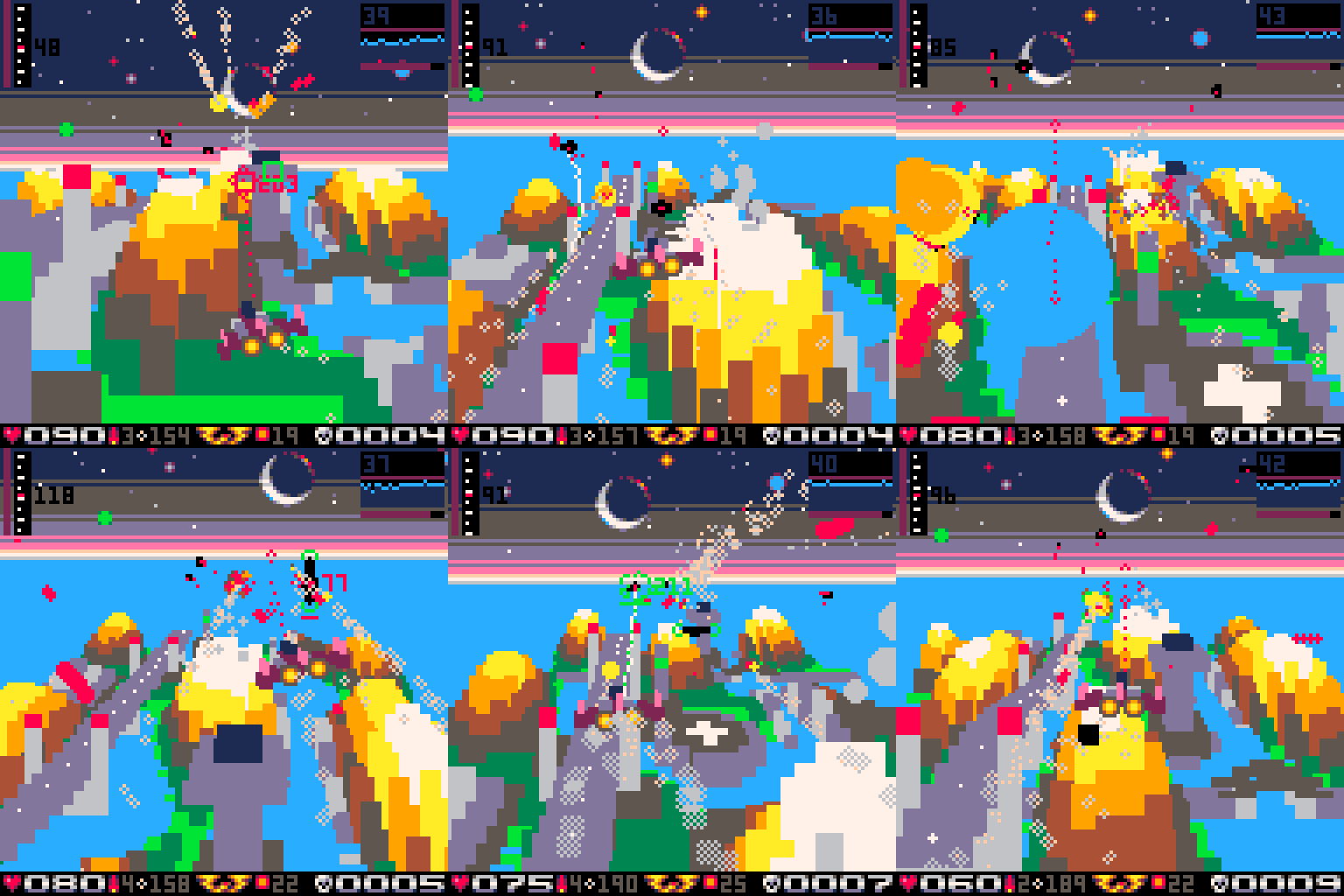

rez: uuh.. a bit visually hectic though, hard to see atm. but cool! especially like how the killcount font and hp font are "chrome" :D
Didn´t realize the planets in the background until now! nice work there also! :)
The first layers should have some sort of fog. Did you try anything like that?
@xernobyl: not tried yet! it can be nice of course, but a bit hard to do with 16col fixed palette :D
@rez: I might be getting old, but the game is getting messy and hard to read. I'd try another color palette to better "color code" the different things ( ground, enemies, bullets, ... ).
Quote:
but a bit hard to do with 16col fixed palette :D
I'd imagine dither fog would take away some of the magic as well
at least this should be worth a funky try :D
It does look both fantastic and very, very busy. Maybe the game design could be tweaked to fix it instead of the palette though? Like, that background with just one or two 'tough' enemies (or a boss), and less busy scenery (maybe just mountains, no roads/towers) with a swarm.
