Random GUI thread
category: residue [glöplog]
I like how there are several interfaces posted here that by definition aren't GUIs...
Quote:
I like how there are several interfaces posted here that by definition aren't GUIs...
so true, one of them mine :-)
It's quite interesting to see these - i reckon most can be classed as "coder UI", "failed experiment UI" and "just plain shitty UI".
Ok, I'm very late to the party here, but...
That GUI was rather good and functional, though a bit verbose and... well 90s style (by today's standards: ugly) overall. I'd say the slide-to-instrument-screen feature was ingenious back then. Definitely the most sympathetic Adlib music tool I've used.
But that's free stuff from 20 years ago. The real surprise is how terrible many UIs of modern, so called "industry standard" and "industry leading" software still is.
Quote:
Crappiest GUI i found for a tracker.
That GUI was rather good and functional, though a bit verbose and... well 90s style (by today's standards: ugly) overall. I'd say the slide-to-instrument-screen feature was ingenious back then. Definitely the most sympathetic Adlib music tool I've used.
But that's free stuff from 20 years ago. The real surprise is how terrible many UIs of modern, so called "industry standard" and "industry leading" software still is.
fast tracker gui was quite nice. fuck maali :0
worst ever

worst ever
Impulse tracker: vim
Fast tracker: emacs
There's something strangely attractive about IT, but I just can't use it for the life of me... it relies too much on remembering shortcuts and tends to overload the users memory capacity, requiring intensive learning and burning it into your long-term memory for it to become fully usable. Fast tracker on the other hand uses more visual cues, but it has the problem of perhaps showing you too much at once, you don't necessarily need to see everything at once especially on such limited resolutions. A happy medium (which I think Renoise kind of is) between the two would've been nice :)
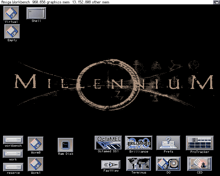
how I miss my A4000/040..

raina: at first i thought "hey, it's another 90s mp3 player" :D
ATAAAAAAAARIIIIIIII
Sk@le Tracker was good.

But I like Scream Tracker 3 more, anyway.

But I like Scream Tracker 3 more, anyway.

And yes, that was BeOS
http://www.pouet.net/prod.php?which=55595
http://pulkomandy.tk/projects/sawteeth/
http://www.pouet.net/prod.php?which=55595
http://pulkomandy.tk/projects/sawteeth/
goddamn blender "GUI"
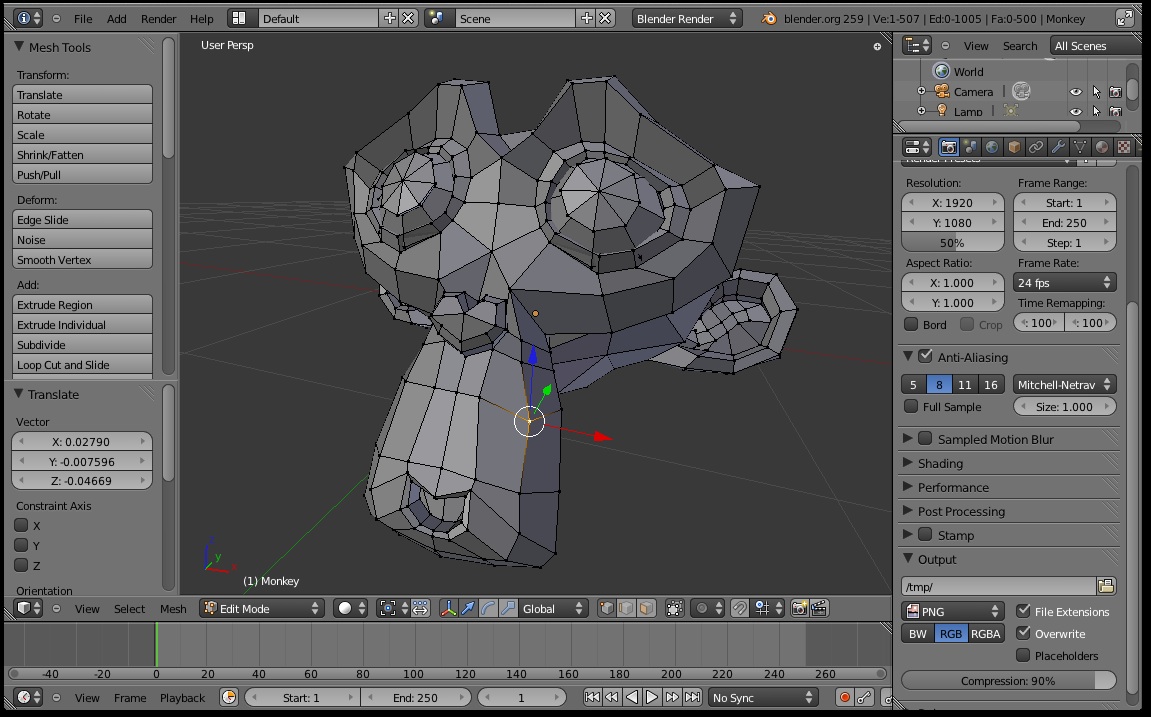

lol, final render options and mesh tools at the same time, because *of course* you'll want to adjust motion blur while you're editing the mesh :D
:)
for me thats even more horrible than 2.49x .. I still can navigate around it but that. Oh god.

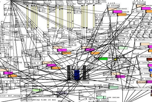
looks like pure data, maybe it is.


