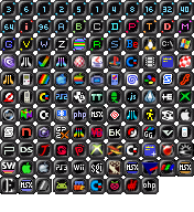
pouet intro icons suggestion
category: general [glöplog]
Im not a fan of the intro icons that's allready there. They are too many imho. Maybe sometimes difficult to interpret in a busy life, maybe also shitty for newcomers - If one decide to check productions based on icons - It's all now mostly just one or two numbers describing intros.
So, I decided to draw some small icons for the tinyest categories. So that they are easier to grip.
32b, 64b, where b stands for bytes (of coz).
128 for 128b, 256 for 256b and 512 for 512b. since not enough room for b.
its easier to get track of them imho.
change the color for the 64K category.
her's what i mean:<br>
her's the old one.
<br>
Gargajud is right. Better is in the eyes of the beholder.
Tell me what you think!
So, I decided to draw some small icons for the tinyest categories. So that they are easier to grip.
32b, 64b, where b stands for bytes (of coz).
128 for 128b, 256 for 256b and 512 for 512b. since not enough room for b.
its easier to get track of them imho.
change the color for the 64K category.
her's what i mean:<br>

her's the old one.
<br>
Gargajud is right. Better is in the eyes of the beholder.
Tell me what you think!
if not this works. maybe one could have two types of icons on the main page versus the productions page. if you understand what i mean.
you're free to use the intro-icons, if you like.
i am specially targeting =< 512 byte icons.
i am specially targeting =< 512 byte icons.
Not bad, but I actually have to physically get closer to the screen to be able to read the 512/256/128 ones. Guess that's why they decided to go for only one digit on the icon :)
What stjin said, I mean the 40 in the upper right is already eye straining - but three characters - puh!
sorry, but the three-digit icons are completely unreadable, and the two-digit ones are unnecessarily blurry. the old ones are much better.
The current ones are fine, if you ask me.
I suppose they're a bit confusing for a newcomer, but even then; on the prod page itself it has a little bit of text explaining the category beside it, and I think anywhere else, you can hover over the image to get a description.
I suppose they're a bit confusing for a newcomer, but even then; on the prod page itself it has a little bit of text explaining the category beside it, and I think anywhere else, you can hover over the image to get a description.
I don't really care that much, just wanted to mention that I don't have problems reading any of the text.
I have good vision (once I put on my glasses) but the new ones are effectively blobs. Yes I can tell what they mean, and read them, but at a quick or first glance ... not so much.
I echo what people said above that most people figure it out over time. They have tooltips and there's the prods page which would give an indicator ... They're not intuitive, but they're learnable. There are a lot of the latter things, and it's not always a bad thing to be that.
I echo what people said above that most people figure it out over time. They have tooltips and there's the prods page which would give an indicator ... They're not intuitive, but they're learnable. There are a lot of the latter things, and it's not always a bad thing to be that.
I am having hard time telling the new ones apart and I have almost perfect eyesight.
Yeah, there's simply not enough pixel space for 4 characters. We could make them bigger (32x32) or go with SVG entirely, but I'm not sure there's really a benefit to that.
Bigger + SVG.
You could also try something like 2² or 2³...

You could also try something like 2² or 2³...

I would stick to the 1-2 characters ones. But if you really want to change something about these icons, I would go for the color scheme: use bright colors for the kilobyte(s) intros, and dark colors for the bytes intros
What about just making the icons bigger?
They're from an era where a owning a 19" made you a badass, while nowadays only laptop screens are under 20" (and since we tend to hold them closer, it cancels out the difference).
Not to mention the fact ppi have increased too.
They're from an era where a owning a 19" made you a badass, while nowadays only laptop screens are under 20" (and since we tend to hold them closer, it cancels out the difference).
Not to mention the fact ppi have increased too.
I tried to make an SVG icon, but honestly, it looks like ass in 32x32 :) I might not be an Inkscape guru though...


JSYK, we faced similar problem many times at Opera and each time vector graphics was not the solution: Purely vector graphics suck at low res due to out of control anti aliasing and coordinates rounding.
The best combination we found, where it was possible, was to use SVG images with media queries switching between vectors AND bitmap graphics depending on the resolution the SVG image is used.
...but that doesn't solve the problem at hand. :\
The best combination we found, where it was possible, was to use SVG images with media queries switching between vectors AND bitmap graphics depending on the resolution the SVG image is used.
...but that doesn't solve the problem at hand. :\
what about removing that ugly border, which takes 50% of the space and btw does not fit to the pouet style anyways.
Quote:
JSYK, we faced similar problem many times at Opera and each time vector graphics was not the solution: Purely vector graphics suck at low res due to out of control anti aliasing and coordinates rounding.
Agreed. I've also done some executable / button icons and cursors and must say that there's no way 'round pixeling icons below 32x32 unless the icon's really, really simple.
Back to the problem at hand: If the current icon had a different frame there would be more space for the content. I also agree with p01 about the color scheme. Why not use the same text color for all <1k icons and another for 1k-96k?


i love hot pink, but toning it down seems to be easier to read on a casual glance. Having a consistent font height and color doesn't hurt either. Each number could be made 2 pixels taller via hand pixeling.


To be honest a considerable portion of the problem is the distinction of anything below 256 bytes - which is mostly just unnecessary.
let's make a competition. some artists will post their icon sets. other people will vote and we will take the best.
Pandur +1
honestly i like the icon set the way it is right now...

If changing them at all, I'd go for simpler - not only gives this more room, but I think it's a also a tad bit more timeless.
Maybe color coding the platforms as well, like making all the games consoles on green backgrounds, script demos blue, and so on.
