|
Surge Response by Approximate [web]
[nfo]
|
||||||||||||||
|---|---|---|---|---|---|---|---|---|---|---|---|---|---|---|

|
|
|||||||||||||
|
popularity : 64% |
|||||||||||||
alltime top: #2320 |
|
|||||||||||||
| added on the 2017-04-16 11:38:06 by velo |
||||||||||||||
popularity helper
comments
This was nice to watch.
rulez added on the 2017-04-16 12:09:25 by Starchaser 
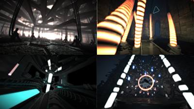
Impressive lighting and mood. Rules a lot! One of my top three in the 64k compo.
the sync is awesome on this one
great intro
great intro
Best from compo, cyberpunk schemes and mood, sync, music, everything is just perfect
Awesome stuff! One of the best in the compo.
Awesome rendering and mood :)
Wow, massive!
nice. I like the sound.
Great and Nice return! Keep on going and have dun!
A beauty. Also, excellent music & killer synth.
Holy hell :D Delivers in a massive way.
Center-rotate-party, but you brought something interesting to it.
You are overdoing it :/
looked great on the stream
perfect visual !!! amazing intro !! Winner for me ;)
good one
Nice. Performance on my r9-380x was soso...
very nice!
Delivery.
Excellent package
not my cup of tea but very solid execution
another damn fine intro in a high quality compo.
thank you or that.
thank you or that.
Cocoon in 64k :)
Really enjoyed the concept and execution. Too many different styles was a minus, but this still rocked!
Dude.
Yeahh O_o--b
This was one of my favourites! :) It has some dark style what Cocoon have in their demos and music was absolutely brilliant!
New record: widest fov
Excellent visual experience!
that plucky synth that kind of sounds like a plucked guitar still blows my mind! Great synth-work, velo! I also really enjoyed this entry in the compo! one of the best
It's not bad, but I didn't much care for the way too traditional style/concept and the camera was not very good as well (way too often rotating about a centered object). Piggy.
Temple intro tour de force! Altar of meta balls and particles strangely absent. What church is this?
Lighting effects are really smooth! And the baseline sounds cracking!
Lighting effects are really smooth! And the baseline sounds cracking!
Quite a break from your usual, smooth style - and three-year release cycle. ;)
had some nice sounds
I sensed some reference in the soundtrack.....I may be wrong.
Great 64k anyway.
Great 64k anyway.
goaaaa!
Good.
Cool , but not sure why it feels like old demos :)
Nice
my personal favourite 64k of Rev17!
...and the competition was really strong ;-)
...and the competition was really strong ;-)
I enjoyed it, but better camera paths and direction would have made it so much better!
Top notch! Those materials. And stunning new synth! <3
that was nice on the big screen!
As others say, my favorite 64k intro for revision 2017
Very cool! A bit too much low-key sometimes, and imo it would benefit a lot from slightly more aggressive music. Still rules!
Word per word, what cce said.
And for a more detailed comment, I'm not a fan of the design, shapes, textures and direction, but I do really like that you went for organic shapes and humanoids. That final mask was a clever modeling. :)
Technically, that's some fine lighting you got yourselves. :) I'm looking forward to seeing you try what you can do with it.
New synth is sounding good :) Great to see you guys back in the fold :D
Contrary to others' comments, I'm not completely sold on the synth. It sounds alot like V2 to me. Perhaps it's the "generic" low pass filtered saw-instrument that you used pretty much like kb did in FR-08. The water drop instrument in the beginning is really nice and actually isn't all that easy to accomplish with need of some pretty tight ADSR-envelope work on the filter. Great work on that. Overall composition of the soundtrack is amazing, though! Has this dramatic in-your-face-vibe to it. Really dig that! :)
Visually, I think this one's really great! It manages to convey this feeling of dark and somewhat scary atmosphere throughout the intro. It never gets boring, and all scenes are obviously polished and well thought through.
Overall - top job on this one, and I'm sure that in any other 64k compo, it would easily have won.
Mixed feelings for this one...
Punqtured is right, the synth doesn't really stand a chance (yet) against other current offerings. Oldschool props for not using samples for the drums :) but that's why they're really missing some punch. And yeah, that sawtooth sound is pretty much "some osc, some filter, and some envelope" with the same weird emphasis on the mid range that V2 has. You can really do better nowadays.
Scenes are beautifully modelled and detailed, but why are they so dark? I know you want to show off your lighting but in fact that would also work if people could see anything else on screen. Some gamma correction or change in the tone mapping would have worked wonders there and the 3D would have sttod out way more.
Camera work and direction is a bit too "classic", yeah. More cuts, narrower FOV, simpler movements would be key here.
But then the lighting and the engine are pretty awesome. You've got some solid tech there, just please go the extra mile next time to really make it shine. It'll probably work, one needs time to get good at even one's own tools.
(also, that thing in the end, is that the sister of Auto from Wall-E? :D )
Cool demo, has some nice scenes, I like it.
nice one!
Love it visually, aurally I think it's less the synth and more the unfamiliarity with it. A few more prods and it'll prolly be better :)
I liked the tune and the light-sync throughout the whole prod. Cool stuff. Don't let anyone tell you otherwise. A bit too gloomy for my taste but nevertheless top-notch material. Did I sense some Ghost in the Shell there somewhere? :)
Great work! I'm not a big fan of the direction, but it looks and sounds good. You've got a very good engine. I can't wait for your next intro!
Great stuff!
I'm bad at computer
pyramid scene was kinda bland, clenched my thumbs, and hell yes. it was worth it :>
Yes!
Very nice lighting!
this is what a demo should be.
Nice Soundtrack.
very awesome!
Nice 64k, i like the tunnels and the music also velo showed me a preview at Syntax Error in Stockholm before Revision but the whole done final thing is so much better
Not just sync, but each instrument is tied to a specific element of light-up-geometry. Once I realized what was going on it never got old - it's fun to have your brain predict visuals the same way it does with notes of music.
This held my focus enough that the so-so music and generic 3D didn't bother me as much as others perhaps.
This held my focus enough that the so-so music and generic 3D didn't bother me as much as others perhaps.
visuals were good. i didn't like the music, sorry. swine
Pleasant to watch and hear :)
proper
music + visuals exactly as they should be, great one!
audio-visual synchronization is just sick perfect in this production!
Great prod with just lovely sync!
Very cool!
lists containing this prod
submit changes
if this prod is a fake, some info is false or the download link is broken,
do not post about it in the comments, it will get lost.
instead, click here !
