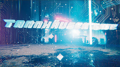
| Tannhäuser Gate by Suspend [web] | ||||||||||||||
|---|---|---|---|---|---|---|---|---|---|---|---|---|---|---|

|
|
|||||||||||||
|
popularity : 61% |
|||||||||||||
alltime top: #11405 |
|
|||||||||||||
| added on the 2024-04-01 18:12:18 by OlaHime |
||||||||||||||
popularity helper
comments
Like the visuals, soundtrack and generell the content.
rulez added on the 2024-04-01 18:18:13 by Chainsaw 
Better than previous as has less crappy cheap game dev mocap, which was distracting especialy with such a bad teeth.. plus self voting is not cool degrysin, just don’t do it
Nice demo with great tune .Chaser can into trance!
I like all of it!
There were a few strong scenes, but overall the pacing felt quite bad, especially with the Bethesda-esque head rig constantly interrupting the flow. Would have been cool once halfway through, but used too much imo
solid prod !
Thumb up for the music and general progression as I observe (demo over demo) :)
Painfully cheesy. Also, "AI" thumb
weak thumb
for desecrating Sir Ruger Hauer, how dare you >:(
head/face is quality "show at some distance and apply some blur", but shown as "I can lick this guys' nose if I want to"
I like the atmosphere of this one. A bit long maybe.
I was very much with you on the opening visuals, and looking forward to the rest of the demo. But then the head close-up appeared, and you completely lost me there.
I don't even know if this is the authors being oblivious to being at the rock bottom of the uncanny valley, or if this was meant to be a joke prod or some kind of grotesque style. Then on top of that, the modification of the quote seemed completely pointless, essentially turning gold into lead.
I don't even know if this is the authors being oblivious to being at the rock bottom of the uncanny valley, or if this was meant to be a joke prod or some kind of grotesque style. Then on top of that, the modification of the quote seemed completely pointless, essentially turning gold into lead.
extremely uncanny and butchers a movie I love :(
I almost laughed when the dude appeared, thinking this was a joke prod for a second, you built so much tension and serious footing during the title sequence and then subverted my expectations so hard. Basically exactly what Zavie said but also what okkie, nr4 and cupe said. In addition to that, massively flickering point sprites scene also didn't add to the experience nor did the only 2/3 beat synced camera fisheye... That being said the demo has a pretty good soundtrack and some decent scenes like the credit and outro scene, yet despite it using unity it looks like a 2005 video game.
Piggy due to aforementioned positives saving it from a thumb down.
Piggy due to aforementioned positives saving it from a thumb down.
Cringe worthy.
I regret no part of watching this. I do wish digital Rutger was sitting a little further back in the fog of the uncanny cyberpunk valley to make him look a bit more convincing (and he'd get a haircut on his sideburns) but liked the concept of the deepfake voice and the rest of the scenes. The soundtrack is a total banger! But in the end? I enjoyed it, so thumbs up.
I have seen lemmings jump from the Tannhauser Gate. Yes, it made more sense than this even if people don't believe it.
Excellent soundtrack, anyway.
Excellent soundtrack, anyway.
I can't get over the uncanny digital Rutger Hauer. Also, with productions like this, it's hard to know just what is the work of the author and what is the commercial engine. Somehow, with Notch productions at least, it feels easier to tell. But unity... a lot of this has a "template game dev" feel.
I will not thumb it down though, because I was entertained and because I liked the music. And it evoked feelings in me.
I will not thumb it down though, because I was entertained and because I liked the music. And it evoked feelings in me.
Great music. For the rest, exactly what Zavie said.
This compo is getting less and less interesting with entries like that. Sorry,but this is just below what i would expect from a demo entry. You get the tools, so use them properly.
yeah, the Hauer yet more like creepy dude in the shower part was hilariously bad :D
Hoping to see a "Shower with Your Hauer Simulator" entry in the gamedev compo next year.
For a while there I thought I was watching a Mass Effect: Andromeda cutscene.
It's a nice demo if you take away that uncanny talking head.
with it, I don't know how this could end up on 4th place.
with it, I don't know how this could end up on 4th place.
ok
Thanks guys, now I cannot remove 'shower with uncle Rutger' from my head. As for the Suspend demos - progress is visible with every one. It's getting there but not yet. Try to show off under 5 minutes running time - it'll be beneficial for all ;)
Didn't vibe with me.
I'm sticking to the Cubicle approach of the title.
I'm sticking to the Cubicle approach of the title.
Motivational thumb because i liked a few things. Poor Rutger
This is a strange thing. First, you nailed the Blade Runner aesthetic (I'll forgive that the rain looks kind of lame). Then, the human head comes up, and I'm like, whoa, this is super-uncanny and the lipsync sucks and the eyes are turned in weird directions, but the rendering is great for a demo engine. (The modelling is also good, except the mouth which is a perennial problem for these kinds of models.)
Then the rest of the demo looks like some early-2000s prod (e.g. four metaballs where you can clearly see the MC artifacts, sin/cos modulated spheres, etc.) and suddenly it's pretty nice lighting and reflections and stuff again, and I'm starting to guess that you maybe didn't actually make all of this yourself and that's the reason why it's so incredibly uneven. Finally looked up the party slide, and yup, Unity. Preacher called it “template game dev” and I think that's fitting.
I like the music, though.
Solid demo, great tune!
Yeah, mixed feelings to. Started out great, then suddenly showed GMOD Rutger Hauer and I wondered if this was a joke prod.
Strangeness vote. Just edit it shorter the next time, please.
Also, if you haven't seen Soldaat van Oranje (1977) you should go and watch it.
I like the idea of using A.I. to generate the monologue in "Blade Runner" style, but 722 Mb, my god...
I knew this isn't going to be great already at the smoothstep camera pans :(
Also extra props for including your 700MB demo in the ZIP twice with the only apparent distinction being the window size, because at this point who even cares anymore.
Within cells interlinked. Within one stem.
lol that rigging was awful as hell, but second part (and music!) absolutely saves the demo for me :)
Five cubes from me :) ■■■■■
Low quality of the facial animation is just self-insulting for the creator. What is the point in using Unity engine if you fail to utilize its potential? This is nothing but cringe. And AI generated crap at its core? Well, that is just shameful.
Some parts of it were really cool, music is good too.
But some other parts are a complete disaster (e.g. quotes, head model, lip sync, etc, as many have said before).
That, and the fact that it's 700Mb (several times more than it could be if it was just a video file!) and uses Unity is just unforgivable.
But some other parts are a complete disaster (e.g. quotes, head model, lip sync, etc, as many have said before).
That, and the fact that it's 700Mb (several times more than it could be if it was just a video file!) and uses Unity is just unforgivable.
very good!
lists containing this prod
submit changes
if this prod is a fake, some info is false or the download link is broken,
do not post about it in the comments, it will get lost.
instead, click here !
