|
Nikki Fox by Penisoft
[nfo]
|
||||||||
|---|---|---|---|---|---|---|---|---|

|
|
|||||||
|
popularity : 57% |
|||||||
alltime top: #60610 |
|
|||||||
| added on the 2024-02-18 10:27:48 by troubleman |
||||||||
popularity helper
comments
The same badly converted AI crap as in the Atari version, but now with broken sound and requiring one meg of chip for no good reason! This is some next level trolling.
sucks added on the 2024-02-18 11:55:30 by grip 
Obvious AI imagery lazily converted. So many artefacts and inconsistencies.
Yeah, despite the pictures looking good and more on the other AtariST slideshow, because on the Amiga they could be better colors and dithering, this use of AI makes me feel empty. At first I see really good slideshows and then I know there is no creativity behind it. Or I wonder, did the original artist do so many detailed pictures at once? That's a lot of work. But then I realize it's a lot of prompts.
glöp
Can someone explain to me how these works are "AI crap"? They don't look as if they were generated by an AI algorithm, and the Atari ST slideshow is so highly rated, by comparison. Apart from the crappy MOD music, which I agree is nothing like Jan Hammer, explain to me why the Amiga conversion of "Rusty Van" (or whatever it is) gets so much hate?
FoeBane72: All images look like they originally were square but have been streched to fit the screen. Image generators such as DALL-E generate square images. I may be more bothered by wrong aspect ratio than most, but I can't imagine an artist capable of creating such images by themselves would get this wrong.
Quote:
They don't look as if they were generated by an AI algorithm
They really fucking do. (And not only because EVEN THE NFO SAYS SO.)
Nice images. Some good imagination behind. But lacks of classic, pure pixel approach. And that's what makes me not accept such a concept.
I would personally retouch all the pictures manually before releasing. As the artist.
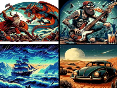
Especially that bass guitar being 4 on the bridge, then 3 and then 6 strings on the tuning keys side ;).
Just OK.
I would personally retouch all the pictures manually before releasing. As the artist.
Especially that bass guitar being 4 on the bridge, then 3 and then 6 strings on the tuning keys side ;).
Just OK.
Now the bass player needs a third arm, then it's perfect!
I know and predict that the dark times of indistinguishable AI art will come sooner or later but as long as these days are not there yet I prefer soul art by skilled and hard-working humans.
I know and predict that the dark times of indistinguishable AI art will come sooner or later but as long as these days are not there yet I prefer soul art by skilled and hard-working humans.
@Foebane72
There are too many telltale signs to list them all, but here are a few: The devil's tail grows out of the chair. The skeleton is fighting back with a feather. The guitar has six tuning knobs, connected to five insets connected four (well, sometimes, three) strings and the beer _hovers mid-air_. The cat has two tails. The right rear view mirror on the motorcycle grows out of the cave man's hand. I could keep going, but let's not even get started on that shark.
Furthermore, all pictures are have apparent artefacting and/or machine dithering, and many have the wrong aspect ratio.
As far as the Atari version goes, I'm surprised it got as many thumbs up as it did, because _every single picture in that version has the wrong aspect ratio_ and all of them are as blatantly AI generated as in this one.
The info file pretends that at least one of the pictures is in fact made on the Amiga. I'd really like to know which one.
What neoman said.
AI thumb
Thanks for the explanations, peeps!
And I really should read the nfo links more often :/
And I really should read the nfo links more often :/
It says it is based on hand-drawn originals in the nfo. I guess it could be interesting to see some of those. Maybe it can stop the thumb-down train?
Regarding AI, this is a step in the right direction. The result is held back by lack of an overarching concept, and weak technical rendition (needless 1mb chipmem limit.) Some good individual pics floating aimlessly in the void. Thumb for the music, which makes up for it and somewhat ties it together.
Showing AI pictures is the least problem in this production. I would say that the pictures are pretty cool if one ignore the lack of attention and post production work on the final work. But there's absolutely no tranisition wich is a pity for a slideshow (there were at least some fading transitions in the Atari version...). And the music should have been AI generated. It would not have been worst.
I really don't care if the images were AI generated, hand drawn or if they thrown an ink can against a wall, took a pic and then scan it. The images are very good and the slideshow is fun. I agree that some post production it would've been great and the music could be better. But I like it anyway.
submit changes
if this prod is a fake, some info is false or the download link is broken,
do not post about it in the comments, it will get lost.
instead, click here !
