| Across the Water by bitshifters collective [web] | ||||||||||||||
|---|---|---|---|---|---|---|---|---|---|---|---|---|---|---|

|
|
|||||||||||||
|
popularity : 59% |
|||||||||||||
alltime top: #7142 |
|
|||||||||||||
|
||||||||||||||
| added on the 2022-04-17 19:54:53 by P_Malin |
||||||||||||||
popularity helper
comments
reflections
rulez added on the 2022-04-17 20:00:53 by 100bit 
Love the composition and the lighting!
beautiful!
incredible
Composition. Colors. Wow.
Nice!
Beautiful!
nice
this was cooled really liked this one in the compo
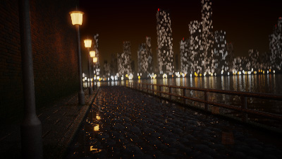
Love that wet street.
In my optinion it's best in compo. I love the lighting and reflections in here.
Nice!
kewl :)
very pretty
love the rocks, the buildings in the background didn't feel realistic enough for me though
Nice
Rejected from the photo compo.
amazing :)
Super use of composing, colors,+ deep blur make this one almost photorealistic!
the intricate modelling of the bricks and cobbles is among the key selling points here, but i feel a lot of the other geometry is a bit... "chibified"? like, the railing just feels a bit too thick, the proportions in the lamp posts just a tad strange, and the corner on the curb just a bit too round. it's small things, but together they result in obvious giveaways that this is CGI scene.
another detail that slightly bugs me is the subject, as it just feels like there is none. for an urban landscape, the expectation would be to have the entire scene in focus as much as possible, but instead the camera is focused a couple meters in front of the lens pointed at... nothing in particular? it still works aesthetically since the bokeh is beautiful, but i still can't shake off the conflicting feeling. similarly the scene also feels a bit too dark? not an easy problem to solve of course... can't just increase the brightness of the light sources when path tracing when your sample budget has a hard limit (kudos for trying the median filter(?) approach though :)).
oh well, feels like i'm merely nitpicking. this is a fabulous entry, and i hope you're not about to run out of steam with these! :)
So this was one of the entries that suffered a bit at our satellite because the compo was early enough that the light conditions kinda crushed some of the rich darker tones into mush, so I wasn't sure why everyone online was so excited about it - turns out I just didn't see a lot of the detail.
should have ranked first. awesome.
Yup
:)
Amazingly photo realistic! Keep 'em coming! :)
submit changes
if this prod is a fake, some info is false or the download link is broken,
do not post about it in the comments, it will get lost.
instead, click here !
