| Color by Ninjadev [web] | ||||||||||||||
|---|---|---|---|---|---|---|---|---|---|---|---|---|---|---|

|
|
|||||||||||||
|
popularity : 64% |
|||||||||||||
alltime top: #2492 |
|
|||||||||||||
| added on the 2021-04-05 01:53:19 by sigveseb |
||||||||||||||
popularity helper
comments
good
rulez added on the 2021-04-05 01:54:59 by SiR 
excellent lighting effects
incredible
felt a bit disjointed at places
nice
Interesting concept, great execution.
The correct amount of wtf (not too little not too much).
I loved it.
The correct amount of wtf (not too little not too much).
I loved it.
Ace!
this is how sync is done ! my favourite from the compo
Syncy McSync Face
Color to the max. The light effects on NINJADEV and COLOR were dope.
on drugs, great (sync) demo !
mf’ing sync
I'm somewhat divided on this one - it goes back and forth between some really solid shots with beautiful caustics and just hashing pixel values
Still one of the better demos in the compo, but meh
Still one of the better demos in the compo, but meh
this caustics scene <3
Yall def need to talk to Williams or smth.. Adult Swim needs you! <3
Meget fleskete! Me likes <3
Excellent combination of different styles.
This was SOOO awesome. I got goosebumps during the compo. I love the syncing. But I love the brevity to do stuff some people would call ugly. But within that context it was evident, that these decisions were neither unintended nor accidental. That's what art is for me.
I like the mix of the more aggressive attitude with the trademark sync.
Woah that screenshot scene was awesome!
Quote:
Yeah maybe a little, but it still had plenty of good parts and nice sync. :)felt a bit disjointed at places
Very nice use of lightning effects. One of my favourites of this year.
love it in every aspect!
i loved half of this but the other half was unpleasant...
the 2d pathtracing was great! how is it even possible? must be precalced
the 2d pathtracing was great! how is it even possible? must be precalced
Best sync in the compo! Fun to see Ninjadev go a bit hard-in-your-face and not _only_ happiness. I love the prism effects. But it's less visually consistent than the previous stuff. :-)
really enjoyed this! :D
Woke me in the stream.
Colorful. Some really good parts.
Unpleasant. Presumptuous music to some cheap cliche scenes, horrible colors. Yeah, the 2d path tracing is a nice idea, but the rest spoiled it for me.
demo was not consistently superb but contained "trademark" ninjadev style and managed to be one of the best productions in the compo
what wrighter says. some parts slaps but most of "outputting some buffer directly" glitches are way too much for my taste. I really wanted to thumb up this,,,
A lot of energy.
Would have preferred more of the refraction effect. It had the potential to go just nuts, but the demo somehow didn't want to go there.
Would have preferred more of the refraction effect. It had the potential to go just nuts, but the demo somehow didn't want to go there.
really cool!
Nice energy here, the tune sound just in the right way a bit off.
the first minute or so with the light refraction effects is great. then it pretends to be glitch art and fails miserably at it.
I wish I could like this but it's mainly a lot of glitching and color barfing, ranging from semi-cool to plain awful. I was really surprised this placed ahead of us in the compo.
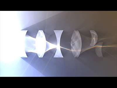
A DHTML page about the properties of photons. The music is very energetic and the visuals are tightly synced. In the end, the LSD kicks in.
Excellent as always!
big fun demo with eye-popping colours and demented soundtrack, love every second of it.
Love the first half. Less a fan of the WTF part. Still, this is massive, congrats!
Prisms :)
Probably the first NinjaDev demo I didn't like. To me the spectral raytracing and the glitching just don't fit together at all, or I just don't get what the demo is trying to do.
Fun and stylish as always
Some effects here are very nice and some look extremly simple and not very good. Yes, you have colors but sometimes a way too much of them. It's not bad at all, but from and to it feelse random, or maybe I'm just missing the plot.
What psenough says but a thumb up because effects seem interesting!
(in fact what almost everybody else say...)
Very good
Should of placed 2nd
Nice music aswell
Nice music aswell
The part between 0:35 and 1:00 (the logo with the spectrums and pathtracing(?)) is sublime and is something I wanted to try out (now I want to try it out even more because I know how good it can look). The rest, and the entire aesthetic of glitch, weird and on-the-money sync feels conflicting to me. On one hand, it's well-made for the most part. On the other, it rubs me the wrong way. A thumb up for the prisms, the production value and the sync is in order.
Kewl
best of compo for me
What preacher said (since he forgot to place his thumb, apparently).
I did indeed, yes. Let's fix that.
Some really good parts (logos in the beginning) - the glitchty parts kinda put me off. Nice overall!
the horrible colors/glitches at some scenes/transitions almost made me thumb it down because other parts look so good (especially the shiny glas/ice objects in front of the glowing lines). oink (a weak one)
yay
Great show!
Psyche, Nervous & Crazy.
i didn't really like some of the visuals (like the one with red and yellow gradient background and the end logo) but i found the city and traffic light quite pleasing. pig overall
Whacked out on a level I can appreciate.
totally awesome, with the trademark killer sync.
it's actually much better in realtime than I remember it from the stream
it's actually much better in realtime than I remember it from the stream
oh and extra kudos for running super smoothly in 4k res on my machine
Solid concept combined with Ninjadev freshness, and then taken up a notch.
Great sync and direction. Music also works very well. Very solid prod!
Awesome demo. By the way, you might want to add 'cursor: none' to CSS to '<body>' upon starting the demo to stop the cursor from obscuring it.
the masters of music sync at it again, really nice!
great show, I enjoyed it a lot, especially as "put all colors on the same screen" lover I am :D
There's some good stuff in here, but it's hidden behind an almost unbearable pacing...
I think this demo kinda illustrates the overall problem NinjaDev has with most of their demos: Lacking the confidence to let something "breathe" on screen. Jumping to another random parameter-set on every beat is not what good sync is about...
I think this demo kinda illustrates the overall problem NinjaDev has with most of their demos: Lacking the confidence to let something "breathe" on screen. Jumping to another random parameter-set on every beat is not what good sync is about...
Nice!
Great job with the pacing and sync.
brilliant
Great!
What a trip!
lists containing this prod
submit changes
if this prod is a fake, some info is false or the download link is broken,
do not post about it in the comments, it will get lost.
instead, click here !
