|
Lights.off by eXtrait [web]
[nfo]
|
||||||||||||||
|---|---|---|---|---|---|---|---|---|---|---|---|---|---|---|

|
|
|||||||||||||
|
popularity : 56% |
|||||||||||||
alltime top: #9415 |
|
|||||||||||||
|
||||||||||||||
| added on the 2015-09-13 23:19:26 by pista |
||||||||||||||
popularity helper
comments
I really like this one. Some of the effects are really cool, I love the ribbon effects. This is really great for a fast made demo using leftover assets.
i really like the (asdish?) vibe in this, also the executions is pretty solid.
should have ranked higher in my book.
should have ranked higher in my book.
Nice demo
nice!
excellent
Great demo, I really liked this one. Also, what wysiwtf said.
It is nice, just needs a bit more refinement.
looked good.
music would have been better without the beat..
but still good
music would have been better without the beat..
but still good
nice
Looks great. Quite a lot like some Adapt demos.
Nice, but horse animation is horrible.
Enjoyed it a lot, my personal fav of the compo.
Actually, I don't like a lot of things in it:
- music was not really my cup of tea
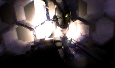
- the wtf dragon scene
- the horrible text
But great concept and great ribbon/line effect.
I wish it was not a fast-made prod!
Actually, I don't like a lot of things in it:
- music was not really my cup of tea
- the wtf dragon scene
- the horrible text
But great concept and great ribbon/line effect.
I wish it was not a fast-made prod!
This is really nice. Should have ranked higher.
serious lack of direction. nice effects and ambience.
Quote:
PS: Huge thanks to Maugli for helping the orgas this run on the compo machine :)
Your welcome! ;-) Any time!
Looks and sounds good, overall one of the better demos in the compo.
Motivational not-down-thumb. Oh, and drop the font.
Looks and sounds really nice. The music fits perfectly. But what raer said regarding the font. :)
Some lovely scenes and effects. I could have lived without the dragon ;)
Got an ftp error, so watched it on YT instead.
This felt uneven, as the quality of the different parts varied greatly. But overall I enjoyed the atmosphere and the idea! With more polish, this would have been great.
Both twisters felt totally out of place, though.
This felt uneven, as the quality of the different parts varied greatly. But overall I enjoyed the atmosphere and the idea! With more polish, this would have been great.
Both twisters felt totally out of place, though.
The best exploding cube I've seen!
Nice
Some interesting ideas in the effects - glad I watched it!
Some incredible parts, very cool!
ok
Nice rendering, and there are some nice scenes.
submit changes
if this prod is a fake, some info is false or the download link is broken,
do not post about it in the comments, it will get lost.
instead, click here !

Made during one and a half week, music was made by my brother.
Initial concept was to use black (or very dark) scenes with only a few fully white (or glowing) objects, then use screen space reflection post-processing effect on it.
Hope you enjoy it.
YouTube link, in case you have troubles running it:
https://www.youtube.com/watch?v=t7eaOtnp6Dk
PS: Huge thanks to Maugli for helping the orgas this run on the compo machine :)