|
Nu Retro by Simple
[nfo]
|
||||||||
|---|---|---|---|---|---|---|---|---|

|
|
|||||||
|
popularity : 63% |
|||||||
alltime top: #4679 |
|
|||||||
| added on the 2003-11-13 06:03:38 by rnd^smp |
||||||||
popularity helper
comments
good oldschool demo with many of good effects that made the 90's so enjoyable !
rulez added on the 2003-11-13 12:20:37 by sokoban 
oldschool wank-off production!!!!!!!
i'm nice today... this oldschool demo is not bad... maybe too few parts... but if it wasn't buggy and slow on some parts on nowadays computer, i'll thumb it up
oldschool bonus,
but you could have done more out of it!
but nice for the beginning :D
but you could have done more out of it!
but nice for the beginning :D
i like it very much . . . .
A great production.. old skool demos are still more fun to watch!
didnt like this... music was quite annoying
Very cool! More of that please
yes, liked it also :)
yeah. love it. but the music wasnt specially good :P
charming
Keep like dis!
nice...
The powerpacker alike startup was cool! Reminded me of my good old miggy. Better music and more design next time and it can become a real hit!!
i like prods like this getting out these days.
i want more, oldskool rulez and you can rock it guys.
i want more, oldskool rulez and you can rock it guys.
I actually (gasp) wish it were longer... Keftales, 3d vector graphics, 16x16 sprites, world vector anyone?
Maybe the music needed more of the catchy melody stuff like the old greats. It was definitely oldschool, though! I want a sequel!
Maybe the music needed more of the catchy melody stuff like the old greats. It was definitely oldschool, though! I want a sequel!
Pretty nice oldskool stuff, partly a bit slow.
sometimes greAT!
This one was definitely fun.
Apart from being a tad slow and a bit short it definitely lacked a proper sine scroller :)
That would be better than just showing some plain bitmap characters for sure.
Tracks were quite decent. Want more of it!
Apart from being a tad slow and a bit short it definitely lacked a proper sine scroller :)
That would be better than just showing some plain bitmap characters for sure.
Tracks were quite decent. Want more of it!
Excellent! But.. Could the people using words like "oldskool" please do a world a favour and slit your wrists with a rusty razor? Thanks, it'd be nice.
Why? It does have an oldschool feel. Unlike a lot of want-to-be-oldschool-demos.
Good old Blitz Basic!
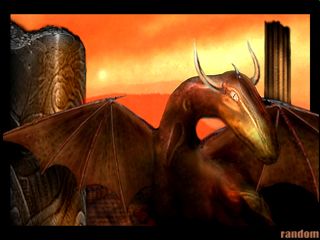
hehe our oldschool friend da red dragon :)
but where is our other oldschool friend da painted girl ? instead there is a muscleman screwing a tree (?) maybe painted by a girl ?
but where is our other oldschool friend da painted girl ? instead there is a muscleman screwing a tree (?) maybe painted by a girl ?
oldschool is still the worst excuse for not being able to write proper code i've ever heard. this demo shows of absolutely no imagination with all effects being either totally obvious or described in at least 6 tutorials within the past decade. worst part: the esc button doesn't work.
I liked the feeling of this demo, but I can't say I liked the demo itself. For an oldschool demo it lacked a lot of presentation features and transitions that I'd associate with many such demos of this period.
I do like the idea of adapting a retro format to new hardware, but I think the Pilgrimage Invite was a better way of going about it.
I do like the idea of adapting a retro format to new hardware, but I think the Pilgrimage Invite was a better way of going about it.
Yet another below average 'oldschool' reincarnation.
Well, what can I say... I'm a girl, I happen to like drawing hunky centaurs fighting with evil sylvanians.... too much Ravenloft shit in my subconsicous I guess. But I'll do a special for the next one guys, and I'll do a few pinup chix.
oldskool forever
ok prod
Not enough...
oldskool rocks - newskool sucks
rocky
cool! real ninties-feeling, but too short..
very good if i remember correctly
meh. somehow i feel my 1.8GHz PC can do better that this
If you can't show off, entertain with your demo. Since showing off with old school effects is very hard these days there is only one possibility. And I was good entertained.
I just wonder why everybody + dog believes that a demo must have 3d shit and softsynths to be cool. Where are all the Pixelpushers gone :( *sniff*
Big!
"unable to set graphics mode"
win 2k professional, p4 2Ghz, directx9, ATI Fire GL8800
win 2k professional, p4 2Ghz, directx9, ATI Fire GL8800
woohoo, back to 90'
LAL
LAL
...but the end sucked
Love it. Nostalgia trip from start to end. Funny, too.
Yeah, I liked it. Oldskool in everyway, almost...
oldshit is ok but in 800x600 minimum with antialiasing please! and quit at the end
Does anybody here have this file somewhere? I made this (terrible) demo years ago and I lost all my files in an HD crash. Nostalgia bug bit me and now I really wanna see it again :(
Gargaj uploaded it to scene.org and link has been fixed now :)
NO WAY!!!! You guys fucking rule! Im gonna shed a big fat tear of nostalgia right about now :D
submit changes
if this prod is a fake, some info is false or the download link is broken,
do not post about it in the comments, it will get lost.
instead, click here !
