|
Sailing Beyond by Aberration Creations
[nfo]
|
||||||||||||||
|---|---|---|---|---|---|---|---|---|---|---|---|---|---|---|

|
|
|||||||||||||
|
popularity : 59% |
|||||||||||||
alltime top: #7390 |
|
|||||||||||||
| added on the 2018-09-02 20:12:25 by 100bit |
||||||||||||||
popularity helper
comments
I enjoyed the great variaty and mix of color schemes used. Sweet.
Impressive!
Wow! 16k is the new 64k. Superb soundwork. Clinkster ?
Nice, love the tune.
Yeah sounds like clinkster, great music from jammer! Visuals are alright, some scenes better than others. I appreciate the fact that the landscape feels properly big though.
when the music is so good who cares about visuals.
Can’t wait for the final version!
Too many pointless fade outs into nowhere, and ugly raymarching artefacts in the terrain. Last scene was definitely something new that awoke my interest, and that saves it from a thumbs down.
Good content, somewhat subpar rendering. Some of the scenes were quite exciting even though they didn't look very well. Great music makes it a thumb though!
Nice! Ugly artifacts are ugly, but the music is nice as are some scenes, and what noby said about the landscape (as someone who's screwed that up before, good job!). Also the triangles remind me of the greetings part in Blazar :D
I also get very similar graphical problems as Gargaj on nvidia, performance is also really bad...
I also get very similar graphical problems as Gargaj on nvidia, performance is also really bad...
(to clarify, I'm referring to me when I say "as someone who's screwed that up before")
Fine zik and some nice scenes.
I love the creepy scifi vibe in the first part and the lighting and the mood in the landscape in the third part. The middle part felt kind of contrived though and the end parts felt kind of out of place. Still, great-looking visuals and a cool soundtrack.
too bad that it has some quite ugly scenes compared to the good ones. but fantastic soundtrack. nothing i'll re-watch but not bad at all. and thumbs for 16k!
i like this a lot
starts good, little let down in the middle, then very strong finish in the last two scenes =)
Okay the Youtube video is completely different than the intro in the archive.
What's going on?
What's going on?
tested the exe on 3 machines now. same problem as gargaj on nvidia cards.
GTX750
GTX1070
so it seems all nvidia cards.
GTX750
GTX1070
so it seems all nvidia cards.
Quote:
The differences you wrote about in the first entry (no ship and others) are caused by a different, incorrect calculation of the location and rotation of the camera on NVIDIA (I don't know if on all or "only" on 10xx).
I have an RX 580 and it looks different on that too.
my favourite in the compo
this is nice!
(also, what everyone else said about nvidia (mobile 1050 here, ~1fps and camera paths are all wrong; i would be willing to help with looking at sources and fixing that, but not sooner than late next week)
(also, what everyone else said about nvidia (mobile 1050 here, ~1fps and camera paths are all wrong; i would be willing to help with looking at sources and fixing that, but not sooner than late next week)
Nice!
The snare sound is awful and the bass is just loud legato all the time, which makes it a bit numbing. I'd rather take a swinging beat feel where the bass shuts up on snare hits. Like what people had to do in ProTracker mods for technical reasons.
The snare sound is awful and the bass is just loud legato all the time, which makes it a bit numbing. I'd rather take a swinging beat feel where the bass shuts up on snare hits. Like what people had to do in ProTracker mods for technical reasons.
If you think it sounds like crap even to you, why did you leave it in? :) The art of size-limited intros is usually about carefully selecting things from the limited amount of stuff that works, and leaving out things that don't...
Great prod! :) Keep it up, guys! :)
Hey if you think your snare was good enough for whatever you tried to do, there's no need for technical excuses.
Don't know about raymarching artifacts, but some of the landscape scenes look a tad too much like basic noise. Hwoever, they convey the sense of scale, and the ending scene with the bubbles was a nice touch.
Worked for me. I would have liked to see more direction, though (for example, the ship exiting the portal into the alien world - the first portal already looked nice).
yep
Nice 16k a thing flying trough triangles
After leaving the first triangle scene my mind started to sail away into the wonderful!
solid
Quote:
The source code will be available on request and even with pleasure if someone would like to have a look at this issue.
Is the issue still present? I could take a look at it.
Lovely tune!
submit changes
if this prod is a fake, some info is false or the download link is broken,
do not post about it in the comments, it will get lost.
instead, click here !
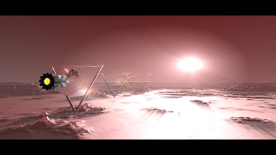
Also note how the scene is mirrored relative to the screenshot, the terrain is different and there's no spaceship?