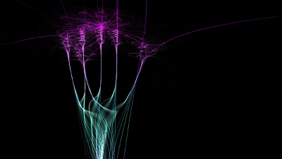
| Gedankenmikroskop by Intense | ||||||||||||||
|---|---|---|---|---|---|---|---|---|---|---|---|---|---|---|

|
|
|||||||||||||
|
popularity : 52% |
|||||||||||||
alltime top: #18151 |
|
|||||||||||||
|
||||||||||||||
| added on the 2019-04-22 02:34:27 by Intense |
||||||||||||||
popularity helper
comments
apart from the length i loved it
rulez added on the 2019-04-22 02:54:35 by nagz 
Starts to shine towards the end, the first half drags on for a bit too long with too much black on the screen. Still:
Visually really pleasant to look at but about 1/4-1/3 the length would've been totally sufficient
Have to agree with others here. It was far too long. The effect is absolutely beautiful, but picking two seeds and making to 45-60 second scenes with those would probably have kept it shorter.
Long but nice!
Beautiful but far too long
My favourite of the compo.
Nice. I tried the same thing once before, but not in realtime.
too long
Looks so nice, but way way way too long! Nevertheless damn great for a first (?) prod.
beautiful!
Lovely fractal flame aesthetics! I was a big fan of Electric Sheep back in the 2000s (actually wore their t-shirts to some parties), so this hit right home with me, but you should definitely look into pacing next time. Nice soundtrack as well.
Nice, although a bit too long.
Very interesting effect. The circular form at the end looks best, IMHO.
A background would've been nice, or maybe a subtle glow around the lines (or a scaled down blur + texture filtered scale up).
Gimp mockup: Gedankenmikroskop-blur.png.
A palette animation would've added some more variation.
Any chance you could upload this to Github ? :-)
A background would've been nice, or maybe a subtle glow around the lines (or a scaled down blur + texture filtered scale up).
Gimp mockup: Gedankenmikroskop-blur.png.
A palette animation would've added some more variation.
Any chance you could upload this to Github ? :-)
Nice. Maybe too long.
waaaaaaaaaaaaaaaaaaaaaaaaaaaaaaay tooooooooooooooooooooo loooooooooooooooooooooooong which makes it boring very fast. on the other hand pretty good for a firstie :)
A bit long, but very stylish!
nice
submit changes
if this prod is a fake, some info is false or the download link is broken,
do not post about it in the comments, it will get lost.
instead, click here !
