|
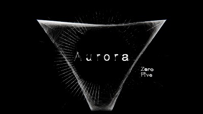
Aurora 05 by Cocoon [web]
[nfo]
|
||||||||||||||
|---|---|---|---|---|---|---|---|---|---|---|---|---|---|---|

|
|
|||||||||||||
|
popularity : 65% |
|||||||||||||
alltime top: #2409 |
|
|||||||||||||
|
||||||||||||||
| added on the 2019-04-22 14:00:22 by 100bit |
||||||||||||||
popularity helper
comments
Was not bad, but for sure not my personal favorite of all the Cocoon demos :)
rulez added on the 2019-04-22 14:23:02 by Sapphire 
A very typical cocoon demo; lots of huge effects, big soundtrack and very tight sync. A very well made demo, but I would like to see something different in the next demos..
the music is good and i thumb the entire demo up, but only because i Kinda feel like i have to thumb it up - still a great tech feat after all - in hopes of seeing something new next time
This was a sick, heart-racing experience.
Great effects and style. i never thought i would say this, but the cuts, speed and overall in-your-face-ishness was just a notch too high for me
I have the feeling to see the same demo every years
Kicked some serious ass sitting in the front rows.
I loved the music and the fast pace.
Using someone else's engine for effects that all have been done before mmm. I liked the demos with Cocoons engine a lot better. If this wasn't made with Notch it would have been mindblowing but most of these effects have been in Fairlight demos since mid 2000. Piggie because it still looks awesome nonetheless and it is clear that a lot of effort has been put into it.
was ok, but I have seen better from Cocoon. Still liked this one.
nice demo
Technically well done, hence the thumb, but I feel it just looks and sounds like everyone else's major demos. DnB, skinny brightly lit wireframe shapes, etc.
looks great
Could definitely have won. I can see you're getting better and better at making demos with Notch. =) The hallway with the synched lights was great, as was the mirrored 'fluid' near the end. Awesome work.
So into this! Wish we could have spoken more at the party!
i don't understand all the arguments and resentiments about cocoon presenting the same demo again and again.
to me this demo is different and another step forward to a new direction. awesome tasteful visuals and a great, wild soundtrack. i like it a lot!
to me this demo is different and another step forward to a new direction. awesome tasteful visuals and a great, wild soundtrack. i like it a lot!
There's so much quality content here !
And that hallway scene :) Damn ! It was looking awesome.
I wish I was there to see it on the big screen.
Great job !
And that hallway scene :) Damn ! It was looking awesome.
I wish I was there to see it on the big screen.
Great job !
cocoon as usual
Nice demo!
Greetings back from Nah-Kolor :)
Greetings back from Nah-Kolor :)
Quite a few great ideas, good one as always!
Some beautiful individual bits are in there somewhere, but overall it's just too much of a mess for me. Way too much happening all at once.
how this didn't clearly win is beyond me. I just love everything about it ♥
same stuff, different party, could've been more impressive weren't it not reheated effects from old fairlight demos
Nice
very cool! solid rule!
Well done! rocks!
Stylish. And no more blood and violence.
some really neat scenes, but what Preacher said ; i felt too much overloaded with content, perhaps the demo would have been far better with some pruning
Enjoyed it, even if there wasn't much new stuff.
I still feel that Terminal 7 is the ultimate Cocoon drum and bass demo. Terminal 7 is heavy and moves like an angry t-rex. This one jumps around more like an angry chihuahua or a wasp or something.
Aurora05 is also awesome of course and got a really nicely twisted track. I especially love the scenes which mix some abstract shapes with realistic shapes. Like the forest scene.
I for one welcome another 20 or so drum and bass demos from Cocoon.
Aurora05 is also awesome of course and got a really nicely twisted track. I especially love the scenes which mix some abstract shapes with realistic shapes. Like the forest scene.
I for one welcome another 20 or so drum and bass demos from Cocoon.
Hmm... I like the music, but the rest is too hectic, too cramped and indeed looks like re-hashed Fairlight effects in many places.
This must have been a ton of work, but I wish there was less but more original stuff in there...
This must have been a ton of work, but I wish there was less but more original stuff in there...
One step closer to ultimate time-warp lighting / 300bpm gabbercore white noise sound / machine gun bullet rain in your face fx Cocoon demo :)
Impressive buildup but when the Goldie beat drives in, completely loses sync and focus.
Quote:
This one jumps around more like an angry chihuahua or a wasp or something.
And that made it horrible for me.
it stutters so much.. ryzen 2600@39.0x so i don't think it's cpu bound but Even in 800x600, GTX1060 doesn't seem to handle this.
nice work ntsc! really cool stuff as always!
great visuals
Les vrais vainqueurs sont ceux du coeur.
Totally awesome demo, I dig it 586% (oh Kevin, why...)
This feels empty for me, unlike a lot of the earlier Cocoon stuff (including the previous Notch demo). Turning lights on and off to show off Notch…
present a tunnel and then have no tunnel effect, fook off mate.
Not bad !
Quote:
i Kinda feel like i have to thumb it up - still a great tech feat after all - in hopes of seeing something new next time
This. Everything is just as stale as it is high-tech. There is only one scene that is actually new and worth discussing—the hallway lights—and even that has a stylistic choice that doesn't sit well with me: the invisible light sources. I don't know.
Notch, but not top notch this time
Great work on the effects and sync with the music is really tight and fitting. But more than 3 cuts per second is probably inducing ADHD over longer peroids of time. It fits the hectic of the music, but not sure if that's too much (at least to me it's unpleasant and distracting instead of exciting).
Desperately missing color, but still a solid thumbs up overall.
Desperately missing color, but still a solid thumbs up overall.
Too aurally and visually brutal for me.
Nice!
The sync of this heavyweight champion is out of this world, and so is the soundtrack. Unfortunately all the visual stuff doesn't taste fresh anymore as we've seen nearly everything of it far too often in the last years. I really love this demo, but Cocoon really needs fresh design input now.
Technically impressive as per usual, but devoid of any soul or innovation whatsoever. And while I'm usually a sucker for DnB, the soundtrack was mostly grating and annoying to me.
You can polish a potato to a mirror shine, but it keeps being a potato. I'll take Kevin over this any day. Challenge yourself mate, you're such an excellent designer I know you can do different! :)
You can polish a potato to a mirror shine, but it keeps being a potato. I'll take Kevin over this any day. Challenge yourself mate, you're such an excellent designer I know you can do different! :)
feelings of dejavu....
not even for the music ...
This deserves so much more praise imo... It's a large step forward in visuals compared to previous Cocoon 'flyby' demos. The sync is great, the visuals - effects even if using Notch are mind-blowing. Everything based on the spot on soundtrack. My favorite Cocoon demo from last years.
Not my cup of tea.
Cocoon can do better. The light scene was cool tho
sorry.
Really stylish
Quote:
One step closer to ultimate time-warp lighting / 300bpm gabbercore white noise sound / machine gun bullet rain in your face fx Cocoon demo :)
I unironically want to see this.
greetings part and the scene after that were amazing. the rest was ... what DanLemon said.
Started fairly weakly for me, the first scenes with the cube and the underground station didn't fit the pounding d&b at all, but as the demo goes on it becomes a lot stronger and I enjoyed most of the scenes in the second half. The music fits, there's good variation with excellent sync, and it just throws more and more at you. I want to look closer at the little touches you put in, but the opening scenes and how slowly notch demos run on my 1060 (some scenes were like 5 fps) make me less interested in rewatching it over and over..
I disliked the demo but enjoyed the epileptic seizure
b/w attack! :)

:D
The demo is still head and shoulders above average, but the problem with it is that it's just not memorable - a lot of the times with a Cocoon demo the music has to carry the experience, and neurofunk, by design, isn't necessarily a genre that's capable of that in itself. (Finally Inside is a great example that can pull that off.)
No.
Some really great looking stuff in here! (albeit also a few things that resemble things we've seen before :) )
However I feel that several scenes/sync work can't keep up with the audio, and in the end the sum of all parts doesn't add up as well as they could.
A clear thumb nevertheless.
However I feel that several scenes/sync work can't keep up with the audio, and in the end the sum of all parts doesn't add up as well as they could.
A clear thumb nevertheless.
Top notch (pun intended)
Great Coocon demo, kick ass effects and music and first Notch thing from NTSC
awesome, in-your-face style. The hall and the river scene were fantastic
watched it again with proper device.
really liked vhs loss effect!
really liked vhs loss effect!
It is definitely lightyears better than a typical cocoon demo with boring flybys over Quake III maps.
Tunnel scene was very good.
Tunnel scene was very good.
Some parts, like the tunnel part, are simply great, while others are too much (for me). Even though the overall style is not really my cup of tea, I do appreciate the dedication, presentation, sync, and the amount of work that was put into this demo!
this demo is literally throwing at your face with all that VFX done there.. I understand why this can be too much for many. Watching it may include epileptic risk.. still great and coining what Cocoon style is.
nice one
lists containing this prod
submit changes
if this prod is a fake, some info is false or the download link is broken,
do not post about it in the comments, it will get lost.
instead, click here !
