|
Nervous Breakdown, Part I by Optic Nerve & MRi [web]
[nfo]
|
||||||||
|---|---|---|---|---|---|---|---|---|

|
|
|||||||
|
popularity : 61% |
|||||||
alltime top: #9118 |
|
|||||||
| added on the 2003-10-28 13:19:11 by izecolt |
||||||||
popularity helper
comments
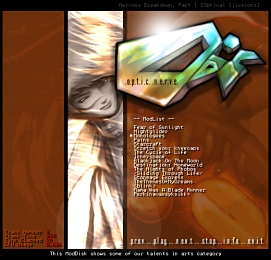
Optic Nerve's first release. Hope you'll like it :)
added on the 2003-10-28 13:20:18 by izecolt 
Being the composer of our silly darn group, I have to say this really kicks ass :D
the graphics art and the songs are a pleasure :D thought, i would like you to use a bit bigger font next time ;)
tmb, we'll put that hint behind our ears :)
Nice.. Gute arbeit
Thanks guys!
I often play musicdisc's while coding so new releaes are more then welcome!
Good songs with a neat interface.
I often play musicdisc's while coding so new releaes are more then welcome!
Good songs with a neat interface.
Nice music and graphics, but compared to some older Amiga music demos, I can't help thinking that PC music demos (not only this one) have taken a huge step backwards.
First of all, it's just a menu; no introduction sequence, no fancy presentation and no real features. And secondly, the filesize is just too big for what it is, especially considering that some of the best music demos come on 1-2 disks.
It's just my personal opinion, but I think a music demo should be more than just a player and a static picture.
Ok, Wade, I think we got your point ;) But hay, thank you for your opinion.
As you might have noticed, this musicdisk is our first project and there might be some problems here and there (and this is why we desided to post this prod here, so that we could get some ideas from you guys). Secondly, we're not really coders of any kind (atleast, not yet) and doing this prod was kinda cool 'couse you really had some sort of point where to aim.
Kettunen's music is very Amiga-stylish, thats for sure, and our goal was to make some sort of retro-kind-of-musicdisk. I think we managed in that some how, didn't we?
*rotfl* nice first project :)
Oh God, Pouet flipped out on me for a bit there. :)
But anyway, my criticism isn't really of this music demo at all, but more of the modern format of all PC music demos. But as you mentioned, the music has a traditional Amiga style, which I did enjoy a lot and the more I play it, the more it grows on me, so here's my thumb too... :)
But anyway, my criticism isn't really of this music demo at all, but more of the modern format of all PC music demos. But as you mentioned, the music has a traditional Amiga style, which I did enjoy a lot and the more I play it, the more it grows on me, so here's my thumb too... :)
Wow, this one really rocks, nice graphics and design + cool music.
I have always been very critical on my own composing, so thanks for all these positive comments here... However, I think I still have plenty of room to develop myself as a composer, due the fact that some of these songs are four, five years old. These days I have been making some efforts to go for more analogue sounding music, trying to enhance the experience towards somewhat more pop-like, but still melodic and moody music with edge. I hope you guys will like our next musicdisk, which we will make in the future, although the exact timing is yet unknown...
Really Nice :) Nice Tunes but a little bit static Interface, but not bad :)
Great stuff. Really reminds me of some oldskool amiga music disks (at least the music does). Sadly, the interface bugs on my pc (i get whitespace all around the interface, and the buttons and song info are in that whitespace area, not in the actual picture).
Keep up the good work and looking forward to next tunes.
Keep up the good work and looking forward to next tunes.
Some of it is ok, some of it is not so good. But the on going concept of the musicdisc is mediocre. There is nothing that makes the tunes stand out in their genre.
nice prod with cool songs... i´am waiting for your next musicdisk. ;-)
Nothing hits the spot better than being called mediocre. This was our very first release ever, and yes I admit there are some shitty tunes, which izeColt liked for some strange reason, but at least we tried to create something remotely enjoyable, instead of just sitting around and watching our fingernails growing... We promise to try harder next time, iblis. May the schwartz be with you.
this is good. i like the tracks, and the interface too.
One small request: do something to make it either appear on the taskbar or better alt-tab-able... right now it tends to get lost behind windows and between desktops, which can get pretty annoying...
One small request: do something to make it either appear on the taskbar or better alt-tab-able... right now it tends to get lost behind windows and between desktops, which can get pretty annoying...
FooLman, we'll get our hands on that bug. Thanks for noting us.
z5, what OS are you using?
z5, what OS are you using?
kettunen. Dont get me wrong mate, it was not a negative comment. Far from it.
Yeah, I know. No problemo, mate. Btw, has anyone noticed our "hidden" extra yet? ;P
@izeColt:
The standard stuff: Windows98, Geforce2
The standard stuff: Windows98, Geforce2
Roger. I'll try to check out what's happening in there. Thank you for your feedback, z5.
Argh! Mother-fucking-admin of helium.wakkanet just pulled our plug off! He said that there was too much traffic on our site and he didn't really like it(!). I'm gonna stick a Key Tronic keyboard in his arse...
Anyways, new mirror is on its way.
Anyways, new mirror is on its way.
http://www.lowfidelity.org/~rotator/OpNrv/OpNrv_NB1.rar ... Here ya go!
Some good tunes, interface is pretty, but it would be nice to see more happening, not just a pic + basic (and hard to read cause it fades too much) scroller.
Still worth a thumb up.
Still worth a thumb up.
bad music
Then we got that goal achieved, spengler. Our next production will include even worse, that's a promise ;o)
great graffix, music is ok
nice gfx, but i don't like the music
I don't like the music either. Nice gfx though, izeColt kicks ass! Btw, who the hell this Kettunen thinks he is?!
Announcement: the next project is on the way and it will be a media player to play all that good music instead of my crap. The deadline of the release will be Feb 28th and the player will be coded by izeColt, including maybe some additional code from me, depending on various things like the spread of time and intelligence.
Well, I think that Kettunen has managed to do some personal stuff in here. After all, we all have our own taste of music. If you just don't like mods, maybe you should stick on chipdisks... or listen some junk from MTV :P
And no, I don't say that chips are bad. Actually, I listen to them too! Just wanted to add this so non of you hard-core sid-fans gets pissed off...
Horrible
dlink isn't working anymore.
submit changes
if this prod is a fake, some info is false or the download link is broken,
do not post about it in the comments, it will get lost.
instead, click here !
