|
Elektrofunk by Razor 1911 [web]
[nfo]
|
||||||||||||||
|---|---|---|---|---|---|---|---|---|---|---|---|---|---|---|

|
|
|||||||||||||
|
popularity : 67% |
|||||||||||||
alltime top: #3107 |
|
|||||||||||||
| added on the 2003-08-25 16:21:27 by kb_ |
||||||||||||||
popularity helper
comments
It's ok, I'd say.
deserved to be 1st, imho. nice design and very well fitting musick.
mediocre
dull
Runs really slow on my system and is totally out of sync.
Except of that it's atmosphere doesn't really catch me..so pigface
Except of that it's atmosphere doesn't really catch me..so pigface
didn't work correctly on me (e.g couldn't see scene of screenshot), it was about 2 minutes in scene where were particles + woman smoking
surprising!
nice music + synchro.
some things don't fit in the overall appearance, still a very cool intro.
some things don't fit in the overall appearance, still a very cool intro.
it's ok.
nice composition of old stuff.
horrible syncing. (But my system is only slightly above the req's mentioned in the .nfo)
->the reflection on the water is about 1 second behind ....
nice composition of old stuff.
horrible syncing. (But my system is only slightly above the req's mentioned in the .nfo)
->the reflection on the water is about 1 second behind ....
undying Razor ! very cool demo with an attitude !
the 2d babe at the beginning made me expect a lot of style.
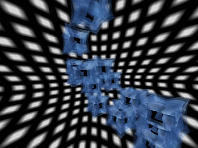
all that was coming was some cube stuff.
all that was coming was some cube stuff.
Quite good intro, atleast much better than some other late Razor intros.
ok
elend said it: surprising, for a razor prod.
but too empty and barren somehow.
and the music sounds weak.
but too empty and barren somehow.
and the music sounds weak.
i like the music and i love that horizon and clouds stuff...
kann man machen.
Very decent music, one or two pleasing effects, but quite forgettable in its entirety.
Very Delightful Intro.
The font writer was awsum.
The font writer was awsum.
hmmmm
don't know what to think about it
not my stuff at all
same about the music, mediocre demostyle.
i didn't get the idea of the sky.
not much design in this whole stuff.
don't know what to think about it
not my stuff at all
same about the music, mediocre demostyle.
i didn't get the idea of the sky.
not much design in this whole stuff.
nice music.
nice design.
nice design.
rp: muss man aber nicht.
The music was cool, some parts were slow on my PC.
ryg: den versuch war es doch wert ;)
great intro
cool music, cool sync, best 64k from evoke for me.
It's still a very unfinished party version, expect a "elektrofunk" logo aswell as design-tweaking in final version.
Run bloody slow on my PC, and crashed after the first buffer underrun :)
(Work more on the synth guys :)
On another box it went 100% OK, and it was COOL, the music was sweeeet, the sync was great (I guess the others' syncing problems are because the sync-thread runs independently from the visuals, which is synced by timeGetTime(), so there is no connection whatsoever :), altho I expected something else other than Arial Black for the starting titles :)
Standard objectshow, but the music+sync saves a lot.
Not bad at all. But it seems to need a bit of tweaking timeline-wise, and maybe some more camera movements. I'll wait for the final version.
like it, and music rox :)
yes, its nice!
gave me a totally black screen on a S3 ProSavage. A little more specific requirement-list would be nice. The music was in general good, but a bit too tame and slowpaced to make the show enjoying without visuals ;)
(I'll rate the intro when I have seen it at home (if I bother))
(I'll rate the intro when I have seen it at home (if I bother))
more i watch it , more i like it.
simply the best
yeah music and sync are amazing
yes
didn't like it, lacked something..
nice intro
A completely mediocre production.
A nice intro is once again ruined by some ugly scenes. When will coders learn to consult some graficians/designers before releasing a prod? ;)
Great, I love it.
All 12 ALiENthumbs up!
All 12 ALiENthumbs up!
good music and nice skies. rest a little cubey but certainly a thumb.
jep
Fat thing.
+ nice sync
++ nice music
+ nice code
+ nice size!
--------------------
cool show, thumbs up
++ nice music
+ nice code
+ nice size!
--------------------
cool show, thumbs up
nice gfx, piggy
Simply great...
I agree with hellfire, I was expecting so much more after that gfx. A collection of mostly mediocre effects that is saved by great sync and decent music.
Is ok - running at 1fps after the second effect is not really enough to give a thumb.
nice sync and music but the effects are not really special.
nice rzr1911 demo :)
nice
No.
nice
Elektrofuck .... ährm, 'funk!
Well, thumb up, because rez demo. ;D
Well, thumb up, because rez demo. ;D
Great music... :D
the beginning is nice
the pulsating thing in the tunnel ruins it for me though
the pulsating thing in the tunnel ruins it for me though
A huge inspiration for me back in the days! Vibing to it till this very day! :)
P.S. RIP Stv. :'(
P.S. RIP Stv. :'(
mkay
submit changes
if this prod is a fake, some info is false or the download link is broken,
do not post about it in the comments, it will get lost.
instead, click here !

the design is too poor, with very bad transitions... several fx could be skipped
but it's far away better than the 1st intro from the evoke