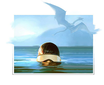
|
Our Other World by Hoodlum [web]
[nfo]
|
||||||||||||||
|---|---|---|---|---|---|---|---|---|---|---|---|---|---|---|

|
|
|||||||||||||
|
popularity : 62% |
|||||||||||||
alltime top: #7070 |
|
|||||||||||||
| added on the 2017-08-22 11:09:18 by unix |
||||||||||||||
popularity helper
comments
Really awesome demo love the music too
rulez added on the 2017-08-22 11:18:39 by Queen_Luna 
Nice effects and good music, enjoyed it.
Real winner for me
Real démo VS Shitbag = Shitbag winner...Very nice compo really...
Go to backschool germany ;)))
Real démo VS Shitbag = Shitbag winner...Very nice compo really...
Go to backschool germany ;)))
Cute
Really cool stuff!
Hoodlum does the best demo composing around looking at the merging of 2d, 3d , music and code in one great composition! keep it going!
The intro promissed something really kickass, unfortunately later the level drops down with incoherent direction. Keeping my fingers crossed for a next even better demo.
looks (mostly) very nice. but the voice is absolutely not my cup of tea which kinda ruins the experience. i think a piggfayse is fair.
decent
Top!
Alright, I'll be the guy. It was an ok demo for the first 80 seconds. Yes, somewhat corny tag-cloud-style term dropping in the track (this went out of fashion in the 90s, mind you), but at least there were pleasant visuals to compensate.
And then it went downhill completely, as if somebody had sabotaged your demo—either purposely or in a drunken stupor. The dragon model and especially its animation look just laughably bad and tacky; moreover, exactly none of the scenes benefit from it thematically—removing it would actually make everything better. Was it meant to symbolize "imagination", "faster", etc., and clumsily juxtapose "assymmetric cryptography", "HTML", and "virus" in the "lyrics"? The fly-by over the terrain was somehow made less eventful and impactful compared to every size-optimized intro I've seen in the last decade that attempted to do the same. What exactly makes it so interesting that we need to look at it for minutes—surely not the generic flailing-around camera paths? The fonts are horribad and thematically unfit, and the way the black "I'M FREE" emerges from the ground is cringy in a way rarely seen even in newcomers' first-time demos. I mean, you've been at this for years, surely you must have some standards of artistic decency? The glowing dot during the fly-by doesn't cast shades or really do anything—did you just forget about it or something? The scene at 3:50 is drawn out beyond any comprehension and has very confusing light sources: the light comes from the back but it's the camera-facing surfaces that get illuminated. Though to be fair, everything about the direction of this demo is confusing. The strobing light during the credits scroller is annoying and pointless, and once again the surfaces are illuminated from the wrong side. Music is lively but ultimately bland, and certainly not strong enough to tie together the mess of scenes; besides, I don't understand why the composition has to jump around so abruptly. The overall sense of coloring can be summarized as "fifty shades of turquoise", which is weird because intuition and common sense suggest you aren't supposed to color the world of IP addresses and the world of dragons and bad fonts in the exact same tones if you want to juxtapose them.
Also, I don't remember the screenshot scene being in the demo. Also, selfvoting!
The amount of things wrong with this release is genuinely impressive, but that's not how I would want to be impressed.
It's not pretty in many ways.
The only cool effect came from here:
https://www.shadertoy.com/view/MsjBDR
The only cool effect came from here:
https://www.shadertoy.com/view/MsjBDR
Basically all of Moozooh's points are valid. However, I kinda feel that it's probably not as bad as it's made out. Sure, there's some really weird design choices and the music is kinda generic, using publically available samples for the song, that have been heard quite a few times before. But even with all of the above, one have to also consider the amount of time this must have taken to create. You very obviously had a story/concept that you wanted to convey, and put some effort into doing so. So all in all, a piggie.
this dragon shouldn't be able to fly with such wings moves ;)
So, maybe not the best demo ever, but for me it should have won this compo. It featured the second best music track of the whole party as well, following Poo-brain's Yermom which was really awesome (and inside a 64K). At some moments it sounded pretty much like your demo from last year (Solar Storm), as if it had come from the same album of the same band, although the style is completely different. Overall, well done, totally deserved thumbs up!
Wow, some parts just grabbed me.
Nice soundtrack and some good parts, but all in all it felt a bit like an incoherent mess.
That music! nice talking to you again unix!
Technically acceptable. Visually horrible. Tune and style is way beyond my comfort-zone.
Kudos for doing "your thing", but please get out if the valley.
Kudos for doing "your thing", but please get out if the valley.
The effects and progress of the prod are good, the visuals itself are messy at best.
The soundtrack was enjoyable so that makes it a weak thumb, I hope its mostly original work ;)
The soundtrack was enjoyable so that makes it a weak thumb, I hope its mostly original work ;)
A bit conflicted about this one... mostly what moozooh said. But that screenshot, wow, looks great, reminds me of old Fairfax stuff from Seven Seas etc! Buuut it's not in the prod, wtf? Poor form old bean..
Obviously a lot of work. Congrats for shipping the demo!
My recommendation would be: remove some content, remove the least interesting scenes, shorten the long scenes. Make your demo just 3 minutes, but make sure the content you keep is polished.
Watch your demo without the sound and you'll notice which parts are too slow, long, or boring. Camera is difficult to do, but please try a bit harder. If you change your shots and camera moves, you can make the content much more enjoyable.
Good luck with your next demo!
Lots of work and skills that cannot deserve a thumb down. Disappointed as it feels it could have been much better
feels really inconsistent -- some of the content is ace and some is... weird.
If i completely ignore that dragon and those ugly fonts clipping with the environment this was quite pleasant to watch and listen to.The 3d to 2d part in the end was nice.
As others said. weird is probably the best description.
so a weird thumb.
As others said. weird is probably the best description.
so a weird thumb.
yeah, coming back for the weird thumb too..
Inconsistent and a bit weird
I have to appreciate this attitude of "just doing it" and not giving a damn if some parts are not polished before starting to work on the next one. The 3d landscape transition at the end was indeed very inventive.
Nice soundtrack at the very least
So much in this, such variation, but somehow I really like it. I especially love the Dragon and Mountain scene with the very nice palettes and subtle PP effects. Also the mountain and sky scene near the end is beautiful too. It's such a mixed bag, doesn't appear to be consistent. However, keep doing what you love, I really enjoy the different and positive experience I get from watching your demos <3
loved it
best thumb down ever! will watch this gem later
"fifty shades of turquoise"
Läuft.
Läuft.
The 3D text kinds ruins it for me
Also what's with the screenshot that's not in the demo?
Also what's with the screenshot that's not in the demo?
submit changes
if this prod is a fake, some info is false or the download link is broken,
do not post about it in the comments, it will get lost.
instead, click here !
