| Uusimaa by Deluxe & Premium | ||||||||||||||
|---|---|---|---|---|---|---|---|---|---|---|---|---|---|---|

|
|
|||||||||||||
|
popularity : 57% |
|||||||||||||
alltime top: #9656 |
|
|||||||||||||
| added on the 2017-08-06 14:29:25 by 100bit |
||||||||||||||
popularity helper
comments
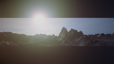
Feels like the Terrence Mallick version of Elevated - which is kinda nice :D
rulez added on the 2017-08-06 14:59:00 by Gargaj 
Shrinking/expanding borders - awesome idea.
Liked.
This was like a UFO has landed in a strange land.
I am no fan of letterbox even for the sake of art, but at least I liked when they went small and they detected the lights. Gives some strange atmosphere of something still going on behind the scenes.
I am no fan of letterbox even for the sake of art, but at least I liked when they went small and they detected the lights. Gives some strange atmosphere of something still going on behind the scenes.
looked and sounded nice. didnt get the idea behind the filtered top and bottom.
not so sure about the glowing orbs the kinda feel out of place for me. might have worked better with a simple single glowing cube ^^ but nice visual quality, fitting soundtrack and great work with the top/bottom bars. nice one.
the orb disconnection from the scene has an artsy wtf moment to it. nice overall tension and quality =)
The terrain looks a bit perlin noisey (and feature scales are off, a lot). But everything else is just right. Love the music, nice feedback and delay :D
clever
I really like this.
@psenough it separates the viewer from the realities of size coding bugs
@psenough it separates the viewer from the realities of size coding bugs
I agree with noby that the terrain didn't look particularly great, and I constantly got the feeling that those weird glowing orbs are suffering from some kind of Z-sorting bug, I couldn't put that part together in my head at all.
On the positive side, playing with the letterboxing was a nice touch, and I dig the overall mood as well.
On the positive side, playing with the letterboxing was a nice touch, and I dig the overall mood as well.
ok
not sure what to make of this
the rendering is pretty and the letterbox-effect quite neat but the scenes seem hollow and too uneventful to stay interesting, even for a calm and atmospheric production.
somehow this tries to carry more atmosphere and mood across than it actually does (to me, at least...)
the rendering is pretty and the letterbox-effect quite neat but the scenes seem hollow and too uneventful to stay interesting, even for a calm and atmospheric production.
somehow this tries to carry more atmosphere and mood across than it actually does (to me, at least...)
As urs keeps saying, well made postprocess fx/filtering makes such a difference. I seriously had to look away from the big screen instinctively because the sun looked so bright, brighter than a full white screen. That bloom and not so subtle loss of contrast make it seem very much like the real thing.
Short but nice.
nice mood
Pretty cool for OCS. ;)
The lights in the letterboxed area are sublime.
^ I only remember thinking how awful that design idea is and also that someone was laughing hysterically during the presentation.
cdnjkewlcufmh4o5z,mfx
cool
Mystical creator spheres of mother nature :)
Nice
Very creative use of the frame. I would be interested in a full demo developing the idea.
mesmerizing
Those borders didn't work for me.
Any lamer can do a single perlin noise planet...i mean not much work done here... here is a piggy
Shiny, mellow, moody, interesting, surprising, thoughtful <3
submit changes
if this prod is a fake, some info is false or the download link is broken,
do not post about it in the comments, it will get lost.
instead, click here !