|
Feed Your Machine by Faktory
[nfo]
|
||||||||||||||
|---|---|---|---|---|---|---|---|---|---|---|---|---|---|---|

|
|
|||||||||||||
|
popularity : 66% |
|||||||||||||
alltime top: #3402 |
|
|||||||||||||
| added on the 2003-08-10 13:14:32 by zafos |
||||||||||||||
popularity helper
comments
Some effects were good, but as demo it was pretty terrible =)
added on the 2003-08-10 18:07:32 by reality3D 
oh sweet jesus! i loved this production!
very, very very nice work!
ROXS!!!!
very, very very nice work!
ROXS!!!!
Quite nice indeed. Too bad it's rather chaotic sometimes. Nice Screenshot scene
The effects are rather good, really, but it's taken down, by an put-eveything-in-the-same-bag' design ... too bad !
Yeah, we need some design. Anyone know where I could buy some secondhand design-skills?
Some really cool code, too bad about the rest.
explosion effect rulez, dog rulez, 3D dancer rulez, 3D objects rulez...
Very nice effects (some totally original ones), but needed better transitions between scenes. Didn't enjoy the music that much, but nothing wrong with it technically. Look forward to seeing future faktory prods. If they can address a few things, they have a lot of potential to produce something great.
Some very impressive effect in this.
looks like shit but i like it
I thought this ruled, should have placed higher. It somehow looks like an oldschool demo with some cutting edge effects. Perhaps people don't like that oldschool look anymore?
some nice code (i wouldn't call it groundbreaking) spoiled by the ugliest music, colors and design available on the planet.
The total lack of design makes this prod terrible to watch. Nice physichs though.
groundbreaking code if you tried to do some of this effects before >P
The coder definitely knows his math and physics, but there is no design to speak of and the music isn't so nice either. I hate to say this, but try to copy some other demos! :)
phoenix: try to copy some lamers comments.
[EDIT] oh, sorry , you already have.
[EDIT] oh, sorry , you already have.
Very nice stuff happening on screen, but it's put together in such an incredibly shoddy manner!
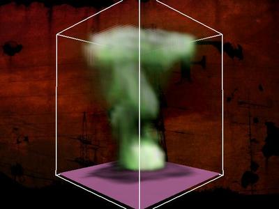
Although the whole design sucks, the smoke effect is SO impressive that compensates. I saw a lot of nice demos in asm03 but this one had me jumping of the chair and yelling.... If this smoke is not from Fedkiw's SIGGRAPH 2001 paper, I'm a gardener... my warm congratulations to the coder for bringing state of the art Computer Graphics research into realtime demos...
Didn't really 'get it' !
But shit-hot effects tho!
FPS was down to 3, at points, on my GF4..
must be time to UPgrade again !!!
But shit-hot effects tho!
FPS was down to 3, at points, on my GF4..
must be time to UPgrade again !!!
some very good fx... but the demo is too messy and ugly... horrible design and music (and i don't want to talk about the gfx)
haha :) rawhed did it again :)
haha.. this makes me rotfl and lol and OMFG.. it makes some kind of statement by looking/sounding like crap while being bloody brilliant in the technical department.. :D si teh h4xX0r
How have I not commented on this one? I could masturbate on the effects and puke on the graphics and design... <3!
nice code. bad design.
Indeed, code work is great. Too bad it takes some more to make it up to a thumb... here flies piggy
Ok Prod
coder porn
final version here.
Amazing prod!
.
I do like Preacher to this prod.
Feel much better now :)
Feel much better now :)
what an amazing shit
Effectdemocoderpr0n!
amazing! Great code!
the fx do it for me!
This one is so weird... I keep coming back to it time after time. It is not that I am so impressed by the physics (they are, however, very good), or from the lack of any design that reads as a no-no bible.
Maybe the combination of these really weird selections in style and the music create a trully hunting experience, putting you in a strange place where all rules have been changed.
So for that I give :
Maybe the combination of these really weird selections in style and the music create a trully hunting experience, putting you in a strange place where all rules have been changed.
So for that I give :
the 2d vortices were cool
Gives me a oldskool feeling with some newer effects in between. The Dog at the end or the walking man are nice. All those triangles, spheres falling on eachother is nice executed.
DeGrySin gfx always rule btw ;-)
This demo could have been so much more
I guess..
DeGrySin gfx always rule btw ;-)
This demo could have been so much more
I guess..
Über
all the things they said
ugly coderporn :)
some of the graphics were quite good. but uh..
ok
codepr0n indeed 8)
horrible code. but GREAT design and gfx!
Nice one. Stands out from the crowd abit.
Pretty ugly most of the time. Some very neat effects though. Thumb for the dog at the end, that must be the most retarded dog I've ever seen. :D
c0depr0n
newton never did this coderpron!
pure coderpr0n!!!1
fumbs up! my next cdc will be for this
okay here's your cdc
sweet to rewatch.
pure coder demo, but thank god most of the effects are actually very cool. lacks a lot in design department unfortunately, and the soundtrack has room for improvement
yeah, what noby said. love the music.
Very cool demo!
submit changes
if this prod is a fake, some info is false or the download link is broken,
do not post about it in the comments, it will get lost.
instead, click here !
