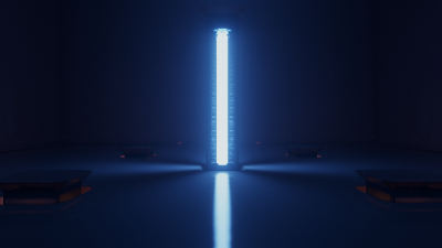
|
delight by Mercury [web]
[nfo]
|
||||||||||||||
|---|---|---|---|---|---|---|---|---|---|---|---|---|---|---|

|
|
|||||||||||||
|
popularity : 71% |
|||||||||||||
alltime top: #713 |
|
|||||||||||||
| added on the 2015-12-29 00:00:24 by cupe |
||||||||||||||
popularity helper
comments
One word: Georgeous.
rulez added on the 2015-12-29 00:01:13 by dojoe 
Hell yeah, excellent code, perfect style, great music
awesome lightning! Top in every aspect. Thank you mercury!
Runs smoothly. Nice usage of inverse spherical fibonacci in the last scene :)
Loved it from the first second.
For style. And science :)
like it :)
It has a disco ball, that alone deserves a thumb. The rest is pure awesomeness......
What a delight!
just dies right away here :/
nice ball
Love the light show, and I really, really like the music. Merry Christmas \o/
What CONS said
well, it looks and sure sounds nice (great track red) but in the end its just not much content behind that one scene.
still, you make it look way too easy once again!
still, you make it look way too easy once again!
Superb lighting, lovely motion blur (looks and acts just like it should). The lighting even makes the teal-orange more than bearable in the beginning, but I don't like the hue-rotate colors that come later. Also nice to see (or not see?) less lofi-optical pp this time :). The scene is nice, and well animated. A less talented group wouldn't have had any idea how to use it properly, but this one does just the right things with it. I don't like the music unfortunately, mainly due to the annoying main instrument.
The flow seems a little unpolished in a few places, but wow, this is pretty!
Looks amazing, you guys keep pushing higher with the visual quality with every release. The synth also sounds amazing. Only problem was the sound breaking down in some parts, not sure if you are pushing the synth harder than normal but I never experienced this before with any mercury release. Maybe my cpu is too slow (2.5ghz quad intel).
Found it meh actually.
After about 15 minutes, deliberated on thumbing it down since i found it bleh, but cannot simply because of the tech involved. The rendering is nice and clean, nice synth, etc.
After about 15 minutes, deliberated on thumbing it down since i found it bleh, but cannot simply because of the tech involved. The rendering is nice and clean, nice synth, etc.
Big pile of rendering tricks, I love it.
Beautiful
I love the lighting
Someone likes Rob Dougan! :) Good stuff, good use of a relatively small scene and great tech!
awwwwwwwww !!!
THIS is ART !
THIS is ART !
I have to agree with mudlord. Left me feeling very uncanny. The excellent light shading saves it :)
Very nice, i really liked the colours, the rendering, and the music as well. Entertaining, as always. Two points of criticism: please please at least random-offset the startpos of your blur, it's way too easy to see the samples. The other is: 7 people, "science" ? :)
Turns out the reason it didn't run was my stupid Optimus setup deciding to run this on the Intel GPU. So yeah, maybe not the biggest surprise ever.
However, even on the NV GPU, this crawled away at an unbearable framerate. Sure, I don't have the beefiest GPU around in this laptop (GT 650M), but we're talking 5-10 FPS. In what seems like 720p resolution, that seems a bit slow.
Anyway, I'll reserve my judgement once I've seen it on a real GPU.
However, even on the NV GPU, this crawled away at an unbearable framerate. Sure, I don't have the beefiest GPU around in this laptop (GT 650M), but we're talking 5-10 FPS. In what seems like 720p resolution, that seems a bit slow.
Anyway, I'll reserve my judgement once I've seen it on a real GPU.
nice nice
great stuff. loving the colors.
excellent and this glow. you made me happy :)
Nice
i liked it...
Yeah!
Ja!
Youtube: https://www.youtube.com/watch?v=InnB7f1IcMA
Nice
Looks nice but left me cold. I particularly dislike the music.
generic.
shiny and awesome!
nice one!
I really wonder what Mercury comes up with for Revision 2016..
Hopefully something out of this world for years to come :)
Hopefully something out of this world for years to come :)
nice and shiny =) last moment, in hindsight, made the whole demo look like some (hyper)cube (zero) effect
From the comments and the people involved I expected more. Nice to see it's not nvidiagl this time, but had to rerun it on maxwel to verify that it rendered correctly.. A higher resolution version - especially for intermediate targets - would be nice, as it is aliasing quite a bit imho (ofcourse the fine structure in the columns isn't helping either). Still looks nice, but not much, and pretty generic content - would have been a good 8k ;)
Mercury are new "Demoscene Light & Magic (TM)". Audiovisual candy.
The geometry looks a little basic, but I love the lighting (so shiny!) and style. Somehow I have the feeling you guys are working hard on a Revision entry, and only spent a little bit of your time on this :)
Awesomeness!
Quote:
I really wonder what Mercury comes up with for Revision 2016..
Hopefully something out of this world for years to come :)
Quote:
I really wonder what Bero comes up with for Revision 2016..
Hopefully something out of this world for years to come :)
Magic, halt doch bitte einfach die Fresse.
Also, what Psycho said. Weak thumb here.
Excellent!
Beautiful!
Very cool light effects and clean rendering. Are the light sources really tall area lights or is it just faked? :-)
But: quite boring demonstration. It feels like that you have all this cool tech, but nothing to use it for.
But: quite boring demonstration. It feels like that you have all this cool tech, but nothing to use it for.
I like the concept, and you squeeze out of that one scene as much as you can. It looks really nice, and music is nice, too - but it *is* a bit generic. Weak thumb up.
I wish Mercury would come up with a different style next. All your demos are having a very similar look, it's all shiny-neon-laser-glowing... While looking very pretty, it's also beginning to get a bit old, despite the great tech behind it.
It's a fine line between having a distinct style and repeating yourself (no offense!).
Hell yeah. Great visuals, great audio. Should have brought my sunglasses, though. ;)
Really pretty disco room (before the party). Now it only lacks some crowd.
good one.
looked a bit lowres and blurry though
looked a bit lowres and blurry though
It's pretty, it kinda has an idea but lacks in direction - in an odd way, it does too much with too little. The multiple different looks from the same effect becomes confusing because they change too rapidly.
But it's pretty.
But it's pretty.
Love this
Another great idea executed with excellence and love for detail. <3
Let there be light :-) Great atmosphere
O_o--b
Shiny!
Very pleasing for the eyes, I even enjoyed the stroboFX, suited for people who normally dislike strobos.... ;)
But.. I find it also a little generic and missing some kind of soul.
But.. I find it also a little generic and missing some kind of soul.
Incredible amounts of style over substance. Substance not needed.
nice lighting effects, but, dunno.. lacks the zing
needs moar lensflare (:
Amazing! A gaspode prod in 64K :))
a little empty content for a 64ko.
too stiff for my taste
i love it!
<3
Pretty! :D
cool lights!
Fucking aye.
the piano has been killing
weak 64k thumbs because it's not my cup of tea. but it's shiny :D
I'm delighted!
I liked it
A demo that Hitler would make
i like
This is a difficult one but still a piggie. Also not sure why this is the winner. Beros demo was better. It was wise to use animation sequences synced to the beat in the first moments to get attention from the crowd. Then we got a downer at 0:50 which feels a little bit out of sync to the whole intro theme. After that you were not able to get back You got a lot of nice post-processing effects though but they don't intensify the attention. Basically they are overused. Good effort.
Impressive and good-looking lighting.
What put me kinda of 'off' when viewing the executable was the antialiasing - as Psycho stated. Are you rendering to half-sized buffers? The particles that emerges, they are very plain and feels kinda cheap in the rest of the scene. Thumbs up for specular bounces on the walls, great work!
PS: I don't think vsync was enabled either? Got screen tearing on a GTX970 (2560x1440)
weird scenery, but great light show!
Fully sick. Loved it.
The visuals, the music. Love it.
love it
i like the dezing and the music. Looks good!
What StingRay said.
Mercury always brining the quality, does fell like they are just warming up for Revision, but thats not a bad thing at all.
wopopopopoppopooopop, that rendering is so beautiful! how the fuck it's possible??
and (as usual) a marvellous music by red!
and (as usual) a marvellous music by red!
clubbed to death
Super pretty rendering and lights. I wish it was showing something slightly more interesting.
in der panorama bar
Shiny!
Nice
Candy for me :) Only flaw: syncs are off by half a second in the start scenes, despite zippy framerate. Later, they sync properly. I liked the hexagon/lens "dissolve". And the abstinence from destructive/disruptive filters. :)
It took a while to sink in (first time I saw, I thought it was too simple), but after a few viewings, I have started to like it quite a lot :)
Nice!
Killing it in 64k.
Sweet!
Technically impressive, to be sure, but it doesn't capture me the way past mercury 64ks have so unfortunately, a piggie.
This rocks. I hated the strobo parts but the rest was nice.
Top notch raymarching as usual.
Awesome
Wicked, had missed this one somehow
Nice
Ah, just watched it again. :) Forgot I hadn't thumbed it up the last time I did so. How to make a single room exciting in 64k or less. ;)
Now that's just showing off. ;)
loved it! the car showroom soundtrack is nice :)
Quite cool. The apparent lack of content is more than forgivable when you present it this well.
Yes, great! I want to be inside :)
lovely video, but after the loading screen I just get a blank display (the shade of grey changes every now and then) - win7, geforce 960- does it need win 8 or 10?
good intro with questionable color choice
cool! have no idea how you do this
the music is *really* not doing it for me, but a great looking demo.
submit changes
if this prod is a fake, some info is false or the download link is broken,
do not post about it in the comments, it will get lost.
instead, click here !
