|
Symbols by Index
[nfo]
|
||||||||||||||
|---|---|---|---|---|---|---|---|---|---|---|---|---|---|---|

|
|
|||||||||||||
|
popularity : 58% |
|||||||||||||
alltime top: #21401 |
|
|||||||||||||
|
||||||||||||||
| added on the 2004-04-18 16:42:38 by rabbit |
||||||||||||||
popularity helper
comments
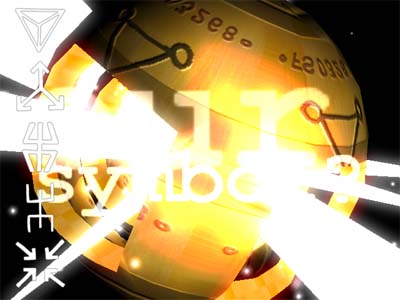
A lot of good scenes, but some of them was not very successfully designed. The parts didn't fit together and the concept was kind of lame. The scene in the screenshot and a few other were quite enjoyable though. Not a bad prod
added on the 2004-04-18 17:05:52 by Duckers 
not bad at all, but some more time should have been spent on the design.
crash
i see only a white square... oops, ok, it's the loader... fuck, after 3 minutes, i choose the ESC solution
I guess you are running full screen are are actually getting a dialog box with en error message (which you can't see). Running it in windowed mode will show the error, but it probably still won't work. I have no idea what's causing the crash, it works on every machine I've tried it on. Though luck, we'll try to do better next time.. :)
nice
Make me sleepy a little, but great visuals and lovely colors :)
This demo has a great concept and a lot of good effects, but it lacks the polish needed to make it really good. The same goes for the music. Excellent ideas, but a bit un-polished.
I've watched it again, and my opinion still stands, but at least I know why. The tune is very good, but the samples for the lead and chord instruments are a bit weak. Likewise, most of the effects are medium-high quality, but the poly counts and lighting are poor, making them seem dull. The same ideas with a bit more attention to visual and aural quality would really rock the house!
i just give this a thumbs up because i can :)
i have no words for this
Fan fucking tastic
On some objects the meshes seem a bit dog-eared. Music is super cheese. Efects aren't really that great (too much tunnel-time.)
Oh yeah, the end credits are cut-off at the sides. (Font size too large...) I assume this is because my desktop is set to use "large fonts" and your code doesn't take this into consideration.
long, some parts very slow - otherwise nice
It looks pretty awful and not just by modern standards. However, there's some kind of naive appeal in it. Dunno why...
I miss demos like this, kinda.
ok
submit changes
if this prod is a fake, some info is false or the download link is broken,
do not post about it in the comments, it will get lost.
instead, click here !
