|
Flow State by Onslaught [web]
[nfo]
|
||||||||||||||
|---|---|---|---|---|---|---|---|---|---|---|---|---|---|---|

|
|
|||||||||||||
|
popularity : 64% |
|||||||||||||
alltime top: #2065 |
|
|||||||||||||
|
||||||||||||||
| added on the 2016-11-12 22:15:24 by drift |
||||||||||||||
popularity helper
comments
stylish stuff, dope music.
rulez added on the 2016-11-12 23:02:44 by kimi kardashian 
Hey you did manage to make the music better :)
Just realized how music video-like this is. Misses just that little something (slower camera movements, more details to aid the composition, better sense of scale... realizing these only now) for that extra mile, but as it is right now is more than far enough for me.
Just realized how music video-like this is. Misses just that little something (slower camera movements, more details to aid the composition, better sense of scale... realizing these only now) for that extra mile, but as it is right now is more than far enough for me.
holy sh**!
scenes with triangles were nice
Great cloud rendering! You have a keen eye for detail.
Fantastic materials and rendering!! Some absolutely great scenes here for sure. The clouds in particular and the nice reflections stood out. I found it a bit lacking in the music (the music sounded a bit cheap/4klang'ish for a 64k and there was nothing memorable about it) and direction departments (lack of any and all transitions, movement was often too fast/jerky), but those are minor things. Great stuff!
Cool effects
Great style!
splendid
I Forgot I was watching 64K
Nice, very nice materials, really liked how the "ground" wobbled, the colors and overall feeling.
Excellent rendering. Sound department a quite solid track. (I could always say something about mixing: say something about mixing :D) Ended smoothly.
Nice, very nice materials, really liked how the "ground" wobbled, the colors and overall feeling.
Excellent rendering. Sound department a quite solid track. (I could always say something about mixing: say something about mixing :D) Ended smoothly.
Really good design and direction ( and code to make it happen ) :)
With more bytes spent on the music side you gonna do some really crazy 64ks!
With more bytes spent on the music side you gonna do some really crazy 64ks!
Nice! Some really cool scenes and visuals. Didn't like the music too much though.
As the others already said: gread rendering tech and smooth tune.
However some minor nitpicks: I felt that the terrain roughness was quite a bit too low making it hard to discern if this was supposed to be magma or rock. The viewspace folding between 1:28-1:37 felt a bit uninspired "fillery". The greetings scene is nice but due to the placement of the text I had a hard time reading the greetings while at the same time appreciating the scene evolving.
However some minor nitpicks: I felt that the terrain roughness was quite a bit too low making it hard to discern if this was supposed to be magma or rock. The viewspace folding between 1:28-1:37 felt a bit uninspired "fillery". The greetings scene is nice but due to the placement of the text I had a hard time reading the greetings while at the same time appreciating the scene evolving.
Awesome! I thought the 64k category was supposed to be dead for years already!?
The color "mood" seems to be slightly different for each scene. I'm not sure if I like that. What would it have looked like, if you'd just picked one of them and kept the overall feeling the same throughout the demo? My favorite is the one in the skyscraper window scene. The yellow, orange, slightly greenish colors stand out to a great effect, but ... each one of them could be worth its own demo? I mean, the music's general atmosphere doesn't change during the demo, it just progresses consistently inside the same style. But the color or post-processing things feel like they're not from the same song's music video, they're from several different videos.
The color "mood" seems to be slightly different for each scene. I'm not sure if I like that. What would it have looked like, if you'd just picked one of them and kept the overall feeling the same throughout the demo? My favorite is the one in the skyscraper window scene. The yellow, orange, slightly greenish colors stand out to a great effect, but ... each one of them could be worth its own demo? I mean, the music's general atmosphere doesn't change during the demo, it just progresses consistently inside the same style. But the color or post-processing things feel like they're not from the same song's music video, they're from several different videos.
iconic rendering in the end did the job for an official YOU apply of demoscenes to become religion (for some).
when it started on the stream i was thinking: okay, another intro with mountains but let's see :D but damn, what a tune, what a visual quality and what a stylish design. okay there are no really fresh effects but the choice of colors, the flow and the overall feeling make this one of the best slightly above 32k i know. i wonder what would have happened if you had more time (to optimize or to go for a full 64k). great one man show, drift :)
Good feel of the style.
I also like the polygonal wall.
I also like the polygonal wall.
Looks sweeet!
Great! I love lights/metal reflections.
Looks like you have some nice voronoi columns here, was it inspired by latest ST experiments or smth simpler? :)
Looks like you have some nice voronoi columns here, was it inspired by latest ST experiments or smth simpler? :)
looks and sounds fantastic =)
Also, stop pissing around and fill 64k already! ;D
That final scene was really killer <3
Beautiful !!!
Beautiful intro with great music, top stuff!
Whohoo!
Fantastic :)
Cube in flow was ossom.
Awesome!
Amazing! Everybody's complaining about how 2016 is a bad year but for demos it sure isn't! First Logicoma, then this. Totally awesome. Atmosphere is absolutely fantastic, it totally sucked me in.
i dig the greetings part the most i think, the liquidy cube is very nice.
theres room for improvement in the general direction of the prod but damn it looks good.
keep on doing this!
theres room for improvement in the general direction of the prod but damn it looks good.
keep on doing this!
The lack of transitions hurts, but apart from that: Whoa, awesome! This looks gorgeous (the clouds <3), sounds good and the design and flow is ace. Will totally watch again!
What they said.
. .
How can anyone not love this!
Sweet! I really liked the sound and looks of this.
holy shit this is amazing. how you could pull this off alone is beyond me. In the middle I though it was right in the middle between our revision 64ks from 2014 and 2015 (and doing it better), but the end gave it a totally different spin. I don't think it needs "transitions", just some polish maybe - but it feels complete as it is, and is one of the best 64ks in my opinion. now come join us in a proper 64k compo :)
really nice prod.
Wow, what a nice intro.
Wow. So smooth. The color grading in and overall design is incredible.
Pardon me while I'm bathing in arguably the bloody best colourscheme I've witnessed in a 2016 production.
The composition of design, typo, colour palette, effects and music is next to perfect.
The composition of design, typo, colour palette, effects and music is next to perfect.
Wow, that really kick balls. Superb!
Lovely intro. I adore the feeling of space that's present both in the visuals and in the sound, although I think some parts could benefit from a bigger sense of scale.
Quote:
if you'd just picked one of them and kept the overall feeling the same throughout the demo?
+1
Very solid 64K.
Amazing work.
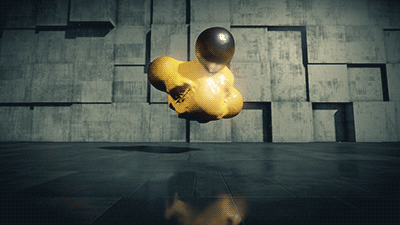
(also, sexy metaballs)
as smooth as a silver bullet
This was really tight!
what an excellent intro. great visuals and nice music. Effects are creative and fit perfect to the mood of the intro.
Solid!
Missing these kind of demos. Very chilly and relaxed!
Drift, is it really you spying on my screen all the time? Having that hacker who steals my frames while grabbing my screen; once i pull the wire my frames are fine again! ;) And most of the effects look very much the same as what i prepared for Revision 2017 so far, mine are just way more colorful as always! ;) (You´ll see then if you haven´t already, haha!)
The prod rocks for sure!
Really really ace for a one-man-show!
More of this plz!
The prod rocks for sure!
Really really ace for a one-man-show!
More of this plz!
Decent. :)
Nice stuff. Maybe next time make more content.
Love the skyscraper part and the nice high-res fluid effect on the spheres and ribbon over the greets.
what a nice flow!
very good
this is somekind of current design fashion it cames down to my eyes for years. the problem do not came from coders or machine power, but I feel something like it does not affect my mind as a great oldskool prod. it comes that a real blind alley is seen with technology.
Good stuff!
colors
Nice rendering, i like the waaaaaaaaalllll!
good shit
want more
Wow, nice scenes and nicely slow. Feels kinda cold, but comfortably so, like... winter. I especially liked the wall behind the blob, making two different appearances, and the way the triangle in the last scene is sneaking in so slowly I first thought I had eye problems ;)
Excellent!
<3
Most stylish! Great rendering.
nice transitions and some effects are really cool
Yeah, the effects like the text rendering + reflections are quite nice.
I guess that involves somehow converting the textured font into a distance field? Or rendering to a transparent plane with the textured font for coloring?
I guess that involves somehow converting the textured font into a distance field? Or rendering to a transparent plane with the textured font for coloring?
Oh nice, looks like I got some reading to do :) Didn't know you could mix plain geometry with raymarching.
this is very good
At first i thought: "okaysh demo". Then I saw that it's "40k". That blew me away!
nice !
I was getting the same errors as Gargaj. AM FirePro W7100.
Mad prod though. You're really good at making me feel bad and lazy XD
Mad prod though. You're really good at making me feel bad and lazy XD
dude that music. so smooth and fits the symmetry of some scenes so well!! on a trip now..........
Really polished in all aspects. Top-notch intro!
Stunning
I really liked the style and pacing. Beautiful!
lookin good
This is a great piece of art. Really smooth flow and the visuals fit perfectly into the chilled tune, well done effects also!
so great
pretty cool! maybe a little rough around the edges, but it does its thing well.
I love this. More please
Yes, drift come back, make more.
submit changes
if this prod is a fake, some info is false or the download link is broken,
do not post about it in the comments, it will get lost.
instead, click here !

