|
liquid sun by Rebels
[nfo]
|
||||||||||||||
|---|---|---|---|---|---|---|---|---|---|---|---|---|---|---|

|
|
|||||||||||||
|
popularity : 57% |
|||||||||||||
alltime top: #10520 |
|
|||||||||||||
| added on the 2016-10-23 09:44:20 by pasy |
||||||||||||||
popularity helper
comments
what optimus said
some nice scenes with DOF save it from thumbs down. but mostly meh colors and the tune is not my cup of tea at all ... sorry.
Not the best looking RBS demo, to be honest - the chromatic aberration on the DOF(?) didn't help either. For some reason I kept thinking "this is very 90s".
Translated compo-notes:
1. generic pseudo-goa music
2. primitive opengl effects
3. blown up contrast
4. ugly rgb distro
5. anemic sync
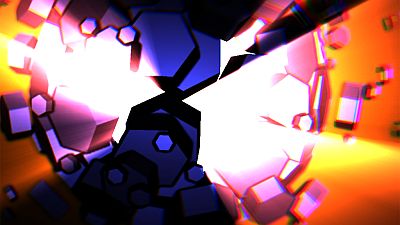
Some of the visuals did look kind of okay while unfortunately marred by absurdly garish colors and values.
1. generic pseudo-goa music
2. primitive opengl effects
3. blown up contrast
4. ugly rgb distro
5. anemic sync
Some of the visuals did look kind of okay while unfortunately marred by absurdly garish colors and values.
colors were all over the place and nothing really exciting happening, but, enjoyable in general. the rotating circle thingies looked both ugly and nice at the same time, so thumb up for that! :D
Feels like cube_test_01, while their 64k intro felt like particle_test_01. Decent but uninspired.
Everything noby said. There's a lot of effort, but no whole; it's all over the map.
Nem elhanyagolható mennyiségű kocka ez.
Could have been 100 times better with a coherent color scheme. Thumbs up anyway. Some good parts
Not my favourite rebels demo but I don't hate it. One of the things I usually like from rebels is the demos are very colourful but I do think this one needs to dial back the saturation just a bit. Also the colour separation in the CA effect is way too strong for a simple channel shift where it is breaking objects up into 3 distinct shapes which is a peeve of mine lately. I think if you want a super strong CA you need to do a multistep blended shift so the colours aren't detached from the original shape (see how the logicoma demo did it). Just some constructive feedback.
I really liked the end part with the hexagonal shaped object with the light rays.
I really liked the end part with the hexagonal shaped object with the light rays.
Great entertainment!
video please !
Finest goa and fitting visuals!
The kaleidoscope could have been used for more interesting stuff. Everything else was nice, especially the pixelation effect. :)
very nice.
I like the line of cubes at the begin.
I like the line of cubes at the begin.
Yep
:)
What Noby said. Didn't really enjoy this one, liked the credits parts though.
a bit unbalanced demo but overall nice.
great
ok
lists containing this prod
submit changes
if this prod is a fake, some info is false or the download link is broken,
do not post about it in the comments, it will get lost.
instead, click here !

Too many cubes though. Music makes this rule.