|
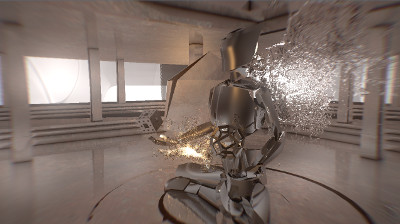
liquiXion: the demo man by Adapt [web]
[nfo]
|
||||||||||||||
|---|---|---|---|---|---|---|---|---|---|---|---|---|---|---|

|
|
|||||||||||||
|
popularity : 64% |
|||||||||||||
alltime top: #3890 |
|
|||||||||||||
| added on the 2016-08-07 13:50:30 by deepr |
||||||||||||||
popularity helper
comments
Sweet looking fluids and other visuals, enjoyable soundtrack as well. But I must say I found the visuals way too chaotic with all the overlays upon overlays. Less would be more in this department. Looking forward to a polished final.
rulez added on the 2016-08-07 13:56:05 by break 
what a mess :(
adapt keeps getting better. awesome water.
Screenshot vote :)
Good to know. Waiting for an official capture then as my PC couldn't dream of running modern demos.
Can't watch due to shader compile errors, Radeon 7950. Looks promising though.
This looks lot like their 2013 assembly demo. The particle effect at the start is really cool. Rest of the demo not so much.
A very close contender for winner (as the score rightfully says)! A bit incoherent, but also very nice at places.
(I've only seen the stream, not the executable)
(I've only seen the stream, not the executable)
lol xD ten times better at home than the mess shown at the party place. Too bad considering the effort tho, it's a great production.
.
Real Winner in the demo compo ASM 2016....
liquid scenes were really cool, finally saw the proper version (whole thing was way better than the one in the stream).
Ok, the proper version made way more sense. Good work guys, enjoyed it!
looks really nice but, 250 megs? plus:
OpenGL message “lost connection”
The application must close.
What does it mean?
If you received this message from an application (on a pop up message or in the Event Log), the application was unable to continue rendering because the Microsoft Windows imposed time limit (TDR) was exceeded. This is normally the case when the workload sent to the Graphics Card is greater than what the graphics card can process in the normal timeout of two seconds.
The proper version is super smooth. Great effects, flow and music, and very "demoish" in a very good way.
A bit uneven with both stunning and somewhat poor looking parts. The fake GI and screenspace collisions, just perfect and demoish. A good sequel to the original though not necessarily better as I still have a soft spot for Reflexion. Would've liked to hear a more "original" track maybe, made the whole thing feel a bit of a remix, which I suppose might've been intentional and certainly not a bad thing :)
Proper is great
my personal winner, too bad it was messed up in the compo
Silky smooth on 1070, looked awesome.
Was going to say this was very messy, but decided to watch the proper version which is indeed a lot better. Would have thumbed up the messy one already though.
Just watched the demo. The fractal-like monuments scene reminded me of the greetings scene in this.
Reminds me of early hardware accelerated PC demos, with all the blending, reflections, and coder colors, [random adjective] music... could be a bad thing, but worked for me.
I really liked the music. Too bad it had a bug. Should have been first.
Awesome
Rocks
This is some weird, messy potpourri of influences (the field trip recursive figure zoom is just the sorest thumb to stick out). But overall it makes enough sense to me, visually. Still there are many rough patches one could improve. F.e. the transitions should be actually seamless (not strangely glued together) and some needless overkill should be curbed (no need for that endscroller over an already busy background, just leave the final message there).
So it's your best work so far, even though I can't shake the feeling that it all looks like ASD and mfx stuffed into a blender, and then taking the goo-y results to a puzzled wood chipper shop. :D
So it's your best work so far, even though I can't shake the feeling that it all looks like ASD and mfx stuffed into a blender, and then taking the goo-y results to a puzzled wood chipper shop. :D
Indeed it's a lot cleaner on the proper capture!
Still a bit messy for my tastes, I miss some consistency between the different scenes (especially in the colors), and the credits are really too kitshy and don't really give the best final impression.
That said, the music is great, the fluid stuff are really sexy, and overall the "poetry" works, especially in the (cool) recursive zoomer scene and the screenshot scene.
Also: happy 10th ;)
ease down on those colors man... and i'm even Dutch.
anyway yeah, incoherent and messy in presentation that distracts from what is actually all in there.
anyway yeah, incoherent and messy in presentation that distracts from what is actually all in there.
nice early 2000's aesthetic
Final looks so much better than what was shown at assembly. Some really great scenes and some not as good but overall a nice demo.
I liked the scene on the screenshot and the music, but... the rest of the scenes were either too long, or the palette selection could have seen more work.
Also, I can't un-see all the Collada source files, the huge DLLs (QT and Assimp?!?) and the images that could probably be packed/optimized better.
So piggie
Also, I can't un-see all the Collada source files, the huge DLLs (QT and Assimp?!?) and the images that could probably be packed/optimized better.
So piggie
I like it :)
The correct version looks a lot better than the buggy asmTv version I initially saw. :)
This could have benefit from 1-2 extra days of polishing.
This could have benefit from 1-2 extra days of polishing.
looks really cool, music may could have served better with more ambience and less beats (may just be a personal taste thing though). All in all still a great demo.
loved it
Better than the #1. Very eclectic. Strange transitions. Inconsistent. OK music. A few very good effects. Not bad, but not great either. Piggy overall.
Final version solved it for me
final version makes a lot more sense.
should have won the competition
Proper demo style. I have to admit I found the compo version more interesting though :)
good demo it was great to watch it :)
Doesn't work for me on my AMD R9... Though looks nice on youtube.
so-so
It was OK.
Wow. This is truly a 2000ish mess. The colors are off and the direction strange. The first effect saves it from a down-vote.
whoops! where did my thumb go? ;)
Lots of particles and techy stuff going on with nice music.... for no reason!! Demostyle to the max
where did my thumb go?
thumb up for the fluid sim
submit changes
if this prod is a fake, some info is false or the download link is broken,
do not post about it in the comments, it will get lost.
instead, click here !
