|
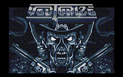
Vectorize by Red Sector Inc. [web]
[nfo]
|
||||||||||||||
|---|---|---|---|---|---|---|---|---|---|---|---|---|---|---|

|
|
|||||||||||||
|
popularity : 67% |
|||||||||||||
alltime top: #2200 |
|
|||||||||||||
| added on the 2016-01-09 21:15:53 by Baudsurfer |
||||||||||||||
popularity helper
comments
A nice surprise. Too oldskoolish for me, but I like some pixel art here. I look forward to more from you.
rulez added on the 2016-01-09 21:41:49 by slayer 
Picture vote!! Nice one.
Very nice artwork :) More Amiga prods please :D
Cute
This is really cute. A lot of nice graphics, good oldschool music and oldschool effects. Impressed and welcome back on Amiga, RSI.
Nice to see texture mapping on an unexpanded A500! You also use an interesting pixelling technique (C64-inspired?).
Nice effects.
It feels like the last 25 years never happened. ;)
GREAT ;)
Eddie's back! I love those RSI logos.
The texture mapping looked nice (not nearly in one frame though) and the music & some of the 2D were not bad. Shame about the fake group name as always, oh well.
what do u mean fake group name?
aaamiiigaaaah\o/
Nice AMIGAAAAAH 500 demo and first amiga intro for 2016 :)
What break said but with thumb up.
Looks good. I really like the graphics for the sprites.
Nice.
copypaste
Really oldskool. Has at least enough RASTERIA :O)
Music was not my cup of coffee, drums were weak.
Overall, goes to the rulez side a bit.
Music was not my cup of coffee, drums were weak.
Overall, goes to the rulez side a bit.
Definitely has an authentic 1990's feel. Reminds me of being a teenager and being amazed by amiga demos. Makes me want to try and code for amiga again one day too.
Very weak thumb up for the great pixel gfx and the amount of work this must have been. But the music was very weak (do I hear STS-01 samples in there ?!?), the effects were too boring (if you use old effects with standard objects, at least do them fast!) and the style of presentation was way too oldskoolish for my taste.
Good demo, good Graphics, but let down a little by the underwhelming music. Looking forward to your next Amiga release!
Nice demo with nice music and graphics, all in nice oldskool style (atmosphere)...
Nice oldskool style! In fact, too much oldskool is you listen to the music.
I need to see it on my A500. In the meanwhile, here is my thumb up.
I need to see it on my A500. In the meanwhile, here is my thumb up.
Thumb.
What Break said.
What StingRay said.
What Britelite said.
massive thumb up for great vectors, music and oldsk00l feeling, massive thumb down for fake group, so a piggie ;)
Some nice art work here but the music makes this a piggie for me.
Big thumb!
fresh
What noname said!
...........
Got a flashback in time! let me rejoin :)
This should have been released in 1989 with music by Romeo Knight! ;) ;)
nice
Unlike the other commenters, I kinda liked the music. Otherwise nah.
nice music + gfx but overall just another (boring) rotating object show imho. so I'll pigg this.
Good stuff.
Great classic oldskool.
Very nice demo, I like it!
Thumb up for the textured cube, the music (yup, it sounds like vintage ST-01, I guess it's on purpose :), for SNC improving his pixels skills while reviving Eddie, Lexo improving his exploration of Amiga's classic demoscene figures, and Leonbli for the end-part logo that is truely gorgeous.
Transitions could be improved, and the end-part scrolling would deserve a transparency fx imho, using the uber-classic bitplane trick.
Next prod should be ace, guys! :)
Transitions could be improved, and the end-part scrolling would deserve a transparency fx imho, using the uber-classic bitplane trick.
Next prod should be ace, guys! :)
This demo was an unexpected and very nice suprise to me, since the times all 'enhanced lowend' platfoms were allowed at DiHalt lite.
So thank you guys for such a pleasant surprise!
This demo contains well-known effects and yeah! -- nice textured cube running on 7mhz platform.
Also there are tons of pixelled graphics. Not just fast conversions from photoshop, like some other 'enhanced' demos in the compo.
Sorry for running this demo at the party from A600. My A500 failed exactly at the compo.
Clean design and very moody.
All of what the other old foxes said is true :) But I'd like to add, lots of code here in your second Amiga release! The letdown for me was the over-dithered converted gfx and that the effects are not quite at the level of good similar effects from 1990-1991.
Nice, I like it, although it didn't work on A1000 with 512k. It says in the scroll that it works on an unexpanded A500, so it should work on A1000, right ?
awesome! shows balls and thats what's needed more than ever
What Blueberry said.
+Yet another intro/dentro sold as a "demo".
+Yet another intro/dentro sold as a "demo".
Could this so-called Red Sector be given a separate group id please. The name string can be the same, I don't care. There are many sceners with the same handle but they're not the same person. The same applies to groups. Greetings to The Bruce Dickinson.
Haha, probably the slowest texture cube in history. I stopped cycle-counting at 128 cycles per pixel. That would even be slow on 68030. Ok, I stop trolling.
I like the oldschool style.
Conclusion: piggy.
I like the oldschool style.
Conclusion: piggy.
It surely wouldn't pay so much attention if the Red Sector name wasn't used. Thumbs for unexpanded A500, though.
would've ruled back in '91 ... but i'm an old nostalgic fart so I'll thumb it 25 years later anyway :)
very 1991. also why i didn't really feel much wow-factor watching it.
What juice said. But greeting ones kids in scroller would have been confusing at that time..
Wasn't awesome but still a fair effort. Don't mind the old skool flava.
nice demo! welcome back on Amiga :)
Kicks ass. I'm quite speechless.
And another fake account to upvote fake RSI prods, hooray.
Bugger
Pretty good.
fake stays fake....
Wow. Where can we download this tune?
Not bad. It was cool to see a 4-5bpl perspective-correct textured cube on an A500. Otherwise, it's a simple set of 1991-era routines and music. Gfx are pretty good but a bit overkill with the dithering. Hope to see more and improved Amiga releases.
Good stylish demo. Also interesting in that point, that it is one of the very last productions, that shows some incompatibilities on the Minimig V1 board. There are some horizontal lines from the middle of the screen to the outside in this demo, when the 3D-objects are visible. Will make a bug-report on Minimig.net in next time about this. By the way, a very similar problem, the Minimig has with the 3D-objects in the "Sunglasses at Night" demo. So the firmware seems to have a little blitter-incompatibility which was not wiped out until now and can be seen in this production.
Nice gfx and oldschool mood! Still some way to go from here to something like Rink A Dink Redux though.
Sorry this isnt even near good. It sucks ass
Meh, "RSI"
Slow code and pretty plain as a demo...
down-O-thumb
That's nice!
quite ok
Sorry lads. Vectors are old and boring. I'll give you a motivational piggie to make something a bit more interesting.
Awesome! Go! Go! Amiga!
The Minimig incompatibility, which i mentioned above in my entry, is fixed now. So this demo runs now like it should on Minimig. :)
Quote:
It feels like the last 25 years never happened. ;)
Awesome gfx!
Great graphics
It's still really underwhelming.
Quite nice
Why? Lustreless copy of classic effects from the early '90s. The only
effect that is of interest to me is the texture mapped cube.
effect that is of interest to me is the texture mapped cube.
vectors always welcome, nice pixels... only it could be a bit longer
submit changes
if this prod is a fake, some info is false or the download link is broken,
do not post about it in the comments, it will get lost.
instead, click here !
