|
Invader by Hardread [web]
[nfo]
|
||||||||||||||
|---|---|---|---|---|---|---|---|---|---|---|---|---|---|---|

|
|
|||||||||||||
|
popularity : 58% |
|||||||||||||
alltime top: #59151 |
|
|||||||||||||
| added on the 2003-07-07 20:49:52 by pohar |
||||||||||||||
popularity helper
comments
Ach, I forgot my name tag in the .nfo. Very lame. =)
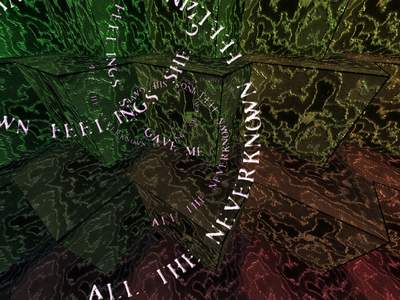
Was ok, the cubes bits could of looked good with some radiosity or something, and the textures suck big time! The tune was not too bad tho.
The scene bogetry twirling writer was very good, I liked the music, preety simple code, but it was so strange with these cutting cubes that I somehow liked it..
ugly
This isn't very good, but doesn't suck. I like how it left my task bar on screen and I was able to click on different applications and watch 3D objects paint over everything. Interactivity is cool, even if unintentional.
ugly. but who cares? :)
wholy christ, this was ugly! sorry...
Ok, it's an hot summer... but that's not a good excuse!
soft synth is ok... but the gfx - yikes
Well. Better if i don't write anything?! The whole thing hurts me. Music is simple and boring, all texture are ugly. The Only one good thig is cube-guys . They make me smile and you deserve a piggie for it. :/
i like the feeling (the music is nice). it worths a look.
Some sokobanish cube scenes were interesting, but colors... If say in hypocrite words: certain RGBCY dudez movements were way too defiant.
actually, not that bad :)
i really liked the text writer
i really liked the text writer
couple of nice effects and music was good also, maybe not great 64k, but atleast it got something different for all the others.
sorry.
very long and boring.
and ugly some scene.:(
very long and boring.
and ugly some scene.:(
submit changes
if this prod is a fake, some info is false or the download link is broken,
do not post about it in the comments, it will get lost.
instead, click here !

The animation didn't meant to be a FR parody just like some say :)