| Ratavah by Pyrotech | ||||||||||||||
|---|---|---|---|---|---|---|---|---|---|---|---|---|---|---|

|
|
|||||||||||||
|
popularity : 60% |
|||||||||||||
alltime top: #5679 |
|
|||||||||||||
| added on the 2015-08-02 20:47:05 by wysiwtf |
||||||||||||||
popularity helper
comments
Wow.. That was large like hell but really really impressive! Awesome job :D
rulez added on the 2015-08-02 20:48:46 by Sapphire 
nice
nice change from your usual industrial style, so that alone deserves a thumb.
scenes could use a little bit more polish here and there and also some fadeouts look like there wasnt enough time to finish the transition...
scenes could use a little bit more polish here and there and also some fadeouts look like there wasnt enough time to finish the transition...
Great graphics and the engine is awesome. Didn't really like some of the design choices, rhythm didn't struck me and music was bad. Piggy.
Pretty good.
Crysis 4? :). Awesome.
Solid amount of work
Hoo boy.
The music production needs a ton of work (both the guitar tone + mix + actual performance needs work, especially that barely-hit pinch harmonic was a bit too obviously "first take, nailed it"), the graphics look okay (although they remind me of Far Cry 1 which I'm not sure is a good thing in 2015) but the presentation (atrocious cinematography) and lack of actual art direction destroys it. Most of the visuals just blend into a big mush because there's no contrast in the lighting.
Another thing is that you guys keep doing demos about stories / narratives, which is great, but the storytelling doesn't seem to have any influence on the direction, it's just sorta "there", there's no dynamics to it. I know demos aren't as demanding as films when it comes to visual storytelling, but sometimes it's good to remember that the three-act-story structure has been invented and refined for a good reason.
I'm gonna thumb it up because I was reasonably entertained, but I just wish it would have sidestepped the potholes it laid for itself - there's a ton of work in it, but just not necessarily the right kind.
nice!
Not load for me...........
Win 7 X64, GTX 980 !!!
Win 7 X64, GTX 980 !!!
Not load for me...........
Win 7 X64, HD 6800 !!!
Win 7 X64, HD 6800 !!!
its not bad, loads fine for me on Win10 GTX980, but its still kindof slow @1080, i dont see why that should be.
Runs like ass on an r9 390 and where the fuck is anti aliasing? It's 2015, nobody should have to suffer from aliasing jaggies!
It does not start here: Win7 x64, GTX770. Shame, I wanna see it! :/
überlovely
Definitely rulez.
You'll probably have to install the latest DirectX-SDK from MS to get it run. For me it helped...
You'll probably have to install the latest DirectX-SDK from MS to get it run. For me it helped...
10 FPS with a GTX 980?
COME ON!
COME ON!
I enjoyed this one. Pretty scenes, good music (a little ASD-inspired but not too bad).
youtube please :)
There were bits in the Avatar-inspired (?) visuals I really liked, such as the water shading and the trees. The intro part was also quite stylish. However the "story", music and overall washed-out grayish look left me cold. That said, this was easily my favourite Pyrotech demo so far.
nice, proper looking scenes.
What break said. The lack of dramaturgy, as well as the inclusion of a robot tentacle monster, ruined it for me. Would have loved it more if was a modern version of this.
cliché visuals that were already executed better in a 64K a few years ago, so.. bleh!
Nice scenes but felt fairly generic.
There is obviously a lot of effort in the code and good rendering tech so it deserves a thumb for that alone. Unfortunately as other people have said there is something about the content that isn't very interesting.
Someone in the demostudio (might have been navis) said that this style and content is too familiar these days from games, you need to somehow find your own "demo-ish" content that can get peoples attention for being something unique.
It feels like a tech demo for your rendering engine which some coders might appreciate but other people find boring. Don't feel bad though, crowd pleasers have been winning votes over tech demos ever since assembly started.
.............
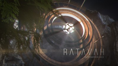
Do I have to feel bad for thinking that this was the best demo of the Assembly democompo this year? I hope not. Sure, it's far from perfect both technically and artistically and maybe there's too much Avatar and Far Cry visuals and ASD music in it. However, I got this feeling of "boy, I want to be there" while watching, and this is certainly better than the impressions I had with the higher-ranked demos, which were just "nice particles/toruses/lasers".
The engine has some weird quirks like the odd radial godrays, object-clipped focal blur, depth dependent chromatic aberration, the sharp specular highlights on the cliffs. Still most of the time it looks pretty damn good. The flyby through the tunnel is beautiful, and honestly most of this is. This is by far the best Pyrotech demo in my opinion. Now only if you'd make a NEW soundtrack and not one that's almost exactly the same, every year :).
Pyrotech remains one of my fav. groups. Period!
Since there first PC demo on Assembly!
High tech engine, scenes. But the music in there releases.. oh sooo nice!
Looking forward to next year! Keep it up!
Since there first PC demo on Assembly!
High tech engine, scenes. But the music in there releases.. oh sooo nice!
Looking forward to next year! Keep it up!
Gargaj's comment is spot on.
I see references to a lot of demos and intros in this one, don't know if its intentional or just not very original and the music was simply not my cup of tee. Its beautiful in any case and you have to respect the amount of work put into this. Well done! Looking forward to your next one!
Easy thumb. That tentacle robot reminded me somehow of the Matrix movies, but I felt quite eye and earpleased. Only disturbing point imho were the totally unfitting rhythm guitars but that may be just a matter of taste
Surely the best pyrotech demo! I like the water rendering and the lovely pink tree scene. The direction and music weren't up to the same standards though.
nice journey with some nice polishing in most parts! one of my favorite demos of the compo! looking forward to seeing more from you guys!
what Zavie said
257 MB?!? And it doesn't run on something as common as Win7, GTX970? :-(
Too bad, because judging from the video I might really like this.
Too bad, because judging from the video I might really like this.
no.
Solid and impressive technically. Surely a lot of good work!
Doesn't look amateurish to me, just more like a game engine demo than a demoscene production. This isn't necessary a bad thing, but I guess that's why you get some negative comments right here, as people expect a little more engaging/entertaining/emotion-provoking experience.
Doesn't look amateurish to me, just more like a game engine demo than a demoscene production. This isn't necessary a bad thing, but I guess that's why you get some negative comments right here, as people expect a little more engaging/entertaining/emotion-provoking experience.
if you add letter a to the end of ratavah you get ratavaha..
not much more to say.
not much more to say.
1n10: condescending much?
Me likes!
Very impressive both on the tech as well as on the production side -- I like the calm atmosphere and the solid motif/story. Post effects seem a bit overdone, which I think is what makes this feel like a game engine demo rather than a scene demo.
Overall it's linda like the uncanny valley -- too good to be judged like any other demo, not quite good enough by higher standards.
Still very enjoyable and a clear thumb!
Overall it's linda like the uncanny valley -- too good to be judged like any other demo, not quite good enough by higher standards.
Still very enjoyable and a clear thumb!
shiny
nice one
submit changes
if this prod is a fake, some info is false or the download link is broken,
do not post about it in the comments, it will get lost.
instead, click here !
