|
Endo by Epoch [web]
[nfo]
|
||||||||||||||
|---|---|---|---|---|---|---|---|---|---|---|---|---|---|---|

|
|
|||||||||||||
|
popularity : 62% |
|||||||||||||
alltime top: #3773 |
|
|||||||||||||
| added on the 2015-05-23 22:39:11 by noby |
||||||||||||||
popularity helper
comments
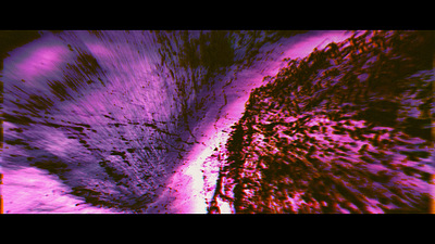
Beautiful, I loved it when it surprised me, giving a strong association to ultrasound imagery.
Still at loss for words, so I chicken out and say: what visy said.
(missing thumb)
Oh my god the visuals gobble gobble gobble
and missing thumb. nothing wrong with the audio though, visuals just sucked me in much harder
whoa, impressive
WOW that rendering!!
Atmospheric!
Great sound and looks.
Beautiful indeed, with perfect accompanying soundscape. If this is a "quickprod", I'm excited to what you can do non-quickly in the future :)
One om my favourites from compo, wonder about its ranking
Ambient !
Stunning visuals indeed.
what mog said
Lovely atmospheric piece. Epoch is seriously making its way towards my personal favorite groups.
nicely done, managed to distort my mood and make me contemplative so job well done.
It's..beautiful
I just love shader feedback.
Lost particles from the woods of Herwood. Veri jees!
Youtube please!
Mind expander
Tries to generate deep atmosphere with a simple setup. Succeeds with it =)
purple!
Epoch is one of the most interesting groups nowadays because they don't seem to compromise on the vision they start out with to get brownie points from the audience (unfinishedness notwithstanding), nor do they overexplain what they're doing.
nice quick demo, but less interesting than your previous releases tho :)
nice visuals.
music reminds me of fallout 1 ambient tracks!
music reminds me of fallout 1 ambient tracks!
Epoch demos to me are a fine example of why it's worth watching more than just the top 3 from any given compo. And I guess the style might be best viewed at home instead of drunk at the party place...
The visuals and the subtle sync to the great soundscape creates a great atmosphere that sucked me in and moved me. It's also exactly the right length - if this is a byproduct of it being a fast-prod, it's a good one. :-)
I'm not too fond of all the colour choices though. The purple looks garish at times IMHO, but that's a minor complaint.
I really liked this.
What Gargaj said.
Very, very, very nice. A demo I wish I did.
Way too similar with "Entropy" and "Exodits, God Shift". You've done the same looking post-processes, particle tricks and such too many times now. But now everything about those you've done before are brought to perfection so I forgive you. Colors are way too monochromic for my taste most of the time. Camera work is insanely good in this one. Soundtrack is maybe the worst one yet but IT'S NOT BAD AT ALL. It's just not as good as tracks in previous Epoch demos. Basically it's too dragged out even for a ambient track.
But these epoch demos always have that crazy crazy feeling to them that give me the shivers. Something that fairly unique!
But these epoch demos always have that crazy crazy feeling to them that give me the shivers. Something that fairly unique!
very strange show ???!!!
i'm always enjoying the overall amosphere in epoch-productions
Well done demo art. Ranks much higher in my heart!
Nice, but lacks edge apart from small details (like the ending cut). 3d models seem kind of under-represented. Kinda felt that the heart should have some particle veins or something. Same with the fetus. Easy thumb up tho because of your high standards with each demo.
Not bad.
Very cool atmosphere. I like it a lot. With a bit more attention to details this could have been a real killer. Some ideas that come to mind:
- Clamp the gauss-blur at the edges or zoom in a bit to avoid edge-bleeding
- Slower camera with less editing when suggestive artifacts appear (like the black dots on blurred magenta)
- A bit more realistic heart-beat animation
- Some variation in editing-pace
Some of the color-schemes were really beautiful an refreshing. I would love to do a remix of this idea one day.
looks extremely boring but damn that sound! thumbs up for that.
Very nice! Should have won!
*yawn*
Great ambient track. Some nice feedback effects happening in the visuals. I think it's cool how you guys have a very strong concept and style that you aim for.
Cute mature demoscener content here.
Missed this one! 2015 ?!?¿!
Nice size/content ratio.
Missed this one! 2015 ?!?¿!
Nice size/content ratio.
that ambient... I do not know what to say, impressive,imposing...
noise, eem, nice :D
yes
submit changes
if this prod is a fake, some info is false or the download link is broken,
do not post about it in the comments, it will get lost.
instead, click here !
