pouët.net

Exoidits, God Shift by Epoch [web]
[nfo]
screenshot added by noby on 2014-10-12 01:03:52
platform :
type :
release date : october 2014
release party : DemoJS 2014
compo : combined demo
ranked : 2nd
  • 27
  • 4
  • 1
popularity : 62%
 62%
  • 0.81
alltime top: #4941
  • sm sm [Code, design, direction]
  • Dysposin Dysposin [Graphics]
  • noby noby [Music, direction, additional code, typography]
added on the 2014-10-12 00:45:44 by noby noby

popularity helper

increase the popularity of this prod by spreading this URL:

or via: facebook twitter pinterest tumblr bluesky threads

comments

the real 2nd.
rulez added on the 2014-10-12 00:46:53 by MuffinHop MuffinHop
Very quickly slapped together version, missing some graphics and probably needs fixing here and there (we'll get to it in a few days).
added on the 2014-10-12 00:47:06 by noby noby
Awaiting final then!
added on the 2014-10-12 01:36:45 by Photon Photon
video of the current version, youtube too (uploaded in an hour or so).
added on the 2014-10-12 02:37:33 by noby noby
OH MY YES MOAR PLEASE
rulez added on the 2014-10-12 04:21:35 by ferris ferris
Weird, but very nice. noby's YouTube link ID is almost an anagram of YouTube itself. Missing a second letter 'u'.
rulez added on the 2014-10-12 04:37:31 by Starchaser Starchaser
damn this is so nice. great style and music make a very moody demo. only a but short imho. solid thumbs up!
rulez added on the 2014-10-12 09:08:23 by sensenstahl sensenstahl
Poetic.
rulez added on the 2014-10-12 09:31:50 by Baudsurfer Baudsurfer
yep
rulez added on the 2014-10-12 10:37:25 by Triace Triace
Nice looking effect and great music. Also, it has exactly (!) the right length, should not have been any longer. Well done.
rulez added on the 2014-10-12 13:40:16 by StingRay StingRay
Won't work. 64 bit only? This sucks!
sucks added on the 2014-10-12 15:14:02 by Gadler Gadler
cool!
rulez added on the 2014-10-12 17:53:24 by mog mog
32bit support coming right after the Amiga version.
added on the 2014-10-12 18:23:29 by Dysposin Dysposin
Nice... Good sound
rulez added on the 2014-10-12 18:24:00 by Serpent Serpent
Interesting single effect :) Maybe you should have changed the colors or created some kind of break to enhance the visual details? Decent though.
rulez added on the 2014-10-12 19:59:56 by phaazon phaazon
Thumb up for the Amiga version.
rulez added on the 2014-10-12 23:49:48 by numtek numtek
Very cool. Nice atmosphere, music and visuals go well together. Really like the mood of this production.
rulez added on the 2014-10-12 23:54:01 by drift drift
This one has a really weird, albeit enjoyable, atmosphere.
rulez added on the 2014-10-13 00:23:19 by TheT(ourist) TheT(ourist)
That's the way you do a one effect demo… with cool effects on top of it.
Meh.
added on the 2014-10-13 13:05:25 by raer raer
Damn. Just when I thought it would REALLY start, it ended. Very nice atmosphere and tune is good, could just go on with some "triphop" drums and very sparse supporting bassline... so thumbs up for that. Visually could have some highpoints, but didnt.
rulez added on the 2014-10-13 13:28:57 by leGend leGend
uuhh, nice!
epoch evolves to a kind of insider tip for me.
interesting visuals wih an atmospheric, boards of canada -inspired soundtrack.
rulez added on the 2014-10-13 16:35:03 by a-move a-move
Like like like.
rulez added on the 2014-10-14 13:47:30 by dv$ dv$
nice colours and trippy music - not really boards of canada inspired imho but i could be wrong.
rulez added on the 2014-10-14 18:06:26 by kimi kardashian kimi kardashian
Not inspired by anyone specific but if I had to throw a name out there then it would be Darrell Fitton (though of course boc has been a huge influence to me for years now). The track was made in one evening just as an attempt to add percussions and some little details to the original intended track which was just drone ambient :)

Thanks for the great feedback everyone!
added on the 2014-10-14 19:13:03 by noby noby
typical oldskool scroller and copper bars
rulez added on the 2014-10-14 20:00:13 by yzi yzi
my kind of atmosphere ♥
rulez added on the 2014-10-22 15:39:46 by HellMood HellMood
Good stuff.
rulez added on the 2014-11-07 11:41:46 by pommak pommak
Short, but very good! Great atmosphere. I really dig Epoch's style!
rulez added on the 2014-11-11 09:10:04 by Kylearan Kylearan
Aaaaaand after "a few days" the final is ready (first time for everything)!

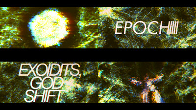
The original was horribly rushed and missed a ton of "planned" content, which is now included here. Improvements include final post processing chain with proper colorcorrection, expanded and enhanced direction with lots more details and added title graphics, and probably a lot more I'm forgetting to mention.

Liked it or postponed watching it before? Now is your time to revisit!
added on the 2014-12-07 02:35:06 by noby noby
A temporary video until we figure out why kkapture fails with this :) (it works on 64-bit applications, right?)
added on the 2014-12-07 15:27:13 by noby noby
good ambient prod.

Somehow I prefered it without the title&credits texte, but the final is nice :).
rulez added on the 2014-12-07 16:58:44 by wullon wullon
little short for a demo, but kinda nice.
rulez added on the 2014-12-07 17:40:40 by superplek superplek
So here's my opinion about the final version:
The colours are better and therefor the demo does not feel as blurry like it did before.
The problem I have is that the added text seems to break the flow a bit. So the party version does have a bit better flow than then final one. But the difference is small.
added on the 2014-12-07 22:42:30 by MuffinHop MuffinHop
I agree that the added texts are not an improvement and the typography is not very good. The rest of the demo is still very good!
added on the 2014-12-14 14:23:21 by Kylearan Kylearan
The text was something that I envisioned right from the start, and can't even see the prod without them :), so they weren't an afterthought. Even in the party version they were always there in my mind's eye. Another classic case of succeeding at something through limitations I guess, which in this case was lack of time with the original version. I don't know if they're typographically really good either - they are extremely stripped and minimal, but provide the impression I had in mind (thin, modern, bright, cinematic, italics). The purpose was mainly to fill the temporal dimension at couple "dead-air" parts. To me they're essential.

The flow is perhaps slightly worse, but I think it's because me and sm semi-accidentally cranked the flashing a bit too high in the end; that is something I would return to change further, but the final is final, sometimes you just need to recognize when something shouldn't be touched anymore :). See you next time with something different!
added on the 2014-12-14 21:23:47 by noby noby
Thanks for the insight in your design goals, always interesting (but rare) to read. :-)
added on the 2014-12-14 23:47:58 by Kylearan Kylearan
atmospheric and mesmerizing
rulez added on the 2015-06-15 00:31:01 by T$ T$
yes
too short, this went somewhere, but then it didn't
rulez added on the 2023-01-18 20:22:36 by SiR SiR

submit changes

if this prod is a fake, some info is false or the download link is broken,

do not post about it in the comments, it will get lost.

instead, click here !

[previous edits]

add a comment