|
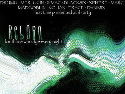
ReBoRn by Spöntz [web]
[nfo]
|
||||||||||||||
|---|---|---|---|---|---|---|---|---|---|---|---|---|---|---|

|
|
|||||||||||||
|
popularity : 62% |
|||||||||||||
alltime top: #5333 |
|
|||||||||||||
| added on the 2003-05-18 19:19:21 by merlucin |
||||||||||||||
popularity helper
comments
Here is the final version for ReBoRn! We spent a few hours more to improve some scenes after the party. Enjoy it again! XD
added on the 2003-05-18 19:20:23 by merlucin 
nice style and ok music. but it lacks intensity and wow-factor...
Spontz's best demo so far. Pretty neat.
looks (and sounds) like ending screen of some movie.. well, this is very different-like, and i liked this
blooming
good. liked the "building-of-a-3dmodel" scenes.
exists as winamp pluggin ?
Very well done demo and nice music with a good classic touch.
Not bad at all. And hey, no techno music, even if I didn't particularly care for it. However, sounds like a few too many preset patches were used and the guitar recording was paper thing. But everything looked kinda nice. Ah hell, thumbs up.
boring but not bad... music is not interesting at all...
happy demo ^^
nice original prod
nice original prod
pretty decent. though i'd like to point out that "to dye" is something quite different than "to die". :)
oh my god, gloom found a bug :D I cannot change the pouet pic but at least it sounds fun XD
I dye my pants every night
this demo is for you then
i've only seen some very early version of this since the compo version didn't work on my pc. i should probably try this final version or wait for the mac port...
It's very nice, smooth and flashy with great ideas and music. I liked the writer for the credits and the 3d dots which deformed into wireframe and then real objects. Nice idea!
sooo sexy !!! i felt in love lol 8)
and kudos to the musicians !
and kudos to the musicians !
very cool, liked the music
It has some cool moments
very very nice letters-effect! XD~~
hmmm
R0000000lz!
R0000000lz!
good job!
it rulezzz except for 'that strange music'... ;)
for those who dye their hair every night
cool ;D a very nice demo
Roulaise!
Let's see:
Some Pointsprites + zoomblur, plus some lukewarm kewlers-alike parts with some ultra-cheesy music on top. Mostly ok, but in no way near a thumb-up.
Some Pointsprites + zoomblur, plus some lukewarm kewlers-alike parts with some ultra-cheesy music on top. Mostly ok, but in no way near a thumb-up.
1-Music is very nice
2-Graphics are very nice
3-fonts are very nice
RULEZ! I liked it a lot, keep up the good work men!
2-Graphics are very nice
3-fonts are very nice
RULEZ! I liked it a lot, keep up the good work men!
The music was weird. The rest was nice. =)
great design, great music
Coder colors + 2 effects + some 3D gfx ... Sorry, expected more from this, I preferred Inferno A LOT over this one :(
please, learn how to compile your datas in a single file
greetings part is the best of it
unusual music, not bad at all
effects are too much centered
dot makes line makes faces is a good effect
it is a problem of colors, this blue is ugly
greetings part is the best of it
unusual music, not bad at all
effects are too much centered
dot makes line makes faces is a good effect
it is a problem of colors, this blue is ugly
Zone you really narrowed it down.
zone: the fact of leaving the files in a folder is for simplicity and to animate people to touch the script and see the original graphics. If you take a look to our older prods you will see that they are compiled in a single file. Btw, thanks for your constructive comments :B
nice stuff...
had some ugly black-backface problem in one of the scenes for a second or so, but otherwise, i like this one...
had some ugly black-backface problem in one of the scenes for a second or so, but otherwise, i like this one...
Terrific music. Mega fun love and peace design. For my little sister.
Music sounds rather cheaply recorded, while the melody is in fact good. Otherwise somewhat bland as well... but uh well, thumbs up anyway. :)
I don't see what's so cool about compiling everything in a single file. Frequently people are going to want at least the song so... And why not let the filesystem do what it's supposed to?
On to the demo then. It promises, but doesn't deliver. Everything is fine until the guitar appears and after that it's very average. Not that the code is, there's some great action going on in that department but the presentation is sub-par.
For example, when the great-looking particles appear right after the guitar, they only cover a horizontal line across the middle of the screen which neither shows off the effect well nor in a new way. Also the idea of first drawing the vertexes, then a wireframe and rendering the rest is good but isn't used to it's full potential at all. The variformish objects are nice looking but the colors fit the rest poorly and it's nothing new.
Last but not least the soundtrack fails to go anywhere and I really don't think electric guitar works well with the other part and even that seems like a single really short loop instead of a full several minute song. You've also recycled the credits decoration style and unfortunately it's one that doesn't appeal to my personal tastes much. Still waiting for the real mindblower from Spöntz...
Yeah that was... something. It has some nice visuals in it, but if I watch it again I'll be sure to turn off the speakers. Not really into 80's porn movie victory lap music...
music is horrible and it stutters on my osx
gr8.
PPC Macs only :(
ok
submit changes
if this prod is a fake, some info is false or the download link is broken,
do not post about it in the comments, it will get lost.
instead, click here !
