|
frutos do mar by Armada
[nfo]
|
||||||||||||||
|---|---|---|---|---|---|---|---|---|---|---|---|---|---|---|

|
|
|||||||||||||
|
popularity : 58% |
|||||||||||||
alltime top: #55858 |
|
|||||||||||||
| added on the 2014-08-02 21:23:17 by tonic |
||||||||||||||
popularity helper
comments
Random 3d models that look specially bad for something that uses a commercial game engine.
164MB, premade effects from someone else's engine, not very pretty.
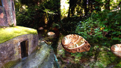
+: Ace soundtrack (of, course - it's a !Cube!), nice seashells and an atmospheric last scene with the gigantic statue.
-: Some horrible photos, especially the city scene cries for pressing ESC immediately.
-: Some horrible photos, especially the city scene cries for pressing ESC immediately.
Mixed feelings here. Music is good and I love shells but... the graphics are not good.
There is no color choices. No coherence in illumination. Just photos as textures... And that makes the demo looks ugly.
There is no color choices. No coherence in illumination. Just photos as textures... And that makes the demo looks ugly.
The combination of high-resolution photo textures with very simple geometry creates a bad look - especially in the first scene where the water surface intersects harshly with the wall of plants. The texture mapping of the flooded interior scene is really bad, it looks like perhaps the geometry was simplified too much. I found the circular glow transition pretty jarring and the godrays coming from the flying shells don't work (assuming they are supposed to be godrays) because they are cast in the wrong direction. The particles used for the water spray were unconvincing, I'm sure Unity can provide a much better solution for that.
This is very bad quality considering it was made using a mature engine and is over 100MB. I would expect using an engine such as this would alleviate the coder of most coding problems and allow them to focus on design. That doesn't seem to be the case with this demo.
This is very bad quality considering it was made using a mature engine and is over 100MB. I would expect using an engine such as this would alleviate the coder of most coding problems and allow them to focus on design. That doesn't seem to be the case with this demo.
What fizzer said
+ !cube
- eyecancer
- eyecancer
i kind of liked this one on the stream, even with all its problems
....
Sorry but this didn't make any sense. Better luck next time!
I like the idea, but the prod is still too unpolished to give a thumbs up.
What dixan said. The headtracking is a novel idea, but other than that, this was just ugly and disconnected. It felt like it was made in 1999 in so many ways...
I did liked it, even if some scenes would seem 1999. Interesting different demo with use of headtracking and such. I think as an idea was novel.
Interesting general idea and fine music, but the end result mostly looked quite horrible to be honest. Still can't make myself thumb this down though. It would be interesting to see if these ideas and techniques could be taken further to produce a pretty and immersive demo.
To a certain extent I enjoyed this, the idea is nice and the music is excellent. The graphics could have been better though. Still, not a bad demo in my book.
Awfull camera work. But for concept and refreshing idea and fitting music I give my so so thumb
I liked it, some nice things and tune rulez anyway.
k
What StingRay said + thumbs up :)
what's up with the camera movements?!
to blend photos with computer generated stuff, you should definitely add more filters.
to blend photos with computer generated stuff, you should definitely add more filters.
- Shaky camera to hide lack of direction
- Photography converted to 3D will always always always need manual retouching to make it look good
- Because of the odd perspectives I continually feel like the whole demo is played in a box.
- Oversaturated colors made worse by that weird transition effect.
The ideas are nice but the execution needs a really strict artist / designer.
idea yes, execution no
Music is good and I like the water looking at some of the angles, but that's where the good stuff ends. Horrible colors and models in general and even worse vignetting-type transition. The head-tracking was more annoying than interesting.
What fizzer, dixan and others said
What everyone above said..
i like !cube but this tune just reeks of comfort zone. visuals are pretty boring.
That 2d and 3d mixture does not work in every scene, but it does for me in the scenes with the water. Wow. Awesome. Those make up for the lack of design. Music itself is a good one, but it feels disconnected from the material sometimes. Overall. I enjoyed this very much!
using music from !cube: good
using photography for realistic scenes: ok
trying to be artsy / surrealistic by playing with conches: ok
trying to combine both despite looking completely out of scale: fail
200mb forsuch low quality visuals: deserved thumb
using photography for realistic scenes: ok
trying to be artsy / surrealistic by playing with conches: ok
trying to combine both despite looking completely out of scale: fail
200mb forsuch low quality visuals: deserved thumb
Great music.
great music by !cube and what everybody already said :)
naah.. you guys lost your style when dropped Dubius brand long ago. This could be interesting tech prototype check some capabilities for a game or final demo but never presented as a product into the public.
pretty lame shit :D
oh forget the thumb
very meh
submit changes
if this prod is a fake, some info is false or the download link is broken,
do not post about it in the comments, it will get lost.
instead, click here !

could have been much worse and the soundtrack was ok, tho