|
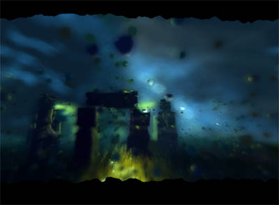
Celtic Time by z brothers
[nfo]
|
||||||||||||||
|---|---|---|---|---|---|---|---|---|---|---|---|---|---|---|

|
|
|||||||||||||
|
popularity : 63% |
|||||||||||||
alltime top: #4014 |
|
|||||||||||||
|
||||||||||||||
| added on the 2013-08-13 00:10:58 by f0x |
||||||||||||||
popularity helper
comments
Very nice, i like the music and the visuals. Good job! (:
good work overall, the beginning is especially cool.
i'm a bit disappointed, i thought this would be an intro about celtic glasgow :P
I like the part with forest ;)
Also, fresh style! Need moar 64kb-intros with nature-theme ^_^
Also, fresh style! Need moar 64kb-intros with nature-theme ^_^
looks very 2001. music is awful, but some scenes kind of makes me awww back to intros like heaven7 so for that nostalgic trip, i'll spare you the thumb down ;)
Overall very enjoyable, but the instruments at the end felt a bit silly. :)
nice colours, fresh music. waaaay to blurry.
waiting for final but you can have my thumb already :)
waiting for final but you can have my thumb already :)
starts quite nice but becomes strange (and silly according to what Saga Musix said). music is also strange ... but better that dubstep ... again. overall a nice feeling about this one. and it's 64k so 

First I was like, oofff, awfull music...then I was more like...meeeh, I guess it'll do. Then it became really awfull with the flute and this stuff. Visuals are pretty good, but as mentioned above, be came silly twoards the end.
Nice blurry scenes :)
good!
plz moar 64ks!
also, plz bigger targets next time! =)
plz moar 64ks!
also, plz bigger targets next time! =)
only 4 support
Best prod in compo,
sadly.
sadly.
A few scenes looks really good
Liked the ultra blurred look, last parts look ugly due to not blurred objects standing out. Also what ton said: bigger rendertargets pls :)
Do more :)
very well
Lovely. I liked the theme and the music a lot in this one. The end result is really good too, for 64k :)
Not bad at all.
I'm not a huge fan of the ultra blurry effect on everything though, it feels like your trying to hide the textures.
Rather ok tune, but I missed a bit of a punch soundwise.
Id like to see more in the future!
I'm not a huge fan of the ultra blurry effect on everything though, it feels like your trying to hide the textures.
Rather ok tune, but I missed a bit of a punch soundwise.
Id like to see more in the future!
rewatched it on xp
fine
didn't do it for me
good prod, scene with fire/plasma/whatever is especially cool, glad to see new (?) group with such quality in russia. good luck!
Love this, and for me the blur was just right. Reminds me a bit of f0x old stuff but with more modern shaders. Nice work.
great
Really loved the epileptic drum stick in the last scene.
yesyes
Why do the drums sound as if they're in the basement? Why is everything blurred to hell? Why are there suddenly unblurred objects in the center of the screen? What the hell is that drumstick doing? Why are the bar lines at top and bottom squiggly? Why must EVERYTHING be zoom blurred?
Too many unanswered questions for me, but clearly some effort went into this.
Too many unanswered questions for me, but clearly some effort went into this.
What I can say, it will be good to watch this prod after a while. Of course it is not one of the greatest, however I can say it could be considered as very good start of something new. it is mostly one man prod, thus I wonder why some people do not like it.. sure it has bugs and different thing I do not like.. but RESPECT to the author of that 64k, it could get a prize place at ASM13 demo compo..
nice concept
I actually quite like this prod. The visuals could do with a lot less blur as already stated. The music is perhaps a bit uninspired, but the instruments works for the visuals, I think. The flute, however, is a totally different story. The instrument does resemble a flute to a certain extend, but the way it's "played" leads your mind to something completely different. To me, creating a realistic instrument is a 20/80 thing. 20 percent is the actual instrument while the last 80 percent is how you play it. You can get away with rather horrible instruments, if you just "play" it the way a normal person would play it. It's not only the visuals that are all about smoke and mirrors, the music is too ;) All in all, I think it's a lovely production with some obvious points that could have been better. I think it's still worth the thumb!
Quote:
and what you seen at xp?:)
added on the 2013-08-13 19:56:20 by f0x
some parts look a lot better for me with dx9. :)
All in all, this is a rather good prod. I was not totally fond of the music (a mere imitation of celtic music) but the atmosphere was pretty well set. Worth a thumb up.
Next time please ask someone from the culture you are mimicking to look over it first. The tin flute is ok and you kinda get the style right, but the bodhran (drum at end) is played with both ends of the stick and sounds nothing like the drumtrack.
Also, the stone circles predate the celts by 1000 years or so.
I like the visual style though so piggy.
Also, the stone circles predate the celts by 1000 years or so.
I like the visual style though so piggy.
Good stuff, but way too blury. Also HTF did you make a window so unstable? It looks like a screensaver as it crashes when I move my mouse! o_O
i see progress from zbs )
good work (for a partyversion)
Adorable :)
as some other said some parts are too blurry. otherwise it's pleasant to watch and definitely a very good intro.
this is quite enjoyable.
Too blurry, too ugly and the music sucks. No downvote because it must have been a lot of work to put all of that into 64k...
Very enjoyable.
Ambitious. In some scenes you can see what the intent was, and how a little more time and tweaking would have made it nail the look.
Maybe a bit too much blur, but overall a pleasing watching experience :)
Not bad
submit changes
if this prod is a fake, some info is false or the download link is broken,
do not post about it in the comments, it will get lost.
instead, click here !
