|
MCMC by The Royal Elite Ninjas Inc. [web]
[nfo]
|
||||||||||||||
|---|---|---|---|---|---|---|---|---|---|---|---|---|---|---|

|
|
|||||||||||||
|
popularity : 60% |
|||||||||||||
alltime top: #6307 |
|
|||||||||||||
| added on the 2013-08-03 19:37:35 by noby |
||||||||||||||
popularity helper
comments
nice (=
Quite solid demo.
Nintendo DS ... (:
That's what I'm talking about.
Wow, another quite good DS demo!
A DS Demo with only one screen is like stereo music with only one speaker :/
Quite cool otherwise... Luv' the glow...
Quite cool otherwise... Luv' the glow...
I liked the zoomer after the train hits in. Could have some better direction, but still good.
Great stuff!
My favorite from the compo: great code, punchy music and design. More please!
ah yeah this is sick :D
What novel said.
Nice glow, but I really wish it was two screens...
Though deffers a thumb for the glow, the platform, and the Haifisch. Gotta dig my DS out later and try it on HW.
Though deffers a thumb for the glow, the platform, and the Haifisch. Gotta dig my DS out later and try it on HW.
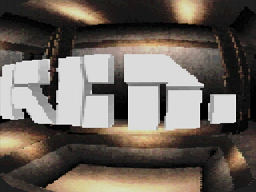
1) First scene is way too messy. I know the resolution is small in NDS but you could've had a bigger logo or zoomed closer to it. Personally I don't like how you and I can see the square edge of the map.
2) I think the fake fisheye is somewhat ok but it some how removes some of the depth from the whole scene... it doesn't work that well in a small closed room. Models are really well made in this part.
3) Tunnel scene looks quite desolate, it maybe PARTIALLY due to the texture, but also adding particles or something like that could've made it look better.
4) Spikey ball, hey I really like this one. But maybe we've seen too many of these. Also I would've liked if the spikeballs surface moved.
5) Train scene, waaaaaay too dark. But overall I liked it! Noise at the end really adds to the feel.
6) zoomer was quite nice actually. :-)
7) I'm kind of getting bored of seeing objects just rotating in the scene and them really not doing anything. But I guess technically its nice.
Nobys music is always a winner.
I guess can't thumb this since I'm in the same group?
here's the thumb anyways.
I quite like the tone of this production, but I can't help but wonder if it was a bit rushed. The logo model could have some proper lighting (prebaked AO etc.), and the train scene really was too dark.
The infinite zoomer and noby's music rock big time!
The infinite zoomer and noby's music rock big time!
no luck running on hw, M3+sakura
really nice work.
Fuck yeah.
Perkeleen hyvää koodausta! Works with newest akaio.
WTF, was this demo actually made by using my useless RTT demo as a base? I just can't believe it. xD
Finally watched it on real hw with newly bought acekard.
late thumb (works with dsi exploit+hbmenu)
yes
lists containing this prod
submit changes
if this prod is a fake, some info is false or the download link is broken,
do not post about it in the comments, it will get lost.
instead, click here !
.png)