|
A deficit of hands by kvasigen [web]
[nfo]
|
||||||||||||||
|---|---|---|---|---|---|---|---|---|---|---|---|---|---|---|

|
|
|||||||||||||
|
popularity : 60% |
|||||||||||||
alltime top: #5315 |
|
|||||||||||||
| added on the 2012-10-21 11:43:41 by eladamri |
||||||||||||||
popularity helper
comments
First kvasigen demo in history that my GPU couldn't keep up with :)
rulez added on the 2012-10-21 12:04:04 by Duckers 
can't give this one a thumb up.
well i certainly can! nice track!
duckers: you have weak GPU-sauce, I ran it fine in 2560x1440 with 16x anti-aliasing :)
rulez
Good but misses something to make parts fit together.
What pommak said, but with a thumb. The radial blur made it feel a lot like an early ~2000s demo which is a definite plus in my book.
Good!
Early 2000s called: they want their 64k music back.
zavie: i think the music works perfectly. sure, it sounds old-fashioned but i thought here in the scene we're supposed to love that.
nice work!
What gargaj said, actually felt kind of fresh in that sense.
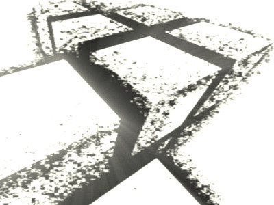
I liked the noisy cube replicator in the screenshot, the font and the style.
somewhat nice
Nice style.
I think this is OK visuals and OK music (nothing more), but they don't really fit together.
Also, just because you have a radial blur routine now doesn't mean you have to use it _all_ the time =)
Also, just because you have a radial blur routine now doesn't mean you have to use it _all_ the time =)
For using the radial blur routine all the time!
good
good
Really liked the expanding cubes. The prod in it's entirety worked out just perfect on the big screen and I really enjoyed the music. Perhaps a bit of what Sesse say about a slight feeling of disconnected music and visuals. But that's a minor detail to an overall awesome prod!
too facile for my taste
a good demo .... with radial blur :)
ok intro, and the music is le very nice!
I like it, and very good soundtrack
Very nice. Not totally sold on the stencil/pencil effect , but it's certainly different.
I like this one..
Like it ! Did you use a shader based on this prod for the 2nd scene (the color and the fog is the same !), with the cube ? No greetz ? :(
rofl ! HERE :p
hoppla!
Very well deserved 2nd place :)
drama ;-)
looks and sounds like a 64k from 2001.
is ok
okish.
nice music
It's ok. A couple of nice scenes, but the light blob at the end isn't one of them.
interesting. thumb up because of the music. scenes are a bit diconnected
Some nice moments.
One of the best from Kvasigen imo.
nice tune! can i get the .xm?
Yeah, I didn't get the shiny blob either, that and the seemingly inevitable cuberaymarcher should have been out. Music was quite all right. Thumb is for the transition from the cubesplitter, enjoyable :)
a deficit in being interesting
uninspiring
Nice norweigan demo with some cool visuals and music
ok
submit changes
if this prod is a fake, some info is false or the download link is broken,
do not post about it in the comments, it will get lost.
instead, click here !
