|
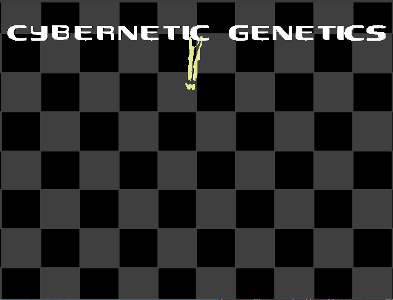
Livin' in a box by Cybernetic Genetics
[nfo]
|
||||||||||||||
|---|---|---|---|---|---|---|---|---|---|---|---|---|---|---|

|
|
|||||||||||||
|
popularity : 64% |
|||||||||||||
alltime top: #8825 |
|
|||||||||||||
| added on the 2012-06-22 10:12:12 by Travis |
||||||||||||||
popularity helper
comments
quite ugly, sorry.
sucks added on the 2012-06-22 11:13:52 by psenough 
it may be ugly but its a linux demo! surely you have to more forgiving on the design side when it comes to linux coders
video please :D
Quote:
To run it you
need an OpenGL 4.1 capable card.
Asking to much for me. Video please.
visuals are not the best but quite okay. nice tune and somehow a nice overall feeling. really liked the last scene.
not a blockbuster, but enjoyable.
i see what they were going for but somewhere the "hey this looks worse than prince of persia 1 sprites scaled to 1080p"-bell should've rung
amiga did it better 20 years ago :(
While this will not win a price for technical achievement, I like the "protagonist" thats followed through the demo.
Also, nice soundtrack.
Also, nice soundtrack.
w32 port (with binary) here: https://github.com/Gargaj/livin_in_a_box
The demo itself has a bunch of great ideas, but the look needs a lot of work.
The demo itself has a bunch of great ideas, but the look needs a lot of work.
Meh... despite some nice music (though a bit repetitive) and a good idea with the falling letters.
(https://github.com/Gargaj/livin_in_a_box/zipball/master if you want it zipped together)
the music saved it.
My thoughts: Not technically impressive. Not toooooo bad. Ok concept and some interesting ideas. But 22 megs for this?
I don't know. Pig it is.
I don't know. Pig it is.
did you people use kinect for this?
asd_spin--;
Better then i thought....
like it
a couple of good ideas that deserved a better execution. as it is, it's rather ugly and boring.
What Alpha C said.
\o/ imadom :)
Love than guy in the box :D
It is entertaining. Up fot that
Thanks for the Win port, Gargaj.
This starts an odd trend of Hungarian demos entered in American parties, that either a) were not shown at Revision (Das Experiment) or b) use mocap (Moove).
Other than the animated figures, I didn't see much in the way of effects.. given the focus was on them, I was disappointed by the missing triangles. The dot-face and hands toward the end was real cool, was that a 3d object or did you capture a pin-box somehow? Music was good quality, but repetitive.. so, it's okay.
+ for the concept but it fails on the side of execution and design.
This looks like an ASD demo written in QBasic mixed with some early 2000 era photoshop gfx and 1990s demopop trance. :)
Obvious nod to ASD, but I liked it.
ok
I like some of the ideas. However, I don't understand why the guy flickers. Don't know if it's a bug or it's supposed to look like that. Either way, it's bad. The music is rather 90s-like, but given the fact that there wasn't restrictions in size, I think at least the drums could have been a bit better. But all that aside, it's a nice and enjoyable production, that I'm sure you put a lot of time and effort into making. So a weak thumb up on my part.
Somehow reminded me a bit of Lost Blubb, both soundwise and effects. Would give thumbs up without that triangle bug in the characters.
Ah what the hell, being reminded of Lost Blubb is well enough for a thumb. :)
Sie sollten sich was Shamen.
Holy crap, it is a dead ringer for Lost Blubb!
okay
Some nice ideas but design was practically non-existent. Also WTF, OpenGL 4?
Not impressive, backgrounds don't display, make something more impressive next time.
cool for me ! liked it, even if some lacks in color made in characters i mean painting is buggy. but cool done, the creation way is done, after all it needs more impressive effects but cool to see and try a new demo on linux ! so thumb up :)
Tomaes is near truth..
Quote:
surely you have to more forgiving on the design side when it comes to linux coders
Why? I have to agree with the general sentiment here. It should be tighter, some of the colors are more than questionable and tomaes pretty much nailed the rest, but there's still a lot of good stuff there, liket he concept with the protagonist and the falling letters .
I' dont like the graphics... I don't like the effects... Th music is so so....... sorry
cool music, but unpolished visuals
Nothing good about this apart from the music. Unfortunately I don't feel that generic trance, although nice at that, earns even a piggy for the rest of this.
What Alpha C said.
The Shamen would turn in their graves
I am giving a thumb down on this one, because of the bug that was left to fill some triangles. It make my eye keep looking for that bug. Otherwise, I enjoy the letter falling... The design and graphics could be better, but of course would probably take way more time to work on...
running people, what more could you possibly want in life?
Huge thumb for the good ideas. Yes, they would deserve a lot better implementation at some places, but hey, this is the demoscene, instead of criticizing just do it better and enter it to a compo!
Also liked the endscreen message.
Also liked the endscreen message.
Can´t get the linux version running, but the win32 port works like a charm.
Interesting concept - want to see more like that
Interesting concept - want to see more like that
decent
ok
very good production. this is one of my favourite Travis's works
submit changes
if this prod is a fake, some info is false or the download link is broken,
do not post about it in the comments, it will get lost.
instead, click here !
