|
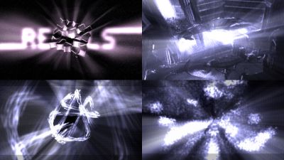
bozon by Rebels
[nfo]
|
||||||||||||||
|---|---|---|---|---|---|---|---|---|---|---|---|---|---|---|

|
|
|||||||||||||
|
popularity : 61% |
|||||||||||||
alltime top: #4378 |
|
|||||||||||||
| added on the 2011-12-28 23:41:21 by pasy |
||||||||||||||
popularity helper
comments
thumb goes for the music
rulez added on the 2011-12-28 23:43:06 by SiR 
TEO and UNREAL = thumb! greetz dudes!! :)
Nice
Kann man machen.
Teo's music rules as usual, and so do these particles.
good prod
Short and stylish.
Also, BASS!
Also, BASS!
Great show.
proper
Nice
godrays. lots of.
Nice
/ME LIKE
1999 called :)
Nice one
there's nothing wrong with it but i couldnt help feeling i'm watching the same effect for 3 minutes, and i think i saw most of this in previous pasy-stuff before. that said, i applaud the idea of using 2d graphics, and the lack of resolution was hidden really well.
wow is it THE unreal ?
nytrik: unreal / faculty (not unreal / sunflower)
The morphing stuff with radial blur looked so great. I love the visuals and the music.
The beginning didn't grab me at all and from the midpoint onwards I felt like I was watching Variform for the umpteenth time. As an intro it's pretty solid but just somehow lacking of soul.
egy demoba kocka kell meg posztprocessz, azt hadd szoljon :))) de a szurket tovabbra sem szeretem
nice!
Nice but not great.
An intro which doesn't need the LHC on your desk to run. Good music, nice to watch. Thumb.
.
I really liked this, especially the particle effects.
I quite liked it. I very much liked the soundtrack, so thumb!
really nice ... should have won !
Good example of the boombastic demo style by Rebels
Please use colors.
is ok
Cool :)
Liked it!
OK intro, but the music is so nice I must thumb it.
not bad, just sometimes fx do not justify poor framerates on my machine
Liked it, especially the beginning with the clean cube of cubes :)
I am not a big fan of radial blur. And it was overused here, in my opinion.
Quite boring, unfortunately.
Made of light.
very good particle work during the first half, shiny cube cube was also excellent!
I was hoping the "space station" to start moving after converging from particles .).
The second half looks a bit rushed :p, but nevertheless a very good 64k!
Big thanks for keeping the 64k scene alive.
I was hoping the "space station" to start moving after converging from particles .).
The second half looks a bit rushed :p, but nevertheless a very good 64k!
Big thanks for keeping the 64k scene alive.
Incredibly boring indeed. Even the music is boring.
what chock and raer said
but anyways... I give you a thumb ;)
Now go and read some papers.
Now go and read some papers.
Nice one! Can't have enough radial blur
a bit short, but nice
I like it
style.
Elite.
Nice!
well-crafted code, good tune, nice gfx - with better timed sync and direction it would be a killer
to much blur for me....
boring and blurry as hell. didn't care for the music.
nice enough
submit changes
if this prod is a fake, some info is false or the download link is broken,
do not post about it in the comments, it will get lost.
instead, click here !
