|
Greetings by Industrial Revolutioners [web]
[nfo]
|
||||||||||||||
|---|---|---|---|---|---|---|---|---|---|---|---|---|---|---|

|
|
|||||||||||||
|
popularity : 55% |
|||||||||||||
alltime top: #15059 |
|
|||||||||||||
| added on the 2011-09-19 14:42:25 by Bobic |
||||||||||||||
popularity helper
comments
2015 called, Doc Brown wants his las back. Firsty + party coding.
nice one, keep it up guys!! :)
2000 just called and said its demo can stay in 2011.
visuals suck. but the music :D :D
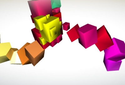
Zoom said it would've benefited from flatshading, and I tend to agree. Otherwise it looks (designwise) much better than most first prods :)
flatshaded cubez can't be bad!
Sorry, didn't notice it was a firsty. Improve! ;)
(And don't take that thumb down too serious)
(And don't take that thumb down too serious)
good
Cool idea maybe you could improve the GFX quality.
Music is nice but it sounds a bit too high mainly for the piano.
Would have been great as a 64k.
Music is nice but it sounds a bit too high mainly for the piano.
Would have been great as a 64k.
I get a white screen
Now this was a nice surprise! As was mentioned already, the shading the cubes is pretty weird and they would look better completely flat shaded (or with SSAO and all those modern toys, and especially antialiasing), but other than that, this was a pretty nice first production.
For future reference, try to make the demo react to the music a bit more. Having only one scene is fine, but right now you have pumping music and a thing rotating on the screen at constant speed. You should at the very least make multiple cameras (and you already have syncing in place) to make it more interesting, but the effect should really react to the music somehow. Thumbs up!
For future reference, try to make the demo react to the music a bit more. Having only one scene is fine, but right now you have pumping music and a thing rotating on the screen at constant speed. You should at the very least make multiple cameras (and you already have syncing in place) to make it more interesting, but the effect should really react to the music somehow. Thumbs up!
motivational + cubes never go out of fashion!
Disliked
Liked
What Mystra said.
ok
submit changes
if this prod is a fake, some info is false or the download link is broken,
do not post about it in the comments, it will get lost.
instead, click here !

With some simple per pixel shading and some SSAO this could have been much better.