|
Living In The Code by Software Failure [web]
[nfo]
|
||||||||||||||
|---|---|---|---|---|---|---|---|---|---|---|---|---|---|---|

|
|
|||||||||||||
|
popularity : 60% |
|||||||||||||
alltime top: #6956 |
|
|||||||||||||
|
||||||||||||||
| added on the 2011-07-25 03:50:50 by ham |
||||||||||||||
popularity helper
comments
What stage 7 said.
Loved the 1995 look but didn't really dig the musics.
Great oldschool shit!
Enjoyable intro. Funny lcd scrolls. Nice to see another software renderer on PC.
Amiga port please ;o) Anyway very nice intro HAM ;o)
The text was hard to read at points but I do like the gist of it :)
Not really my cup of tea, music pretty much spoils the intro for me.
Boah. No.
you know I like your Intro? ;)
Nice production
wtfmusic :D
weird mix
Looks dated but there's something stylish about it too. Music was pretty meh.
nice
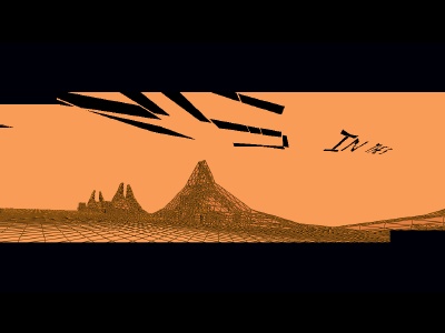
Amazing packet all done in pure SW. Fast/optimized. Especially notably the opening scene where things fly over the sky (and remind me somehow of some StarWars flick) and transparently sort the windows. A lot of thought put to it + just about right length. Very well lives up to its name, since it really is 'another' world where unlimited possibilities exist.
If you have absolutely no clue how colors work, make it in b/w. If you have no clue how music works, just use pink noise with some random pentatonic piano wankery on top. Yes, the result would still be confusing, but at least it would be bearable. :)
Not bad
I found this prod disturbing and confusing. I can feel a presence surrounding all the scenes, that are, in fact, recreating biblical iconography. Perhaps is the digital scroller floating in the sky wich does not fit the desert scene with the Noe's Ark, or maybe the rocket orbiting an object breaking all the gravity rules, which is without any doubt a metaphor of the existence of god. The only think I know is that until these mysteries be solved in the incoming final version I won't be able to sleep an entire night without my mind launching continuous interruptions with these (and other) questions...
Move along.
...
the sky is a rotozoomer.
Pleasant watch, except the scroller steps are too big and the i didn't like the music...
Was pretty good for 32K, but the music didn't do anything for me. The LED segment scroller felt out of place. Otherwise fine. Maybe 64K with luxurious music next? :)
not bad!
completely not my cup of tea. if the music would not have been that bad (or the colors) i would have given a piggie.
very nice! i like the minimal tune & flow
quite ok for 32k
Brilliant :)
wtf?
Awesome. It could use better music indeed though...
software rendering is for real men :)
Wireframy!
I actually had prefered a smooth scroller, tho.
Still, nice contribution.
I actually had prefered a smooth scroller, tho.
Still, nice contribution.
Special, strange style. I think the visual and sound goes well together. I can't say I'm fan of it, but I liked it, in b/w color it wouldn't be the same..
Good
ok
lists containing this prod
submit changes
if this prod is a fake, some info is false or the download link is broken,
do not post about it in the comments, it will get lost.
instead, click here !

It doesn't do the trick for me :<
Maybe one of your intros I've most enjoyed.