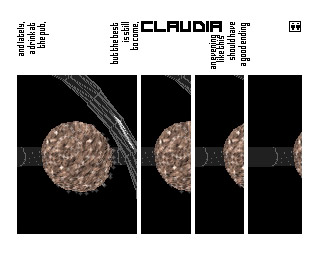
|
Fetish by Ozone
[nfo]
|
||||||||||||||
|---|---|---|---|---|---|---|---|---|---|---|---|---|---|---|

|
|
|||||||||||||
|
popularity : 68% |
|||||||||||||
alltime top: #1312 |
|
|||||||||||||
|
||||||||||||||
| added on the 2000-08-18 11:03:56 by mrdoob |
||||||||||||||
popularity helper
comments
i think that this is da best amiga intro64k.. great ideas.. great dezign... hard lyrics! good job god! ;)
added on the 2000-08-21 01:44:33 by mrdoob 
Couldn't help falling in love with this intro, when I saw it at the partyplace. Great visuals, fantastic design, amazing music. Ozone stays on the top.
Perfect design as usual in ozone. The music fits perfectly with it.
can it be done any better? :) the design is very well done, and so is muffler's soundtrack.
Ozone at it again and another stunning intro. Jee, they do know what style is... Fab, rocking design by god, fast and fantastic effects and code by the really talented drareg and a kicking tune by muffler. Watch it and see what intromaking is all about!
HARDCORE!
the way it is done is perfect indeed. and its even not a demo but intro!
damn this one rox!!
love this text =)
demo itself is good too!
demo itself is good too!
Great idea!
Unique design!
Unique design!
Yeah, rocks! Design and music are perfect.
music and design rulez!
rules
this prod won 64hb intro compo on sattelite '99 held in szczecin, poland... i saw it on place, stunning!
this kicks ass.. One of my all time favourites. This is always shown on my amiga whenever im drunk ;)
Clever use of the little cliparts and the dirty bad girls image is in your face! we want more!
Clever use of the little cliparts and the dirty bad girls image is in your face! we want more!
lick my nipples!
too bad this didn't won. watch the winner, which is plain suck.
how little code can make a stunning intro!
ownz!
too bad this didn't won. watch the winner, which is plain suck.
how little code can make a stunning intro!
ownz!
it really rocks!
Rocks (too bad there's not enough time to read all the text, though ;)
great design and music!
desssssssssssign! >:O
FUcking great designed intro like smoke bomb. Came 2nd actually not 1st ;)
thermonuclear megabomb... smoooooky.
They have style which can beat our style.
Booooo - doesn't work here :(
I'm no expert though...
I'm no expert though...
kewl
nice
O3one
3d-objects could be a bit more complex, but anyway, this is so HARD that it hurts! wear that helmet while watching.
it´s okay but nothing more...
Smooth work.
I certify that I'm 18 + by thumbing this UP UP UP
pure style
pure style
I'll add that the textures are boring and the "use polygon extra scanline pixel" for drawing wireframes sucks :)
wow ... just saw it for the first time and am in total awe. strict design, strong concept and the best way to implement the common rotating 3D objects and effects. straightout fetish!
interresting design but the music is realy not for me.
wham, rocks!
i have nothing against extra pixel wireframe =) as long as ppl don't use wireframe textures like on pc it's okay ;)
seriously: style! this demo rocks. ofcourse i'm a sucker for all this pr0n. which made me fail to notice that there are maybe four or five effects in the whole intro and the objects/textures aren't so great. so, a bit low on content.. but pure kick-ass design and presentation.
seriously: style! this demo rocks. ofcourse i'm a sucker for all this pr0n. which made me fail to notice that there are maybe four or five effects in the whole intro and the objects/textures aren't so great. so, a bit low on content.. but pure kick-ass design and presentation.
So cool! How could this NOT win?
A piece of true demoscene art.
dope !
Didn't have rattings back then :)
Neither ratings.
 design
 music
music style
styleconcept & design
strange design
rulez bigtime!
.
Crappy samples but very nice design.
awesome design
Geil
can't get it to run on my b1260 :/
please, fuck my face. killer design.
hey, how come i never thumbed this up? hell yea, this is one of my all-time favourites :)
and here is a little gift from me - a fresh high-quality youtube encode with proper sync! >> http://www.youtube.com/watch?v=biljccuq3aA.
enjoy!
and here is a little gift from me - a fresh high-quality youtube encode with proper sync! >> http://www.youtube.com/watch?v=biljccuq3aA.
enjoy!
forget about the video, youtube has its ways to fuck up a video... :(
Ozone.
Excellent!
Great design, yes!
Lovely!
One of my favorite Amiga demos!
It was worth the polish train drive 570 km
It was magic to saw it on big screen and voted for magic - true scene friendship won i chÓj ;D
It was magic to saw it on big screen and voted for magic - true scene friendship won i chÓj ;D
;)
Great prod! Nice and stylish!
eh, haven't voted on this yet, even though i made music for the sequel. typical ozone excellence. drareg & god are a real dynamic duo :)
Chock full of design and good ideas.
Great design & music!
great style, design, and another great soundtrack from the man muffler.
ok
lol
nice!
damn
get up, stand up
scary futurevision
scary futurevision
Maybe dated thematically, but holds up amazingly design wise.
One of the greatest Amiga intros
Great!
super stylish!
What lynn said
Rulez.
Liked the 2nd one better, but this one also has unique harsh style
lists containing this prod
submit changes
if this prod is a fake, some info is false or the download link is broken,
do not post about it in the comments, it will get lost.
instead, click here !
