|
Do Not by Ümlaüt Design [web]
[nfo]
|
||||||||||||||
|---|---|---|---|---|---|---|---|---|---|---|---|---|---|---|

|
|
|||||||||||||
|
popularity : 58% |
|||||||||||||
alltime top: #6541 |
|
|||||||||||||
|
||||||||||||||
| added on the 2010-09-05 02:03:02 by Gargaj |
||||||||||||||
popularity helper
comments
the screen looks indeed cool.
foo. thumb. :)
well, booting into xp was well worth it !
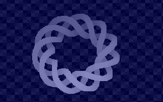
those are bobs, eh ?
good job !
those are bobs, eh ?
good job !
I voted for that :) It was actually shown on monitor which was of course no substitute for the bigscreen... And I guess it wasn't visible on bigscreen because Windows opens fullscreen apps on primary (default) screen, and the bigscreen was the second screen.
Very nice, amazing what can be done when you know some math :)
smooth
yes
Do Not use things like les di,[bx] in 256B intro.
Another deserved thumb :).
Xorus.
Haha, awesome.
donut!
what rrrola said.
nice!
That's nice.
It's fast!
~~~
* dodecahelix!
* respect.
* proper competitor to difúze.
* Do Not use things like 3.14 in 256B intro ;)
* respect.
* proper competitor to difúze.
* Do Not use things like 3.14 in 256B intro ;)
nice!
a solid thumb!
fresh fx
jop
This was quite nice, also runs quite fast with few cycles on dosbox.
Good
Nice
cool
Absolutely great!
fldpi
.
∞
fantastic :D
Wow, yes!
very nice
submit changes
if this prod is a fake, some info is false or the download link is broken,
do not post about it in the comments, it will get lost.
instead, click here !
