|
liquidiced by BluFlame [web]
[nfo]
|
||||||||||||||
|---|---|---|---|---|---|---|---|---|---|---|---|---|---|---|

|
|
|||||||||||||
|
popularity : 63% |
|||||||||||||
alltime top: #2617 |
|
|||||||||||||
| added on the 2010-08-29 13:15:00 by CodingCat |
||||||||||||||
popularity helper
comments
Coder pr0n <3 !
rulez added on the 2010-08-29 13:47:57 by Anat 
very weird stuff... some good looking colors and shaders, but left me feeling very confused
best in the compo imo
best in compo, but i agree with duckers - odd composition :)
Very beautiful and I really like the music, but it crawled at less than 3fps on my machine with a 9800gtx+.
I'll look forward to a final or a video.
I'll look forward to a final or a video.
Crashes here, I'll wait for a video.
some very nice stuff, especially materials but I don't really like the music, content and direction
Like XT95 said :)
Very weird, and the music reminded me of Synthesizer Greatest CD's, but that's not necessarily a bad thing.
Some nice rendering, though, and um... I don't know, I hope your next production makes more sense :)
Some nice rendering, though, and um... I don't know, I hope your next production makes more sense :)
Bugs differently for 3 different resolutions (1024x768, 1280x1024, 800x600 window) !!
Will hold thumb until final is released...
Will hold thumb until final is released...
sagacity: to be honest the greetings part reminded me VERY much of auf wiedersehen monty :)
and i suppose what most people imagine as "weird composition" is the fact that it bookends with the C=/Atari logos which dont really seem to have a lot of connection with the rest. a nice intro still.
and i suppose what most people imagine as "weird composition" is the fact that it bookends with the C=/Atari logos which dont really seem to have a lot of connection with the rest. a nice intro still.
Needs d3dx9_42.dll.
WOW - very nice !
But why only placed 3rd ? :(
Looks nice but it's too repetitive. Specially the music.
(the music is specially boring)
it's coo'
Beautiful. A bit slow here but still watchable.
I can agree with some that it felt kinda random. Not that I care much though.
I can agree with some that it felt kinda random. Not that I care much though.
wtf.... what kinda gfx card do i need to watch this running not like a slideshow?
3D Studio ducks never fails....
Cute! =)
Very nice scenes but the music is kind of horrible.
What Gargaj and xernobyl said, only for me that results in a piggie
Very cool. Some strange seemingly random (but possibly related to a specific shader) crippling slowdowns here, especially during the scroller, and when panning past the blue crystal. Ati.
OK, it runs fine at 720 in a window. If I try any fullscreen res below my desktop resolution (1920x1200) I get a black screen. I have a dual monitor setup, win7.
Solid production. Nice visuals, so so music. But i did not like the movements of the objects or sometimes the camera. They seem to hectic, too abrupt. I guess they were synchronized to different instruments and that did not feel good.
should have won the compo. with some more direction & design this could be one of the best 64ks this year
The whole thing was shattered into million pieces. I was always asking this question to myself: "Well it looks nice, but why is this happening now?".
Other than that solid rendering, but I hated the music and how great-on-its-own things were assembled together to create something that's average.
Not to mention how out of place those C= & Atari logos look.
Nevertheless it's a thumb up for the rendering and the content. But please, try to get someone who can direct demos.
3rd?
Good. Very good.
Good. Very good.
i get only a 2 part blue screen, one half light, the other half dark blue... but loved it at the stream, thumb up and waiting for the video.
Exactly what Decipher said.
I wish, this won. Unfortunately I wasnt at the party. I like the water reflections, because in most other implementations, there is a glitch between the water surface and the object at their meeting point.
Dont judge by the FPS, its easier to render AA lines or cubes with no shadow.
Next time put more time into design. The C= logo may have been the cause for some lost votes as well.
Dont judge by the FPS, its easier to render AA lines or cubes with no shadow.
Next time put more time into design. The C= logo may have been the cause for some lost votes as well.
umts fucked my vote, should have been a thumb up
you get my thumb for the visual content.
also what gargaj said.
also what gargaj said.
Everything that Decipher said. You guys can make something much better.
Nice visuals but strange scenes.
Deserves 1st place.
Visuals are very great, but the direction and the music ruined this demo! A pity...
Thumb up to motivate you for the next demo with balanced visuals, direction, design and music!
Thumb up to motivate you for the next demo with balanced visuals, direction, design and music!
nice one
Lacks design and coherence. Some effects were nice (refraction (?) stuff) but some weren't (water).
Nice one! Waiting for more stuff, this time perhaps a little bit more coherent :)
Runs at a poor frame rate here - how do I selected my own resolution??
Well done!
there is some serious techniques going on here. the result doesn't make much sense to me, but the code is there. these guys can make a killer intro now.
Nice rendering but I really do not like this music.
What the hell were those Commodore and Atari logos doing there? Fine intro otherwise :)
The rendering is really impressive (even considering the frame rate problems during the compo). Next time add a hint of a story (Grimm brothers is always a good source), and win.
beautiful, but sometimes strange design ideas
Somehow all objects are transparent here, though the reflections are not; Win7 ATI 5850.
Having seen the video: While imagine was awesome due to its unrestrained happiness, this one seems to have consolidated the rendering quality but is just utterly random with regards to what's shown. The music was walking on the thin edge between "cheesy but what the hell, it's cool" and "way too cheesy", almost falling off to the wrong side.
Having seen the video: While imagine was awesome due to its unrestrained happiness, this one seems to have consolidated the rendering quality but is just utterly random with regards to what's shown. The music was walking on the thin edge between "cheesy but what the hell, it's cool" and "way too cheesy", almost falling off to the wrong side.
Great rendering going nowhere with bad music. When the Alphörner set in, in that moment you lost me...
some party are strange, some are great, but I like it
really strange but for some reasons i like it
good
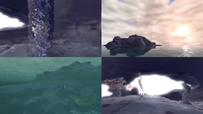
nice rendering and some bits of design are good (that first scene above the waves with the island is lovely) but.. er.. wtf is going on?
I don't get the meaning of C= and /|\ sign, otherwise good.
i like it!
The horribly bad direction and cameras just piss me off and distract from what I'm sure is nice code. A pity.
I like the look of this one! The direction is all over the place...but still a nice intro and my favourite from the compo.
looks good, but doesn't really work as a whole
I´d prefer "liquorized", but anyway a solid prod
first: get a decent ascii-logo already :p
- 2-3fps on my demobox :(
- C= and Atari-signs just have nothing to do with this prod
- that music-sync stuff just looks bad
+ really ace models
+ really ace code/effects
+ LPChip
makes a pig, but i cant downthumb this ;) just improve on fps plz, else imma even downthumb you for that next time !
- 2-3fps on my demobox :(
- C= and Atari-signs just have nothing to do with this prod
- that music-sync stuff just looks bad
+ really ace models
+ really ace code/effects
+ LPChip
makes a pig, but i cant downthumb this ;) just improve on fps plz, else imma even downthumb you for that next time !
Should have won. Very nice gfx and modeling in 64k. Just music could be better next time ;o)
Music - sux
Actually, I like the design. I enjoyed.
You obviously have a serious rendering engine here. Too bad the framerate drop on big screen. :-/
Once you'll have flow and direction, you prods will seriously rock.
Once you'll have flow and direction, you prods will seriously rock.
I just didn't get this.
Ein episches Meisterwerk!
ACK.
Quote:
Should have won.
ACK.
nice,
but music is not my taste.
Atari & C-64 signs are cool ! (they are there, because both companies got liquidiced in some way - got it ? :)
but music is not my taste.
Atari & C-64 signs are cool ! (they are there, because both companies got liquidiced in some way - got it ? :)
Really enjoyed this one!
solid prod! I really enjoyed it!
Looks good but it makes no sense.
Hot. Thanks for the greetings.
really nice technical show!
cool
wow. i can t beleive it ranked only 3rd
Very nice. Really didn't like the harsh sync effects though.
Nice but slow, even on a GTX 295 (was pretty highend for 2010).
Kinda ok, but didnt really do it for me, sorry. What ponce said also music didnt work for me.
Very nice !
Just discovered this nice gem! Great work guys!
ok
submit changes
if this prod is a fake, some info is false or the download link is broken,
do not post about it in the comments, it will get lost.
instead, click here !
