|
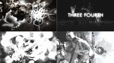
Three Fourth by Dimness
[nfo]
|
||||||||||||||
|---|---|---|---|---|---|---|---|---|---|---|---|---|---|---|

|
|
|||||||||||||
|
popularity : 69% |
|||||||||||||
alltime top: #2387 |
|
|||||||||||||
| added on the 2009-09-07 22:28:37 by kbi |
||||||||||||||
popularity helper
comments
I like the centerpiece big 3 and 4 surrounded by loads of little 3 and 4s, but it lacked life - the camera simply pans and zooms, objects rotate. There is some quite nice pixel work on the mugshots reminiscent of Concrete which was cool, but I was expecting some bold colour, or the suspended numbers to crash to the ground at the end, something to give it a bit of impact.
added on the 2009-09-07 22:42:39 by Claw 
btw nfo says there may be ATI bugs. There aren't.
I must say that I really like this one. It has a nice "classic demo touch" to it...the artwork looks good, the music was well done, too. My favourite scenes are the 3s and 4s Insectecutor mentioned and the greetings part showing scenes from the groups' productions. The blur and noise effects were a bit too overused, though. All in all a fine demo!
Mawi-Style and high quality graphics!
I've always felt that greyscale demos look cheap, but I did like the 2d design a lot and there were some nice looking 3d scenes too.
Music was that awful generic drum and bass track I've heard on a million other demos and really didn't match the demo.
Just ok this time. I think these guys can do much better.
Music was that awful generic drum and bass track I've heard on a million other demos and really didn't match the demo.
Just ok this time. I think these guys can do much better.
should have won
Should have won, IMHO. Still it could use some baked AO and few less bugs (like smart_ptr crash after picking 1280x1024), but it's nice overall.
nice one :)
very good and the music is great
Greyscale with nice style.
If just the 3d and effects could match the music and the 2d artwork, this would be a lot more enjoyable.
Piggy for now.
Piggy for now.
video plz
Rather boring object show. Has a few nice moments (like the greetings part f.e.) though. Totally dislike the music!
nice
Great, can't wait for next production!
kolor up for the next prod ;-)
Screenshots looks promising. YouTube video maybe?
Me likes.
nice :)
DIS-CON-TINUED
my favourite from the compo
Superb!
mawi' style !
kinda polish. not very interesting but not awful either.
meh.
nice
It was hard to get it running (hint: you need to remove the "read only" attribute from the "0.75" file), but it was certainly worth it. Great style, great demo.
meh
Love at first sight!
music!!
nice
hmm left me kinda unsafisfied (colourz?), track is not bad.
Wow !!
nice music. rest is just okish
Grey scale elegance, with quite an artistic style.
it's a good watch, but what Puryx said.
Nice!
Cool !
Credits and end picture are nice, rest is OKish .
Just an oink. Nothing special.
It doesn't rule, so piggy. Be happy to thumb up if someone explains what's special about it tho
Soso. It worked with my ATI Radeon 4870 video card (512 MB; PCIe) with Catalyst suite driver from v10.12 in my updated, old Windows XP Pro. SP3 machine. :)
I really love the music!
the music saved the prod from mr piggy.
Nice! Especially the 2D gfx.
Nice karma and great music.
Reminds me of the old days. Not that good for 2009.
great demo, great music
great b&w "in-your-face" demo. Last scene with 3/4 models was great.
Yes!
Nice prod! I like the style.
Definately worth a thumb up. Great breakbeat and cool syncs. Effect-wise I'm not that blown away, but the overall presentation is flawless!
Hmm...felt a bit empty and boring. Not my cup of tea.
not very lucky combination of static images and 3d objs
Worked fine in 1280x1024 on ATi, mug shots were probably done with flash vectorizer.
I must be honest and say is don't see the CDC in this. At all. Short, bland, 'scenegimmicks implemented' yet (or because of that) unsatisfying. Objects look like OpenGL tests with filters and if you 'style with greyscale' your rendering can't be second best.
Without knowing anything about Dimness, I think the mixed reactions here could be due to the "gamedev buddies gone Scene" feel that you get with some other prods. I'm taking a hell of a risk saying that but I'll also say that if you want to be cooler than the other chumps there's no better place than the scene. Blow us away and you'll be legends ;)
The better parts were the last 4 with 3s around it and the greeting-signs!
why not
Nice. Although a little too heavy dose of white flashing for my taste. The final scene (rotating around the 3rd typo), however, is extremely beautiful.
great
2d art was great, didnt care for 3d
lists containing this prod
submit changes
if this prod is a fake, some info is false or the download link is broken,
do not post about it in the comments, it will get lost.
instead, click here !
