|
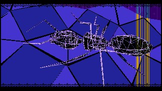
Umbilicus Mundi by Software Failure [web]
[nfo]
|
||||||||||||||
|---|---|---|---|---|---|---|---|---|---|---|---|---|---|---|

|
|
|||||||||||||
|
popularity : 61% |
|||||||||||||
alltime top: #5052 |
|
|||||||||||||
|
||||||||||||||
| added on the 2009-04-12 12:11:03 by ham |
||||||||||||||
popularity helper
comments
AMIGGAA
Nice software engine, cool walking ants.
Good
Rulez!
As Ham can't upload his production now, I'm mirroring it here meanwhile.
As Ham can't upload his production now, I'm mirroring it here meanwhile.
Good production. Antz 4 life.
Nice one
Nice!
Average, more below average.
What EviL said.
Ants!
Yep.
Rulez mucho ;)
Ham!!! Very good intro!
this is a perfect example of why you shouldnt do everything yourself. this could have been great with some proper colors and music. still good code though.
After 5 minutes of precalc (classic 68040) I saw something which I think I had seen in the past. Nothing interesting.
It's ok, but I also feel that I've seen it all before.
cool one!
great animal attraction!
nothing special, but mixed well
what prm said
good
what prm said
as manwe said
nice! Probably (technically) underrated.
I second prm. Ham, you gotta find a guy who polishes your great scenes colour-scheme-wise and you'll be on the pedestal in no time.
Nevertheless the mandatory skill thumb 'cause I love your engine.
Nevertheless the mandatory skill thumb 'cause I love your engine.
Actually the colors and the intro in general was by far the best I've seen from Ham.. Deserved a little higher rank in my opinion.
I don't think this is a copy of Ham's previous intros. It is *similar*, but I think there is definate progression, and I think this is Ham's best intro so far.
a bit boring
great8 visual concepts ... but the music? guys...
Spanish one-man army strikes back. :) And even though the intro is in Ham's typical style it isn't just a copy of his previous intros. Except for the strange object right after the greetings part I quite like it. I'm not too fond of the music though. :)
ok
ok
ham your style is cool, and when i imagine the music as some insects noises - it fits pretty well. ;)
It was ok.
What d0DgE said.
here's your thumb ham! your best production yet by miles, maybe a tad noisy for my taste and the music isn't quite there yet, but a definite 2nd or 3rd place in my compo-ranking.
What Evil said.
ham in the man!
Nice.
Your prods keep getting better. Congrats for the one-man-work factor ;)
One-man awesomness. really like that track too! great stuff
great insecty effects! like it a lot, very impressive.
Really like the colour scheme. You created your own style. Something many people will never be able to do.
What they said, only without the thumb.
Fuckings for not greeting IRIS... eh, what the hell? INSTANT thumbs up!
...looking up for the next release
HAM is the king of the lengthy pre-render.
Every one of these is worth waiting for. Assuming you have at least 030 and a decent amount of mem. And I have yet to see a software failure in a software failure demo running on such a system.
I would give solo style synopsis. But that would just spoil the fun and surprises.
Music is rarely to my 'tastes', but always fit so well with the design that I usually "CRANK IT" anyway!
/me has funky ants in his fancy pants
"and I love it"
Rocks!! And the not-so-polished exterior makes it even better.
Cool ant, but soso demo. :)
didn't liked music but very nice design and what trace said.
submit changes
if this prod is a fake, some info is false or the download link is broken,
do not post about it in the comments, it will get lost.
instead, click here !

but the rest damn rulez