|
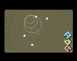
Walking in circles by Amiga Demoscene Archive
[nfo]
|
||||||||||||||
|---|---|---|---|---|---|---|---|---|---|---|---|---|---|---|
|
|
|||||||||||||
|
popularity : 64% |
|||||||||||||
alltime top: #2930 |
|
|||||||||||||
| added on the 2009-04-12 11:02:26 by z5 |
||||||||||||||
popularity helper
comments
Simple but nice.
Very awesome!
.
stylish
Curse my poor posting skills..... Thumb!
...and the thumb
Simplicity that works.
:)
Loved it! The music is fantastic!
...too simple in my taste, but no crap. Piggy.
design
Perfect execution, great zik
this looked great
I like it :)
Great execution but i still don't see why you need AGA machines for such simple things ;D
I like circles.
Cute ^^
Totally cool
Great to see z5 releasing stuff!
Good use of circles, great design!
what hitch said
Not bad prod. Nice music and concept.
thumb for design
Damn sexy design!
not as good as your first prod, but still ace! you have 100% design power!
crap
ADA did it again!
YouTube for you.
YouTube for you.
Pretty nice! Is it supposed to update every 2:nd frame? Did so on my 060/60
@z5: I mean it's a 25Hz demo for me @ the real thing. Still, it's pretty nice!
rulez!!!!!!!
Cute!
Totally boring!
And why did you need AGA for this? Could be easily done on every A500...
And why did you need AGA for this? Could be easily done on every A500...
cool
ok
forgot to vote...
A round release and even before 2012 :)
The compo machine was an overclocked 060.
I didn't see any misbehavior ... will rewatch it as soon as my miggy ist re-set up.
excellent colour choice & tune, again.
The compo machine was an overclocked 060.
I didn't see any misbehavior ... will rewatch it as soon as my miggy ist re-set up.
excellent colour choice & tune, again.
hm...
Cute.
Quote:
Could be easily done on every A500...
...then step into the circle and do it.
you know, talk is cheap! It's his second release FFS.
nice design but boring overall.
Z5: crap, you're coding demos now? Crap I suck.
You rule. Seriously. There are some clever ideas in this...
You rule. Seriously. There are some clever ideas in this...
nice circles! Music is not so good although...
I found this VERY entertaining on the bigscreen. Nice design and execution, when the end part appeared I couldn't help but smile, these walking things are too cool! :) Some minor visual bugs on my A4k tho, some parts flicker a bit and there's some trash on screen. Still a very nice intro, I enjoyed it a lot! :)
After so many people commenting here, it's time for me to tell you what I think about this little intro.
The music is an ok chiptune, a bit repetitive but very well composed. Nice arpeggios.
The rest is almost totally crappy, in my infallible opinion.
First effect: 34 seconds
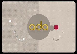
-ADA logo with colouring circles revolving around.
All is centered and the screen is divided vertically at the center of the screen.
That concentrical mania leads the human and superhuman minds to sleep and, in my undisputable opinion, should always be avoided.
Second effect: 30 seconds
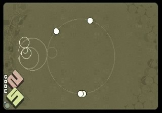
-Circles centered, circles inside circles, credits.
This is the less boring part to me and, maybe, to you. I like the colors in this effect.
I think that this part is the less boring ONLY because it has more rapid changes (the credits).
What do you think?
Third effect: 48 seconds
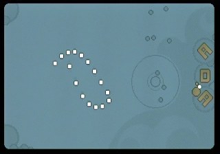
-Circles moving and sinusoidal spirals (and also flags) than changes a little from time to time.
The excessive duration and boredom of this part is compensated a little bit by the good mood of the music.
Yes, this part is boring as hell in my relentless opinion.
Fourth effect: 30 seconds
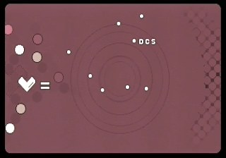
-Circles, greetings, horrible glitches that, apparently, are easily forgiven by the masses.
Seems to me, in my equitable opinion, that this part has a bad choice of colors. I explain, is red but is not calid.
But the colors are not bad at all because the fact that there are some greetings to a few unactive groups is outrageous!
Greetings must be delivered (preferably) only to people who are recently and constantly active in the scene and not to friends or people who maked great stuff lots of years ago.
That could leads Skarla or Potion to move their asses!
Fifth effect: 18 seconds
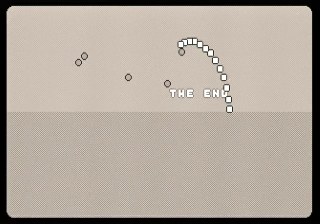
-2D "walk" of the circle things, horizontal exact division of the screen.
"The End" message at the end of the intro. Very important information!
Summarizing:
Static simple backgrounds with simple graphics, less than 5% of the pixels on the screen are actually "alive and moving".
Boring and minimal effects that would be "OK" in 1990.
Few scenes, only 5 in more than 2 minutes and 40 seconds. And what a static and quiescent scenes!
It fits on 40k, but could be done in 4k and in ECS. And maybe even in EPSON, but I'm not entirely sure.
This is my respectable opinion, you may have a different one, but remember that my open-minded opinion is always unbiased, impartial and disinterested (like yours, I hope) and is also of someone who make also intros (like a few of you), and not only opinions.
And I am sure that Z5 will improve his kung-fu beyond these circular movements and eventualy will manage to release great stuff! So, Z5, continue coding and make more stuff!
Conclusion:
Maybe some people can be hypnotized easier than I could figure. I should study this cheap hypnotic tricks because it could save months of hard work to me.
The fact that this simple thing could managed to achieve a 3rd rank at breakpoint and more than 30 thumbs up here in one day, with almost no criticism, is something that seems, in this perplexed moment, mostly unexplainable to me, in my omniscient opinion.
The music is an ok chiptune, a bit repetitive but very well composed. Nice arpeggios.
The rest is almost totally crappy, in my infallible opinion.
First effect: 34 seconds

-ADA logo with colouring circles revolving around.
All is centered and the screen is divided vertically at the center of the screen.
That concentrical mania leads the human and superhuman minds to sleep and, in my undisputable opinion, should always be avoided.
Second effect: 30 seconds

-Circles centered, circles inside circles, credits.
This is the less boring part to me and, maybe, to you. I like the colors in this effect.
I think that this part is the less boring ONLY because it has more rapid changes (the credits).
What do you think?
Third effect: 48 seconds

-Circles moving and sinusoidal spirals (and also flags) than changes a little from time to time.
The excessive duration and boredom of this part is compensated a little bit by the good mood of the music.
Yes, this part is boring as hell in my relentless opinion.
Fourth effect: 30 seconds

-Circles, greetings, horrible glitches that, apparently, are easily forgiven by the masses.
Seems to me, in my equitable opinion, that this part has a bad choice of colors. I explain, is red but is not calid.
But the colors are not bad at all because the fact that there are some greetings to a few unactive groups is outrageous!
Greetings must be delivered (preferably) only to people who are recently and constantly active in the scene and not to friends or people who maked great stuff lots of years ago.
That could leads Skarla or Potion to move their asses!
Fifth effect: 18 seconds

-2D "walk" of the circle things, horizontal exact division of the screen.
"The End" message at the end of the intro. Very important information!
Summarizing:
Static simple backgrounds with simple graphics, less than 5% of the pixels on the screen are actually "alive and moving".
Boring and minimal effects that would be "OK" in 1990.
Few scenes, only 5 in more than 2 minutes and 40 seconds. And what a static and quiescent scenes!
It fits on 40k, but could be done in 4k and in ECS. And maybe even in EPSON, but I'm not entirely sure.
This is my respectable opinion, you may have a different one, but remember that my open-minded opinion is always unbiased, impartial and disinterested (like yours, I hope) and is also of someone who make also intros (like a few of you), and not only opinions.
And I am sure that Z5 will improve his kung-fu beyond these circular movements and eventualy will manage to release great stuff! So, Z5, continue coding and make more stuff!
Conclusion:
Maybe some people can be hypnotized easier than I could figure. I should study this cheap hypnotic tricks because it could save months of hard work to me.
The fact that this simple thing could managed to achieve a 3rd rank at breakpoint and more than 30 thumbs up here in one day, with almost no criticism, is something that seems, in this perplexed moment, mostly unexplainable to me, in my omniscient opinion.
I smell some bitterness here. ;) I am not sure that you are really unbiased as it sounds a lot like "damn, this didn't deserve 3rd place, my intro should have been ranked 3rd". While I agree with some of your arguments I still think this intro is entertaining. Yes, I gave some "bonus points" because it's Z5's 2nd intro, but still, it's an entertaining little piece of work. Instead of being bitter, just start a new intro and be happy, it's not the end of the world to lose against an intro which you may consider poor you know. :) That's just my highly unbiased opinion. ;)
@StingRay: Why do you think that I believe that my intro deserved only the 3rd place? I don't like 3rd places more than 4th! ;)
And, more outrageously... Why do you thing that I did not already started my next production? :D
Anyway, I'm very happy because the party was awesome! Cheers!
And, more outrageously... Why do you thing that I did not already started my next production? :D
Anyway, I'm very happy because the party was awesome! Cheers!
Your whole comment sounded a little bit too harsh IMHO, I wonder if you would have written the same things if your intro would have been ranked higher. Just keep in mind he's still learning.
Anyway, I know (or hope) that you're working on some new stuff already. See you again at next BP :)
Anyway, I know (or hope) that you're working on some new stuff already. See you again at next BP :)
Liked it.
Besides, for many people, it's not about the technical stuff but about the style. And this one has plenty of style.
yes it has style, the rest - hmmm...
It somehow reminds me of small BBS-intros from mid 90s.. Neat, but nothing great.
happy chiptune!
walking in circles (but the way goes up?!) :)
walking in circles (but the way goes up?!) :)
awesome chiptune and oldschool style. must be done on c64.
awesome!
I like your style
Entertaining and neat! Like the chiptune! Up!
Nice and simple
simple and nice
I was expecting a little bit more for a second release. Hope you'll put somethin' more in your next one. Keep it goin' don't stop.)
ok effects, and very annoying music.
I don't get it.
Why does this even need a c2p routine?? I'm very unhappy with the code.
Motivational thumb down :)
Why does this even need a c2p routine?? I'm very unhappy with the code.
Motivational thumb down :)
If my comment sounded harsh or offensive, my apologies :)
Looking forward to see yr future productions, z5 !!
Looking forward to see yr future productions, z5 !!
Coming back full circle to shit.
Cute little production I very much enjoyed.
Oh yes I remember this prod last year. I like the overall design.
@z5
Oh ok, so I won't waste a motivational thumb here... ;)
Naaah, another little thumb can push you back to action... dunno, a fucktro for that zoolamer? ;P
Oh ok, so I won't waste a motivational thumb here... ;)
Naaah, another little thumb can push you back to action... dunno, a fucktro for that zoolamer? ;P
very nice
Wow, what has been going on in here? Seems like I missed some nice action years ago. The intro is cute, but nothing to write home about.
But Ham, how brave of you to piss all over a newcomer whose intro was ranked higher than yours (maybe for a reason?). This really makes you look like a prick. Congratulations!
But Ham, how brave of you to piss all over a newcomer whose intro was ranked higher than yours (maybe for a reason?). This really makes you look like a prick. Congratulations!
Cute, stylish and nice :) Love it.
Some simple but playful ideas :) but again the wrong framework for those ideas. It's simply the case that people watch this at home and expect it to run (full framerate) on an A500 from the effects shown.
Extraordinary minimalist design. The music is not my cup of tea but matches to the effects.
Catchy tune, funny things on screen...
Sweet! =)
Very enjoyable intro!
everytime I'm searching for stuff about amiga coding I land on ada.untergrund.net - and then I found this and I really like it. didn't know z5 created demos! also, even after 15 year a totally unsarcastic résumé by ham here, lol.
submit changes
if this prod is a fake, some info is false or the download link is broken,
do not post about it in the comments, it will get lost.
instead, click here !
