|
contrast #1 by Purple [web]
[nfo]
|
||||||||
|---|---|---|---|---|---|---|---|---|

|
|
|||||||
|
popularity : 52% |
|||||||
alltime top: #33858 |
|
|||||||
| added on the 2005-04-22 01:57:51 by dipswitch |
||||||||
popularity helper
comments
Funny diskmag, had some quite spacy interviews.
rulez added on the 2006-01-10 11:21:41 by d3pth 
what depth said :)
Contrast was a diskmag by the Danish group Purple from 1994/1995. All three issues are available at scene.org and work under DOSBox. They were downloaded about 400 - 600 times.
Contrast #1
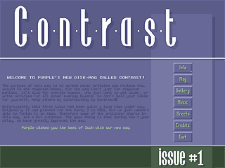
Contrast #1, from December 1994, was a diskmag with a strongly nested menu, a small font and a rather low contrast (what an irony!) between the text and the background pic. Coded by Log Head, Last Nerve and Viper, it had graphics by
Splatt and music by Mystical. It was controlled by the keyboard. The controls inside the article were not very comfortable: Instead of flipping pages just by pressing right or left, you had to select "Next" or "Previous" from a controls menu and then press Enter. After the title picture, you came to the main menu, where you could choose between Info, Mag, Gallery, Music (music selection), Greets, Credits and Exit. The gallery featured a couple of pictures by Splatt which were created using 3D Studio; loading was quite slow.
Inside the actual mag part, there were the following sections: advertisements, articles, charts, general info (how to write an article), interviews, news, programming, reviews and "wanted" (adverts). The articles were again divided into computer related and miscellaneous ones. The former sub-section contained a
Flemish scene report and several general-computer-related (not scene-related) articles on Internet games, why Windows 1995 was the right choice (an ironical humour article) and several quotes about computers by more or less famous persons. The latter sub-section was a bit longer. It featured an article on fractals and an IQ test, as well as some poems, stories and weird stuff. The charts were about demos, games, intros and utilities. There was just one interview, with Zaph. The programming corner dealt with GIF and LZW, GUS and Super VGA, and there was also the first part of a Turbo Pascal tutorial for people really new to programming. The reviews were about demos, parties, hardware and various things such as music.
All in all Contrast #1 was fairly good for a first issue, although it had its weaknesses (as already told).
submit changes
if this prod is a fake, some info is false or the download link is broken,
do not post about it in the comments, it will get lost.
instead, click here !
