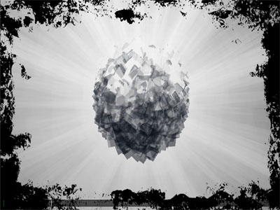
| Grand Central by Outbreak [web] | ||||||||||||||
|---|---|---|---|---|---|---|---|---|---|---|---|---|---|---|

|
|
|||||||||||||
|
popularity : 71% |
|||||||||||||
alltime top: #702 |
|
|||||||||||||
| added on the 2008-06-07 23:37:57 by thec |
||||||||||||||
popularity helper
comments
Quite nice, but definitely not the best.
rulez added on the 2008-06-07 23:38:56 by visy 
yeahh... cubes!!! O_o--b
Cube domination ! No sound on my debian, but nice anyway !
I like it =)
Cool. My favourite part was the words "we greet". (the effect looked nice head-on)
Niiice :)
XT95: Grand Central uses audiere, which appears to be using alsa without software mixing. In my end I had to close all apps using sound (i.e. audacity, firefox) in order to get sound.
XT95: Grand Central uses audiere, which appears to be using alsa without software mixing. In my end I had to close all apps using sound (i.e. audacity, firefox) in order to get sound.
It was not the effects that made this enjoyable for me, but the obvious care that went into putting them all together just right. Designwise, this is a triumph. Also loved the way it referenced textmode demos. Very very nice.
I really like the beginning when the cubes forms the outbreak logo and the transition to the next scene.
The music is nothing for me, but it is still a thumb up
The music is nothing for me, but it is still a thumb up
What menace said in the first sentence.
cool!! CUBES :D
good
Nice styles... music doesn't fit at all here imho.
nice cubes
kickass effects shity music
some parts were really neat. didn't really like the music.
thumb up !
some very cool effects
Good, Classy, Stylish and Charming.
More cube-o-mania. The music was jazzy and fresh. Reminds me about some 1996 Acid Jazz. Way to go guys!
More cube-o-mania. The music was jazzy and fresh. Reminds me about some 1996 Acid Jazz. Way to go guys!
very nice demo, almost as well designed as a keops production (especially the first cuby parts).. /me <3 thec!
nice one
You're improving all the time. The tunnel part was my fav.
Nice demo with a kind of oldschool look and feel in many scenes - a lot of nice ideas - I like it!
Duh... forgot the thumb! :D
<3+<3
I love the music. And the cubes of course.
Love at first sight.
Enjoy!
should be 2nd at least...
Ubuntu 8.04, music started, but screen is black
(GF5200FX, all libs for OpenGL-support installed, and another demo work)
(GF5200FX, all libs for OpenGL-support installed, and another demo work)
Had to install Audiere before it would run but there's some neat stuff in there.
I just LOVED the music (except that the chords are too loudly mixed). Transfering to my mp3-player as I write this :)
It just underlines the perfect oldschool feeling. How can people say that the music "did not fit"?
It just underlines the perfect oldschool feeling. How can people say that the music "did not fit"?
Quote:
should be 2nd at least...
Should have won.
not a huge fan, but at least someone loves you now ;)
thec, audiere has installed, without it it was not started at all. Has tried to press the right button after start of music, something like the index of a position in the bottom of the screen moves, but the screen black. Probably problems with incompatibility of drivers of a videocard.
Nice classy minimalistic oldskool style. It's like a 1996 demo upgraded to modern times. Which is a good thing.
bit oldskoolish.! and i like it.! :)
logs is sent
Great demo!
should have won.
i loved the tunnel part, the way the circles "engage" is really nice.
i loved the tunnel part, the way the circles "engage" is really nice.
nice stuff. nothing really impressive, but solid style and some innovative scenes
that scene with the stretching cubes is simply cool.. nice presentation.
my number one from Icons 2008!
Cube style
great variations of known effects on a not less great music!
nice and cosy. dig the intro cubes and credits sequence
Lovely cubes.
Sweet!
Pretty cool.
cool.
after a couple of patches i had to apply to the shaders to get them to compile, i did indeed get a very nice demo :P
i wonder why it changes screenmode around ten times though.
i wonder why it changes screenmode around ten times though.
Enjoyed it.
should have won.
Real cool, simple and elegant. Wish the credits scene didn't crawl on my system.
I enjoyed it. It should had a higher native resolution.
Great fun - and anyone who didn't like the music is a kiddy-fiddler! Nice one, nightbeat.
Cute and nice :) The orange part had some FPS-issues.
i love you, and you, and you, and you too
quite nice. quite slow in some parts for no apparent reason, though.
Really great...this should have won the compo! The only negative is why the huge slowdown in some scenes. I loved the clean look, great sound, and terrific colors!
This made me think of voxels.
You made a nice demo, so we love you.
Oh, and:
CUBES!
We need more cubes in demoscene. Otherwise SCENE IS DEAD!
CUBES!
We need more cubes in demoscene. Otherwise SCENE IS DEAD!
a nice demo to watch
Nice music, nice demo
Nice music but doesn't really fit the visuals...
If you wanna see this in the aspect ratio of 16:10 on 5:4 or 4:3 screens you have to switch into windowed mode. You can do that by change the setup.xml:
<display width="1024" height="640" fullscreen="off" title="Grand Central"/>
<display width="1024" height="640" fullscreen="off" title="Grand Central"/>
too sleepy for hot afternoon.
- fonts are hard to read at the beginning
- greetings part is choppy like hell for no reason
+ great music by nightbeat
+ great atmosphere
- greetings part is choppy like hell for no reason
+ great music by nightbeat
+ great atmosphere
very smooth design. Didn't like the music, though.
Also didn't like the music much but the effects were in some parts damn nice!
pleasant demo. i really liked the text routines, especially the first one.
the emo sentiment at the end was uncalled for though and seemed to spring out of nowwhere.
the emo sentiment at the end was uncalled for though and seemed to spring out of nowwhere.
I'm with seizure about the emo thing...
...as far as the rest of the demo, it sounded like it was 10 years old and looked like it was 5 years old. All in all I just didn't like it, but I didn't hate it either.
...as far as the rest of the demo, it sounded like it was 10 years old and looked like it was 5 years old. All in all I just didn't like it, but I didn't hate it either.
groovy tune. reminded me sybelius :)
and the pixelated-interlace effects were nice,
some good old' school vibes
and the pixelated-interlace effects were nice,
some good old' school vibes
nice
i'm not much of a fan of productions like these. too cheesy, trivial, random and uninspired. but this somehow reminded me of amiga demos from the early 90ies. and it so happened that i kinda enjoyed it. fair enough ;) .
There was a decent mix of effects in here. Some were nice, some were lame. Overall, it works.
Quote:
I will release a video soon(tm) so everyone can watch this.
I'm eager to know your definition of 'soon'. :)
Really nice demo! Everything is nicely put together. Keep it up.
Very fresh! Cool design. Was a bit slow in some parts.
Applause for the cube effect at the beginning, I had to stop and watch it over again. Good music too.
Wow! I really enjoyed this. Simple with great transitions and lovely music. And a message at the end that made me laugh or maybe remember of myself :)
nice & smooth.
Great sound and flow. I really like that one! :)
wow wow wow wow :D
pwn
Great demo =)
nice
Not for my taste.
some nice effects
This demo has very interesting effects: Outbreak logo, Grand Central logo, credits. The music is good. After the greetings part, the colours get less visually appealing - that's the only weak point in my opinion.
just a few first frames appeared and I already knew that I will like it
Nice effects
Very nice production. A little dull in its colours, but really nice effects.
I miss a lack of constitency between the scenes, and a global "direction".
But the effects are neat and sometimes innovative, I love the colors, the music is nice, and the intro+credits with cubes & pixel 2d gfx is a killer.
But the effects are neat and sometimes innovative, I love the colors, the music is nice, and the intro+credits with cubes & pixel 2d gfx is a killer.
OMG, it's full of movement!
Nice effects, clean look, nice music... overall a quality demo. It's a bit short, though... I wanted more :o
Great track there, Nightbeat! Especially the guitar-part.
nicely done, even if not utterly interesting
jau
Kewl demo
Neat
Really does weaken after the greets, but up till then it is fantastic!
Great!
Nice cubes.
cubes FTW!
wow this is great!
download broken :(
submit changes
if this prod is a fake, some info is false or the download link is broken,
do not post about it in the comments, it will get lost.
instead, click here !
