|
Mudia Art #02 by Alcatraz [web]
[nfo]
|
||||||||
|---|---|---|---|---|---|---|---|---|

|
|
|||||||
|
popularity : 63% |
|||||||
alltime top: #3915 |
|
|||||||
| added on the 2008-01-27 23:47:21 by s7ing_ATZ |
||||||||
popularity helper
comments
and requires D3DX9_24.DLL jsyk.
Thumb for bringing back Mop into a diskmag!
Hi! :)
By the way the lastwords article stops
with "it was never my intention to father a disk-based magazine on" the next line is only half on the screen and you cant scroll down. Bug ?
Good improvements! I hope to see it evolving even more.. Greetz!
Hi! :)
By the way the lastwords article stops
with "it was never my intention to father a disk-based magazine on" the next line is only half on the screen and you cant scroll down. Bug ?
Good improvements! I hope to see it evolving even more.. Greetz!
ehm I ment the first words not the last words.. Sorry :)
I've only taken a look at the ne7 and gfx-twins stories and already love this issue. Though I have to add to the artur&calvin part, they seem to have forgotten their past in Talent :) Greets, anyway, dudes!
Nice!
Ok works fine now Sting.. thanx!
Hmm, looks like some nostalgia thing for old school sceners. It has its place I suppose but sorry to say I didn't like it and it looks so dated.
Nice one. Welcome back, Jogeir.
A nice issue, I enjoyed reading all the articles. Brought back some memories. :) Nice!
gerat issue!!! Love that Hubbard remix Jogeir! And nice to read some facts bout my old gfx heroes! (raven included!) For the next issue I demand Cougar and his oil paintings!!! (btw is this thumb selfvoting?) Ha
Very nice articles about the heroes of my youth, especially Jogeir. Next time please get new gfx, as my eyes hurt.
Nice one. Too bad the fonts used for the titles are that weird and not hand done.
it crashes w/ vista home shit.
I have to say I have a hard time making my mind up about this one. While on one hand it features some nice tunes and graphics, it leaves me wanting some more on the other hand. I'm aware though that it's not a full-blown diskmag, and it doesn't intend to be. Then again, this might exactly be the charm of Mudia Art - a quick diskmag-on-the-go, a diskmag for the weightwatchers among us; you can digest it over a lunch-break.
Nice to see that Jogeir is back in action too, and Mop's interview with ne7 is a great read. Dude, you still know how to write, don't you? Respect. :)
so all in all Mudia Art gives me a nostalgic feeling, while at the same time it leaves me disappointed because of all the insane talent in Alcatraz which is capable of so much more. It feels like Alcatraz hasn't even tapped 10% of its potential. Now put the pedal to the medal, guys! :) In the meantime, I give you a thumb up for the continuing efforts with Mudia Art. Oh, and drop the charts. I think they don't work out well with such few votes.
errr... "metal", not "medal". :)
Very nice stuff.
liked it a lot, its a nice clean work done with this relase. easy to use and good content. But as mentioned before... skip the chart, or make sure to get atleast 10 times the amount of votes for th enext issue.
Nice. And what Bobic said.
Nice articles, I especially enjoyed the Gfx Twins story. But that damn font is making my eyes bleed out :(
Axel, i have the exact same feeling about Brainstorm.
Enzymer: lol. okay, but on the other hand we just suck, while Alcatraz doesn't. :)
Beautiful.
Cool :)
well done! but i expect more from a diskmag engine on a modern 2.5+ghz PC. ROM's engine was a masterpiece and could be bettered on a modern PC.
also the interface gfx is too messy. it should be simple, slick and elegant, not loud and intrusive.
but i like the articles and it has lots of potential!
also the interface gfx is too messy. it should be simple, slick and elegant, not loud and intrusive.
but i like the articles and it has lots of potential!
nice
kinda piggy, do a better one please!
nice stuffs with good idéas! ATZ power!
space for improvementZ,yeah.!
but a real good Read.!
thanx.! :)
but a real good Read.!
thanx.! :)
not that bad
not my style sry
eyecancer from reading this one for sure plus automatic text scrolling feature. no go.
good job my friends! i like it.
Nice work although the font really could be more eye-pleasing. Loved reading about Raven as he is one of the sceners that seems to be there forever. Cheers. :)
art was okay and the interface was sortve confusing.
Enjoyed reading.
Nice work guys!
not too special
Nice work
nice :)
Mudia Art #2
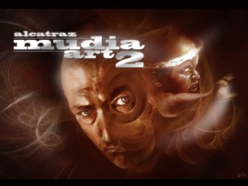
In January 2008, Mudia Art #2 followed suit. The title picture this time is from Critikill of Brainstorm, who also created the
title picture for Zine #13. The background graphics are similar to the ones from issue 1, but they have been altered to fit the time of the year (winter).
The artists in focus this time are the musicians ne7 and Jogeir, and the graphicians Raven and Calvin of Gfx Twins. Some of the articles were written by Mop of Alcatraz, the ex-editor of ROM on Amiga (Rewarding Orthographical Masterpiece).
The flaws mentioned in the review of issue 1 haven't been fixed. Despite that, it's a good second issue.
Flawless.
ftp://ftp.untergrund.net/users/atzAdmin/demo/atz-mudia_art2.zip
yeah
submit changes
if this prod is a fake, some info is false or the download link is broken,
do not post about it in the comments, it will get lost.
instead, click here !

New Features:
- Loading Sequence
- Fading Title Picture
- Fading Art picture when you click on thumbnail
- Fading Menue when you exit
- The Arrows in the menue have now a mouse over effect
- Possibility to use scrolling clip arts in articles which you can see in
the Jogeir Article for example
- mail to and www link function on some cliparts ;)
- Whole engine is now better working and the cpu effciency was downcased.
- You can leave articles now with left or right mouse click
- F11 will toggle window or fullscreen
- and some more little changes....
For the third issue more will come. Mudia Art is a project which grows
in a positive way from issue to issue.
Hope you enjoy the 2nd one... Some will like it some will not but we will keep
it up for sure ;)